注意
跳到結尾下載完整範例程式碼。
修正過多的刻度#
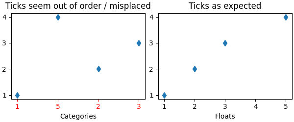
刻度行為不如預期的一個常見原因是傳遞字串列表而不是數字或日期時間物件。當讀取逗號分隔的文字檔時,這很容易在沒有注意的情況下發生。Matplotlib 將字串列表視為類別變數 (繪製類別變數),預設情況下,每個類別放置一個刻度,並按照提供的順序繪製它們。如果這不是期望的結果,解決方案是將字串轉換為數字類型,如下列範例所示。
範例 1:字串可能會導致數字刻度的順序不如預期#
import matplotlib.pyplot as plt
import numpy as np

fig, ax = plt.subplots(1, 2, layout='constrained', figsize=(6, 2.5))
x = ['1', '5', '2', '3']
y = [1, 4, 2, 3]
ax[0].plot(x, y, 'd')
ax[0].tick_params(axis='x', color='r', labelcolor='r')
ax[0].set_xlabel('Categories')
ax[0].set_title('Ticks seem out of order / misplaced')

# convert to numbers:
x = np.asarray(x, dtype='float')
ax[1].plot(x, y, 'd')
ax[1].set_xlabel('Floats')
ax[1].set_title('Ticks as expected')
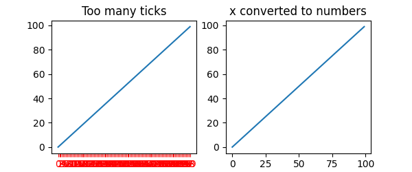
範例 2:字串可能會導致過多的刻度#
如果 x 有 100 個元素(全部都是字串),那麼我們將有 100 個(難以閱讀的)刻度,解決方案同樣是將字串轉換為浮點數
fig, ax = plt.subplots(1, 2, figsize=(6, 2.5))
x = [f'{xx}' for xx in np.arange(100)]
y = np.arange(100)
ax[0].plot(x, y)
ax[0].tick_params(axis='x', color='r', labelcolor='r')
ax[0].set_title('Too many ticks')
ax[0].set_xlabel('Categories')

ax[1].plot(np.asarray(x, float), y)
ax[1].set_title('x converted to numbers')
ax[1].set_xlabel('Floats')
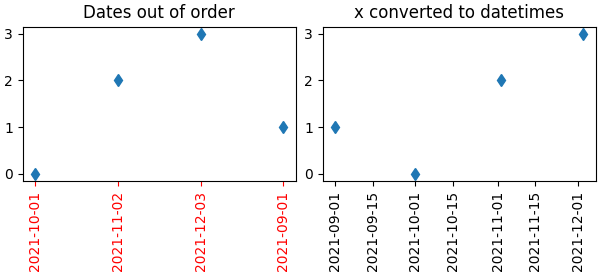
範例 3:字串可能會導致日期時間刻度的順序不如預期#
一個常見的情況是,當從 CSV 檔案讀取日期時,需要將它們從字串轉換為日期時間物件,才能取得正確的日期定位器和格式化器。
fig, ax = plt.subplots(1, 2, layout='constrained', figsize=(6, 2.75))
x = ['2021-10-01', '2021-11-02', '2021-12-03', '2021-09-01']
y = [0, 2, 3, 1]
ax[0].plot(x, y, 'd')
ax[0].tick_params(axis='x', labelrotation=90, color='r', labelcolor='r')
ax[0].set_title('Dates out of order')

# convert to datetime64
x = np.asarray(x, dtype='datetime64[s]')
ax[1].plot(x, y, 'd')
ax[1].tick_params(axis='x', labelrotation=90)
ax[1].set_title('x converted to datetimes')

plt.show()
腳本總執行時間: (0 分鐘 2.262 秒)