注意
前往結尾下載完整的範例程式碼。
直方圖組距、密度和權重#
Axes.hist 方法可以彈性地以幾種不同的方式建立直方圖,這很靈活且有幫助,但也可能導致混淆。特別是,您可以
根據您的需求對資料進行分組,使用自動選擇的組距數量,或使用固定的組距邊緣,
將直方圖標準化,使其積分為 1,
並將權重分配給資料點,以便每個資料點對其組距中的計數產生不同的影響。
Matplotlib 的 hist 方法會呼叫 numpy.histogram 並繪製結果,因此使用者應參考 numpy 文件以取得明確的指南。
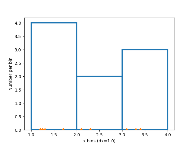
直方圖的建立方式為定義組距邊緣,並取得數值資料集,並將其排序到組距中,以及計數或加總每個組距中有多少資料。在此簡單範例中,介於 1 和 4 之間的 9 個數字被排序到 3 個組距中
import matplotlib.pyplot as plt
import numpy as np

rng = np.random.default_rng(19680801)

xdata = np.array([1.2, 2.3, 3.3, 3.1, 1.7, 3.4, 2.1, 1.25, 1.3])
xbins = np.array([1, 2, 3, 4])

# changing the style of the histogram bars just to make it
# very clear where the boundaries of the bins are:
style = {'facecolor': 'none', 'edgecolor': 'C0', 'linewidth': 3}

fig, ax = plt.subplots()
ax.hist(xdata, bins=xbins, **style)

# plot the xdata locations on the x axis:
ax.plot(xdata, 0*xdata, 'd')
ax.set_ylabel('Number per bin')
ax.set_xlabel('x bins (dx=1.0)')
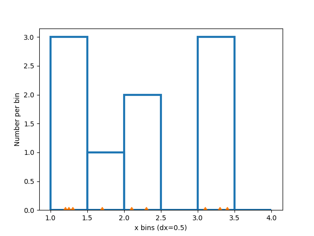
修改組距#
變更組距大小會變更此稀疏直方圖的形狀,因此最好根據您的資料仔細選擇組距。在這裡,我們將組距寬度縮小一半。
xbins = np.arange(1, 4.5, 0.5)

fig, ax = plt.subplots()
ax.hist(xdata, bins=xbins, **style)
ax.plot(xdata, 0*xdata, 'd')
ax.set_ylabel('Number per bin')
ax.set_xlabel('x bins (dx=0.5)')
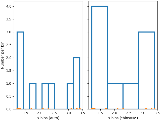
我們也可以讓 numpy(透過 Matplotlib)自動選擇組距,或指定自動選擇的組距數量
fig, ax = plt.subplot_mosaic([['auto', 'n4']],
                             sharex=True, sharey=True, layout='constrained')

ax['auto'].hist(xdata, **style)
ax['auto'].plot(xdata, 0*xdata, 'd')
ax['auto'].set_ylabel('Number per bin')
ax['auto'].set_xlabel('x bins (auto)')

ax['n4'].hist(xdata, bins=4, **style)
ax['n4'].plot(xdata, 0*xdata, 'd')
ax['n4'].set_xlabel('x bins ("bins=4")')
標準化直方圖:密度和權重#
每個組距的計數是直方圖中每個長條的預設長度。但是,我們也可以使用 density 參數將長條長度標準化為機率密度函數
fig, ax = plt.subplots()
ax.hist(xdata, bins=xbins, density=True, **style)
ax.set_ylabel('Probability density [$V^{-1}$])')
ax.set_xlabel('x bins (dx=0.5 $V$)')
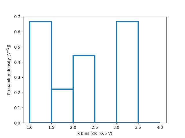
當僅探索資料時,此標準化可能有點難以解釋。附加到每個長條的值會除以資料點的總數和組距的寬度,因此當在完整資料範圍內積分時,這些值會 _積分_ 為 1。例如
density = counts / (sum(counts) * np.diff(bins))
np.sum(density * np.diff(bins)) == 1
此標準化是統計資料中定義 機率密度函數 的方式。如果 \(X\) 是 \(x\) 上的隨機變數,則如果 \(P[a<X<b] = \int_a^b f_X dx\),則 \(f_X\) 是機率密度函數。如果 x 的單位是伏特,則 \(f_X\) 的單位是 \(V^{-1}\) 或每次電壓變化的機率。
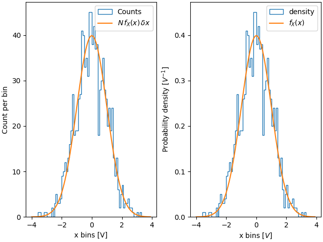
當我們從已知分佈中繪製並嘗試與理論比較時,此標準化的實用性會更明確。因此,從 常態分佈 中選擇 1000 個點,並計算已知的機率密度函數
如果我們不使用 density=True,我們需要同時使用資料的長度和組距的寬度來縮放預期的機率分佈函數
fig, ax = plt.subplot_mosaic([['False', 'True']], layout='constrained')
dx = 0.1
xbins = np.arange(-4, 4, dx)
ax['False'].hist(xdata, bins=xbins, density=False, histtype='step', label='Counts')

# scale and plot the expected pdf:
ax['False'].plot(xpdf, pdf * len(xdata) * dx, label=r'$N\,f_X(x)\,\delta x$')
ax['False'].set_ylabel('Count per bin')
ax['False'].set_xlabel('x bins [V]')
ax['False'].legend()

ax['True'].hist(xdata, bins=xbins, density=True, histtype='step', label='density')
ax['True'].plot(xpdf, pdf, label='$f_X(x)$')
ax['True'].set_ylabel('Probability density [$V^{-1}$]')
ax['True'].set_xlabel('x bins [$V$]')
ax['True'].legend()
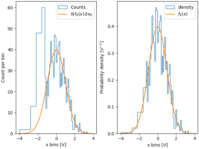
因此,使用密度的其中一個優點是直方圖的形狀和振幅不依賴於組距的大小。考慮組距寬度不相同的極端情況。在此範例中,x=-1.25 以下的組距寬度是其餘組距的六倍。透過依密度標準化,我們保留了分佈的形狀,而如果我們不這麼做,則較寬的組距的計數會遠高於較窄的組距
fig, ax = plt.subplot_mosaic([['False', 'True']], layout='constrained')
dx = 0.1
xbins = np.hstack([np.arange(-4, -1.25, 6*dx), np.arange(-1.25, 4, dx)])
ax['False'].hist(xdata, bins=xbins, density=False, histtype='step', label='Counts')
ax['False'].plot(xpdf, pdf * len(xdata) * dx, label=r'$N\,f_X(x)\,\delta x_0$')
ax['False'].set_ylabel('Count per bin')
ax['False'].set_xlabel('x bins [V]')
ax['False'].legend()

ax['True'].hist(xdata, bins=xbins, density=True, histtype='step', label='density')
ax['True'].plot(xpdf, pdf, label='$f_X(x)$')
ax['True'].set_ylabel('Probability density [$V^{-1}$]')
ax['True'].set_xlabel('x bins [$V$]')
ax['True'].legend()
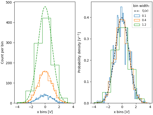
同樣地,如果我們想要比較具有不同組距寬度的直方圖,我們可能會想要使用 density=True
fig, ax = plt.subplot_mosaic([['False', 'True']], layout='constrained')

# expected PDF
ax['True'].plot(xpdf, pdf, '--', label='$f_X(x)$', color='k')

for nn, dx in enumerate([0.1, 0.4, 1.2]):
    xbins = np.arange(-4, 4, dx)
    # expected histogram:
    ax['False'].plot(xpdf, pdf*1000*dx, '--', color=f'C{nn}')
    ax['False'].hist(xdata, bins=xbins, density=False, histtype='step')

    ax['True'].hist(xdata, bins=xbins, density=True, histtype='step', label=dx)

# Labels:
ax['False'].set_xlabel('x bins [$V$]')
ax['False'].set_ylabel('Count per bin')
ax['True'].set_ylabel('Probability density [$V^{-1}$]')
ax['True'].set_xlabel('x bins [$V$]')
ax['True'].legend(fontsize='small', title='bin width:')
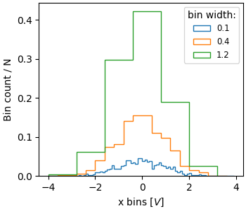
有時,人們想要將總計數標準化為 1。這類似於離散變數的 機率質量函數,其中所有值的機率總和等於 1。使用 hist,如果我們將權重設定為 1/N,則可以取得此標準化。請注意,此標準化直方圖的振幅仍然取決於組距的寬度和/或數量
fig, ax = plt.subplots(layout='constrained', figsize=(3.5, 3))

for nn, dx in enumerate([0.1, 0.4, 1.2]):
    xbins = np.arange(-4, 4, dx)
    ax.hist(xdata, bins=xbins, weights=1/len(xdata) * np.ones(len(xdata)),
                   histtype='step', label=f'{dx}')
ax.set_xlabel('x bins [$V$]')
ax.set_ylabel('Bin count / N')
ax.legend(fontsize='small', title='bin width:')
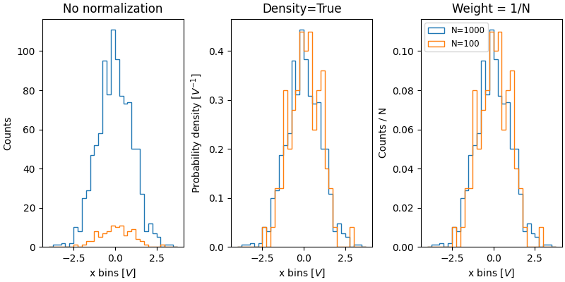
標準化直方圖的價值在於比較兩個具有不同大小群體的分布。在這裡,我們比較具有 1000 個成員的群體的 xdata 分佈,以及具有 100 個成員的 xdata2 分佈。
xdata2 = rng.normal(size=100)

fig, ax = plt.subplot_mosaic([['no_norm', 'density', 'weight']],
                             layout='constrained', figsize=(8, 4))

xbins = np.arange(-4, 4, 0.25)

ax['no_norm'].hist(xdata, bins=xbins, histtype='step')
ax['no_norm'].hist(xdata2, bins=xbins, histtype='step')
ax['no_norm'].set_ylabel('Counts')
ax['no_norm'].set_xlabel('x bins [$V$]')
ax['no_norm'].set_title('No normalization')

ax['density'].hist(xdata, bins=xbins, histtype='step', density=True)
ax['density'].hist(xdata2, bins=xbins, histtype='step', density=True)
ax['density'].set_ylabel('Probability density [$V^{-1}$]')
ax['density'].set_title('Density=True')
ax['density'].set_xlabel('x bins [$V$]')

ax['weight'].hist(xdata, bins=xbins, histtype='step',
                  weights=1 / len(xdata) * np.ones(len(xdata)),
                  label='N=1000')
ax['weight'].hist(xdata2, bins=xbins, histtype='step',
                  weights=1 / len(xdata2) * np.ones(len(xdata2)),
                  label='N=100')
ax['weight'].set_xlabel('x bins [$V$]')
ax['weight'].set_ylabel('Counts / N')
ax['weight'].legend(fontsize='small')
ax['weight'].set_title('Weight = 1/N')

plt.show()
參考
此範例中顯示了以下函數、方法、類別和模組的使用方式
腳本的總執行時間:(0 分鐘 6.097 秒)