注意
前往結尾以下載完整範例程式碼。
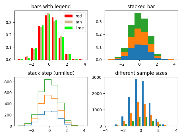
具有多個資料集的直方圖 (hist) 函數#
繪製具有多個樣本集的直方圖並示範
使用具有多個樣本集的圖例
堆疊長條圖
不填滿的階梯曲線
不同樣本大小的資料集
選擇不同的 bin 計數和大小會顯著影響直方圖的形狀。Astropy 文件中有一個關於如何選擇這些參數的精彩章節:http://docs.astropy.org/en/stable/visualization/histogram.html
import matplotlib.pyplot as plt
import numpy as np

np.random.seed(19680801)

n_bins = 10
x = np.random.randn(1000, 3)

fig, ((ax0, ax1), (ax2, ax3)) = plt.subplots(nrows=2, ncols=2)

colors = ['red', 'tan', 'lime']
ax0.hist(x, n_bins, density=True, histtype='bar', color=colors, label=colors)
ax0.legend(prop={'size': 10})
ax0.set_title('bars with legend')

ax1.hist(x, n_bins, density=True, histtype='bar', stacked=True)
ax1.set_title('stacked bar')

ax2.hist(x, n_bins, histtype='step', stacked=True, fill=False)
ax2.set_title('stack step (unfilled)')

# Make a multiple-histogram of data-sets with different length.
x_multi = [np.random.randn(n) for n in [10000, 5000, 2000]]
ax3.hist(x_multi, n_bins, histtype='bar')
ax3.set_title('different sample sizes')

fig.tight_layout()
plt.show()
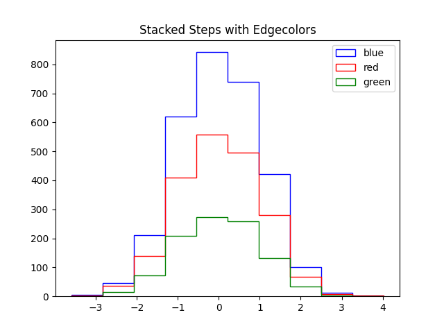
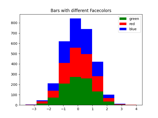
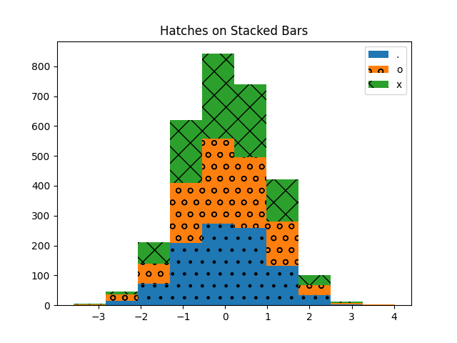
設定每個資料集的屬性#
您可以透過將值清單傳遞給下列參數,分別設定直方圖的樣式
edgecolor
facecolor
hatch
linewidth
linestyle
edgecolor#
fig, ax = plt.subplots()

edgecolors = ['green', 'red', 'blue']

ax.hist(x, n_bins, fill=False, histtype="step", stacked=True,
        edgecolor=edgecolors, label=edgecolors)
ax.legend()
ax.set_title('Stacked Steps with Edgecolors')

plt.show()
facecolor#
fig, ax = plt.subplots()

facecolors = ['green', 'red', 'blue']

ax.hist(x, n_bins, histtype="barstacked", facecolor=facecolors, label=facecolors)
ax.legend()
ax.set_title("Bars with different Facecolors")

plt.show()
hatch#
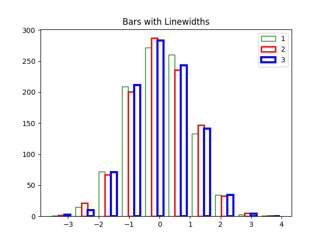
linewidth#
fig, ax = plt.subplots()

linewidths = [1, 2, 3]
edgecolors = ["green", "red", "blue"]

ax.hist(x, n_bins, fill=False, histtype="bar", linewidth=linewidths,
        edgecolor=edgecolors, label=linewidths)
ax.legend()
ax.set_title("Bars with Linewidths")

plt.show()
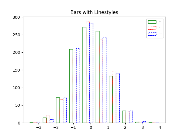
linestyle#
fig, ax = plt.subplots()

linestyles = ['-', ':', '--']

ax.hist(x, n_bins, fill=False, histtype='bar', linestyle=linestyles,
        edgecolor=edgecolors, label=linestyles)
ax.legend()
ax.set_title('Bars with Linestyles')

plt.show()
腳本的總執行時間: (0 分鐘 3.955 秒)