注意
前往結尾以下載完整的範例程式碼。
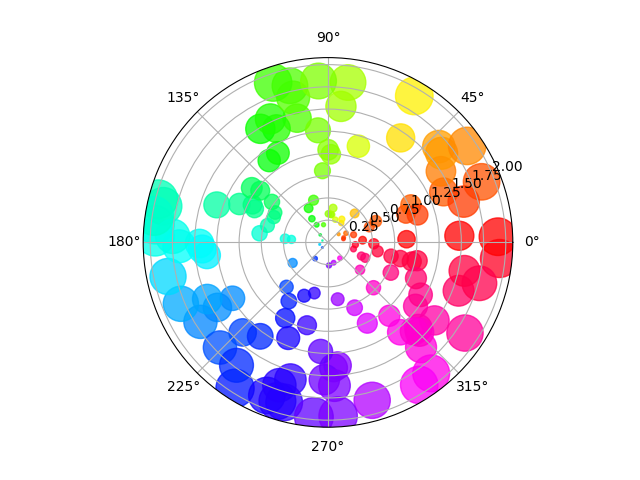
極坐標軸上的散佈圖#
在此範例中,大小以徑向方式增加,顏色隨著角度增加(僅為了驗證符號是否正確散佈)。
import matplotlib.pyplot as plt
import numpy as np

# Fixing random state for reproducibility
np.random.seed(19680801)

# Compute areas and colors
N = 150
r = 2 * np.random.rand(N)
theta = 2 * np.pi * np.random.rand(N)
area = 200 * r**2
colors = theta

fig = plt.figure()
ax = fig.add_subplot(projection='polar')
c = ax.scatter(theta, r, c=colors, s=area, cmap='hsv', alpha=0.75)
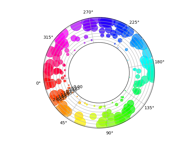
在具有偏移原點的極坐標軸上的散佈圖#
與前一個圖表的主要差異在於原點半徑的設定,產生一個環形。此外,theta 零位置設定為旋轉圖表。
fig = plt.figure()
ax = fig.add_subplot(projection='polar')
c = ax.scatter(theta, r, c=colors, s=area, cmap='hsv', alpha=0.75)

ax.set_rorigin(-2.5)
ax.set_theta_zero_location('W', offset=10)
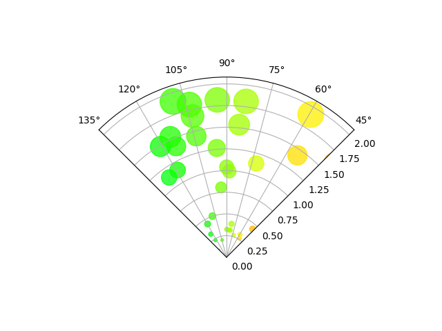
限制在扇形區域的極坐標軸上的散佈圖#
與前幾個圖表的主要差異在於 theta 起始和結束限制的設定,產生一個扇形而不是一個完整的圓形。
fig = plt.figure()
ax = fig.add_subplot(projection='polar')
c = ax.scatter(theta, r, c=colors, s=area, cmap='hsv', alpha=0.75)

ax.set_thetamin(45)
ax.set_thetamax(135)

plt.show()
腳本總執行時間: (0 分鐘 1.944 秒)