注意
前往結尾下載完整範例程式碼。
影像重新取樣#
影像由離散的像素表示,這些像素會被指定顏色值,無論是在螢幕上還是在影像檔案中。當使用者使用資料陣列呼叫 imshow 時,資料陣列的大小很少與圖形中分配給影像的像素數完全匹配,因此 Matplotlib 會重新取樣或縮放資料或影像以符合。如果資料陣列大於所繪製圖形中分配的像素數,則影像將被「降採樣」且影像資訊會遺失。相反地,如果資料陣列小於輸出像素數,則每個資料點將獲得多個像素,並且影像會被「升採樣」。
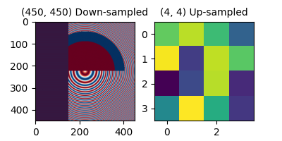
在下圖中,第一個資料陣列的大小為 (450, 450),但在圖形中由遠少於像素表示,因此會降採樣。第二個資料陣列的大小為 (4, 4),並由遠多於像素表示,因此會升採樣。
import matplotlib.pyplot as plt
import numpy as np

fig, axs = plt.subplots(1, 2, figsize=(4, 2))

# First we generate a 450x450 pixel image with varying frequency content:
N = 450
x = np.arange(N) / N - 0.5
y = np.arange(N) / N - 0.5
aa = np.ones((N, N))
aa[::2, :] = -1

X, Y = np.meshgrid(x, y)
R = np.sqrt(X**2 + Y**2)
f0 = 5
k = 100
a = np.sin(np.pi * 2 * (f0 * R + k * R**2 / 2))
# make the left hand side of this
a[:int(N / 2), :][R[:int(N / 2), :] < 0.4] = -1
a[:int(N / 2), :][R[:int(N / 2), :] < 0.3] = 1
aa[:, int(N / 3):] = a[:, int(N / 3):]
alarge = aa

axs[0].imshow(alarge, cmap='RdBu_r')
axs[0].set_title('(450, 450) Down-sampled', fontsize='medium')

np.random.seed(19680801+9)
asmall = np.random.rand(4, 4)
axs[1].imshow(asmall, cmap='viridis')
axs[1].set_title('(4, 4) Up-sampled', fontsize='medium')
Matplotlib 的 imshow 方法有兩個關鍵字引數,可讓使用者控制如何進行重新取樣。interpolation 關鍵字引數可選擇用於重新取樣的核心,在降採樣時允許反鋸齒濾波,或在升採樣時平滑像素。interpolation_stage 關鍵字引數可決定此平滑核心是否套用至基礎資料,或是否將核心套用至 RGBA 像素。
interpolation_stage='rgba':資料 -> 正規化 -> RGBA -> 插值/重新取樣
interpolation_stage='data':資料 -> 插值/重新取樣 -> 正規化 -> RGBA
對於這兩個關鍵字引數,Matplotlib 都有預設的「抗鋸齒」,建議用於大多數情況,如下所述。請注意,如果影像正在降採樣或升採樣,此預設的行為會有所不同,如下所述。
降採樣和適度的升採樣#
在對資料降採樣時,我們通常希望先平滑影像,然後對其進行子採樣,以消除鋸齒。在 Matplotlib 中,我們可以在將資料對應到顏色之前執行平滑處理,也可以在 RGB(A) 影像像素上執行平滑處理。以下顯示這些之間的差異,並使用 interpolation_stage 關鍵字引數控制。
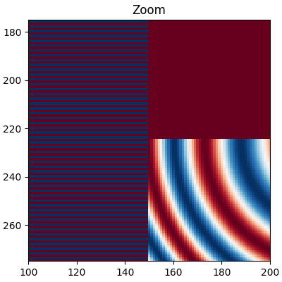
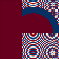
以下影像是從 450 個資料像素降採樣至大約 125 個像素或 250 個像素(取決於您的顯示器)。基礎影像左側具有交替的 +1、-1 條紋,其餘影像中具有不同的波長(啁啾)模式。如果我們縮放,我們可以查看此細節而沒有任何降採樣
fig, ax = plt.subplots(figsize=(4, 4), layout='compressed')
ax.imshow(alarge, interpolation='nearest', cmap='RdBu_r')
ax.set_xlim(100, 200)
ax.set_ylim(275, 175)
ax.set_title('Zoom')
如果我們進行降採樣,最簡單的演算法是使用最近鄰插值來抽取資料。我們可以在資料空間或 RGBA 空間中執行此操作
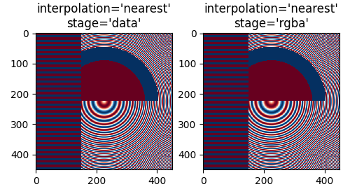
最近鄰插值在資料和 RGBA 空間中是相同的,而且兩者都顯示莫爾條紋,因為高頻資料正在降採樣,並顯示為較低的頻率模式。我們可以透過在繪製之前將反鋸齒濾波器套用至影像來減少莫爾條紋
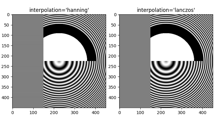
fig, axs = plt.subplots(1, 2, figsize=(5, 2.7), layout='compressed')
for ax, interp, space in zip(axs.flat, ['hanning', 'hanning'],
                                       ['data', 'rgba']):
    ax.imshow(alarge, interpolation=interp, interpolation_stage=space,
              cmap='RdBu_r')
    ax.set_title(f"interpolation='{interp}'\nstage='{space}'")
plt.show()
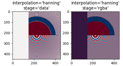
漢寧濾波器可平滑基礎資料,使每個新像素成為原始基礎像素的加權平均值。這大大減少了莫爾條紋。但是,當 interpolation_stage 設定為「data」時,它也會在影像中引入原始資料中不存在的白色區域,無論是在影像左側的交替頻帶,還是在影像中間大圓的紅色和藍色之間的邊界。在「rgba」階段的插值具有不同的假象,交替頻帶呈現出紫色陰影;即使紫色不在原始色圖中,當藍色和紅色條紋彼此接近時,這也是我們感知到的顏色。
interpolation 關鍵字引數的預設值是「auto」,如果影像降採樣或升採樣的倍數小於 3,則會選擇漢寧濾波器。預設的 interpolation_stage 關鍵字引數也是「auto」,對於降採樣或升採樣倍數小於 3 的影像,預設為「rgba」插值。
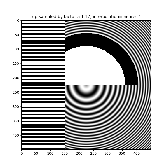
即使在升採樣時,也需要反鋸齒濾波。以下影像將 450 個資料像素升採樣到 530 個繪製像素。您可能會注意到線狀假象的網格,這些假象源於必須補足的額外像素。由於插值是「最近鄰」,它們與相鄰的像素線相同,因此會在局部拉伸影像,使其看起來失真。
fig, ax = plt.subplots(figsize=(6.8, 6.8))
ax.imshow(alarge, interpolation='nearest', cmap='grey')
ax.set_title("up-sampled by factor a 1.17, interpolation='nearest'")
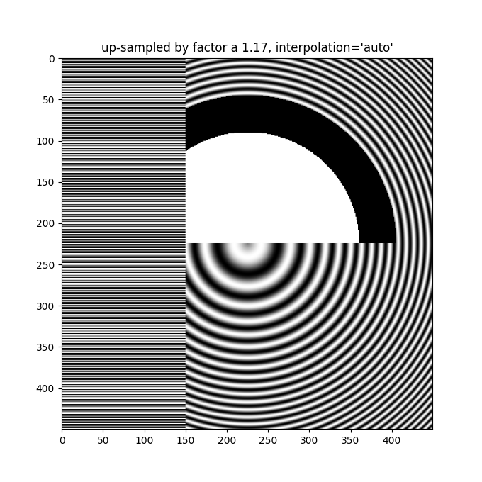
更好的反鋸齒演算法可以減少這種影響
fig, ax = plt.subplots(figsize=(6.8, 6.8))
ax.imshow(alarge, interpolation='auto', cmap='grey')
ax.set_title("up-sampled by factor a 1.17, interpolation='auto'")
除了預設的 'hanning' 反鋸齒之外,imshow 還支援許多不同的插值演算法,這些演算法的效果可能會因為底層資料的不同而有所差異。
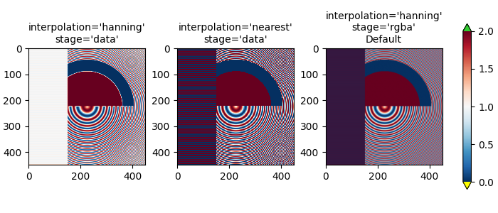
最後一個範例展示了在使用非平凡的插值核心時,在 RGBA 階段執行反鋸齒的優點。在以下範例中,上方 100 列的資料完全是 0.0,而內圓的資料完全是 2.0。如果我們在 'data' 空間中執行interpolation_stage並使用反鋸齒濾波器(第一個面板),則浮點數的不精確性會導致某些資料值略小於零或略大於 2.0,並被指定為欠色或過色。如果您不使用反鋸齒濾波器(interpolation 設定為 'nearest'),則可以避免這種情況,但是,這會使資料中容易出現莫列波紋的部分變得更糟(第二個面板)。因此,我們建議在大多數降採樣情況下,使用預設的 interpolation 'hanning'/'auto' 和 interpolation_stage 'rgba'/'auto'(最後一個面板)。
a = alarge + 1
cmap = plt.get_cmap('RdBu_r')
cmap.set_under('yellow')
cmap.set_over('limegreen')

fig, axs = plt.subplots(1, 3, figsize=(7, 3), layout='constrained')
for ax, interp, space in zip(axs.flat,
                             ['hanning', 'nearest', 'hanning', ],
                             ['data', 'data', 'rgba']):
    im = ax.imshow(a, interpolation=interp, interpolation_stage=space,
                   cmap=cmap, vmin=0, vmax=2)
    title = f"interpolation='{interp}'\nstage='{space}'"
    if ax == axs[2]:
        title += '\nDefault'
    ax.set_title(title, fontsize='medium')
fig.colorbar(im, ax=axs, extend='both', shrink=0.8)
升採樣#
如果我們進行升採樣,則可以使用許多影像或螢幕像素來表示一個資料像素。在以下範例中,我們大幅過度採樣了一個小的資料矩陣。
np.random.seed(19680801+9)
a = np.random.rand(4, 4)

fig, axs = plt.subplots(1, 2, figsize=(6.5, 4), layout='compressed')
axs[0].imshow(asmall, cmap='viridis')
axs[0].set_title("interpolation='auto'\nstage='auto'")
axs[1].imshow(asmall, cmap='viridis', interpolation="nearest",
              interpolation_stage="data")
axs[1].set_title("interpolation='nearest'\nstage='data'")
plt.show()
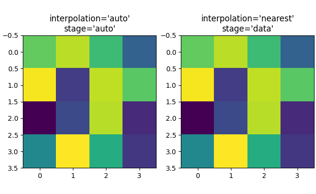
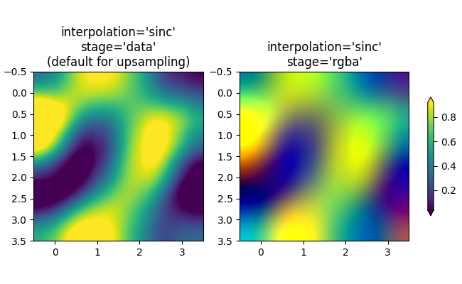
如果需要,可以使用 interpolation 關鍵字引數來平滑像素。但是,幾乎總是在資料空間中進行此操作更好,而不是在 RGBA 空間中進行,因為在 RGBA 空間中,濾波器可能會導致插值結果出現不在色彩對應表中的顏色。在以下範例中,請注意,當插值為 'rgba' 時,會出現紅色作為插值偽影。因此,當升採樣大於三倍時,interpolation_stage 的預設 'auto' 選擇會設定為與 'data' 相同。
fig, axs = plt.subplots(1, 2, figsize=(6.5, 4), layout='compressed')
im = axs[0].imshow(a, cmap='viridis', interpolation='sinc', interpolation_stage='data')
axs[0].set_title("interpolation='sinc'\nstage='data'\n(default for upsampling)")
axs[1].imshow(a, cmap='viridis', interpolation='sinc', interpolation_stage='rgba')
axs[1].set_title("interpolation='sinc'\nstage='rgba'")
fig.colorbar(im, ax=axs, shrink=0.7, extend='both')
避免重新採樣#
在建立影像時,可以避免重新採樣資料。一種方法是簡單地儲存到向量後端(pdf、eps、svg)並使用 interpolation='none'。向量後端允許嵌入影像,但請注意,某些向量影像檢視器可能會平滑影像像素。
第二種方法是將軸的大小與資料的大小完全匹配。下圖正好是 2 英寸乘 2 英寸,如果 dpi 為 200,則 400x400 的資料根本不會被重新採樣。如果您下載此影像並在影像檢視器中放大,您應該看到左側的各個條紋(請注意,如果您使用非 hiDPI 或「視網膜」螢幕,則 HTML 可能會提供 100x100 版本的影像,該影像將被降採樣。)
fig = plt.figure(figsize=(2, 2))
ax = fig.add_axes([0, 0, 1, 1])
ax.imshow(aa[:400, :400], cmap='RdBu_r', interpolation='nearest')
plt.show()
腳本的總執行時間:(0 分鐘 11.438 秒)