注意
前往結尾下載完整範例程式碼。
多層(巢狀)刻度#
有時我們需要在軸上加上另一層刻度標籤,或許是為了指出刻度的分組。
Matplotlib 沒有提供自動執行此操作的方法,但在主軸下方加上註解相對簡單。
這些範例使用 Axes.secondary_xaxis,這是一種方法。它的優點是如果需要,我們可以在執行分組的軸上使用 Matplotlib 定位器和格式器。
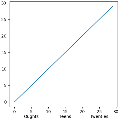
第一個範例會建立一個次要 x 軸,並使用 Axes.set_xticks 手動新增刻度和標籤。請注意,刻度標籤的開頭會有換行符號(例如 " Oughts"),以將第二層刻度標籤放在主刻度標籤下方。
import matplotlib.pyplot as plt
import numpy as np

import matplotlib.dates as mdates

rng = np.random.default_rng(19680801)

fig, ax = plt.subplots(layout='constrained', figsize=(4, 4))

ax.plot(np.arange(30))

sec = ax.secondary_xaxis(location=0)
sec.set_xticks([5, 15, 25], labels=['\nOughts', '\nTeens', '\nTwenties'])
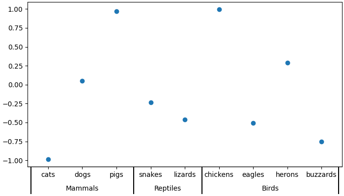
第二個範例會將第二層註解新增到類別軸。在此我們需要注意,每個動物(類別)都會被指派一個整數,因此 cats 的 x 值為 0,dogs 的 x 值為 1,依此類推。然後,我們會將第二層的刻度放置在我們要描繪的動物類別的中間位置。
此範例也會在類別之間新增刻度標記,方法是新增第二個次要 x 軸,並在動物類別之間的邊界放置長而寬的刻度。
fig, ax = plt.subplots(layout='constrained', figsize=(7, 4))

ax.plot(['cats', 'dogs', 'pigs', 'snakes', 'lizards', 'chickens',
         'eagles', 'herons', 'buzzards'],
        rng.normal(size=9), 'o')

# label the classes:
sec = ax.secondary_xaxis(location=0)
sec.set_xticks([1, 3.5, 6.5], labels=['\n\nMammals', '\n\nReptiles', '\n\nBirds'])
sec.tick_params('x', length=0)

# lines between the classes:
sec2 = ax.secondary_xaxis(location=0)
sec2.set_xticks([-0.5, 2.5, 4.5, 8.5], labels=[])
sec2.tick_params('x', length=40, width=1.5)
ax.set_xlim(-0.6, 8.6)
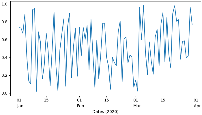
日期是另一個我們可能想要使用第二層刻度標籤的常見位置。在最後一個範例中,我們利用了將自動定位器和格式器新增至次要 x 軸的功能,這表示我們不需要手動設定刻度。
這個範例也與上述範例不同,因為我們將其放置在主軸下方的某個位置 location=-0.075,然後我們將線寬設定為零來隱藏軸脊。這表示我們的格式器不再需要前兩個範例中的歸位符號。
fig, ax = plt.subplots(layout='constrained', figsize=(7, 4))

time = np.arange(np.datetime64('2020-01-01'), np.datetime64('2020-03-31'),
                 np.timedelta64(1, 'D'))

ax.plot(time, rng.random(size=len(time)))

# just format the days:
ax.xaxis.set_major_formatter(mdates.DateFormatter('%d'))

# label the months:
sec = ax.secondary_xaxis(location=-0.075)
sec.xaxis.set_major_locator(mdates.MonthLocator(bymonthday=1))

# note the extra spaces in the label to align the month label inside the month.
# Note that this could have been done by changing ``bymonthday`` above as well:
sec.xaxis.set_major_formatter(mdates.DateFormatter('  %b'))
sec.tick_params('x', length=0)
sec.spines['bottom'].set_linewidth(0)

# label the xaxis, but note for this to look good, it needs to be on the
# secondary xaxis.
sec.set_xlabel('Dates (2020)')

plt.show()
指令碼的總執行時間:(0 分鐘 3.028 秒)