註記
前往結尾下載完整範例程式碼。
具有透明度的fill_between#
fill_between 函數會產生最小值和最大值邊界之間的陰影區域,這對於說明範圍非常有用。它有一個非常方便的 where 引數,可以將填滿與邏輯範圍結合使用,例如,僅在某個閾值以上填滿曲線。
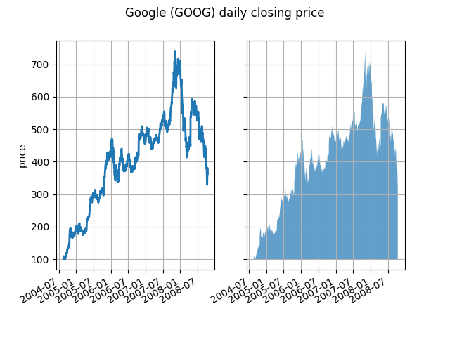
在其最基本的層面上,fill_between 可以用來增強圖表的視覺外觀。讓我們比較兩張財務資料圖表,左邊是簡單的線圖,右邊是填滿的線圖。
import matplotlib.pyplot as plt
import numpy as np

import matplotlib.cbook as cbook

# load up some sample financial data
r = cbook.get_sample_data('goog.npz')['price_data']
# create two subplots with the shared x and y axes
fig, (ax1, ax2) = plt.subplots(1, 2, sharex=True, sharey=True)

pricemin = r["close"].min()

ax1.plot(r["date"], r["close"], lw=2)
ax2.fill_between(r["date"], pricemin, r["close"], alpha=0.7)

for ax in ax1, ax2:
    ax.grid(True)
    ax.label_outer()

ax1.set_ylabel('price')

fig.suptitle('Google (GOOG) daily closing price')
fig.autofmt_xdate()
此處不需要 Alpha 通道,但它可以用於柔化色彩,以獲得更具視覺吸引力的繪圖。在其他範例中,如下所示,Alpha 通道在功能上很有用,因為陰影區域可能會重疊,而 Alpha 可以讓您看到兩者。請注意,postscript 格式不支援 alpha(這是 postscript 的限制,而不是 matplotlib 的限制),因此在使用 alpha 時,請將圖形儲存為 PNG、PDF 或 SVG。
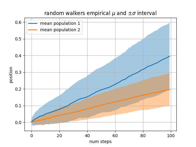
我們的下一個範例會計算兩個隨機遊走者的族群,其步長是從常態分佈中抽取,且具有不同的平均值和標準差。我們使用填滿的區域來繪製群體平均位置的 +/- 一個標準差。此處的 Alpha 通道很有用,而不僅僅是美觀而已。
# Fixing random state for reproducibility
np.random.seed(19680801)

Nsteps, Nwalkers = 100, 250
t = np.arange(Nsteps)

# an (Nsteps x Nwalkers) array of random walk steps
S1 = 0.004 + 0.02*np.random.randn(Nsteps, Nwalkers)
S2 = 0.002 + 0.01*np.random.randn(Nsteps, Nwalkers)

# an (Nsteps x Nwalkers) array of random walker positions
X1 = S1.cumsum(axis=0)
X2 = S2.cumsum(axis=0)


# Nsteps length arrays empirical means and standard deviations of both
# populations over time
mu1 = X1.mean(axis=1)
sigma1 = X1.std(axis=1)
mu2 = X2.mean(axis=1)
sigma2 = X2.std(axis=1)

# plot it!
fig, ax = plt.subplots(1)
ax.plot(t, mu1, lw=2, label='mean population 1')
ax.plot(t, mu2, lw=2, label='mean population 2')
ax.fill_between(t, mu1+sigma1, mu1-sigma1, facecolor='C0', alpha=0.4)
ax.fill_between(t, mu2+sigma2, mu2-sigma2, facecolor='C1', alpha=0.4)
ax.set_title(r'random walkers empirical $\mu$ and $\pm \sigma$ interval')
ax.legend(loc='upper left')
ax.set_xlabel('num steps')
ax.set_ylabel('position')
ax.grid()
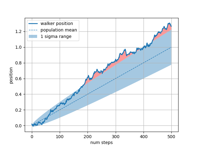
where 關鍵字引數對於醒目提示圖表的某些區域非常方便。where 採用一個布林遮罩,其長度與 x、ymin 和 ymax 引數相同,且僅在布林遮罩為 True 時填滿區域。在以下範例中,我們模擬一個單個隨機遊走者,並計算族群位置的解析平均值和標準差。族群平均值顯示為虛線,而平均值加減一個 sigma 標準差則顯示為填滿區域。我們使用 where 遮罩 X > upper_bound 來尋找遊走者超出一個 sigma 邊界的區域,並將該區域塗成紅色。
# Fixing random state for reproducibility
np.random.seed(1)

Nsteps = 500
t = np.arange(Nsteps)

mu = 0.002
sigma = 0.01

# the steps and position
S = mu + sigma*np.random.randn(Nsteps)
X = S.cumsum()

# the 1 sigma upper and lower analytic population bounds
lower_bound = mu*t - sigma*np.sqrt(t)
upper_bound = mu*t + sigma*np.sqrt(t)

fig, ax = plt.subplots(1)
ax.plot(t, X, lw=2, label='walker position')
ax.plot(t, mu*t, lw=1, label='population mean', color='C0', ls='--')
ax.fill_between(t, lower_bound, upper_bound, facecolor='C0', alpha=0.4,
                label='1 sigma range')
ax.legend(loc='upper left')

# here we use the where argument to only fill the region where the
# walker is above the population 1 sigma boundary
ax.fill_between(t, upper_bound, X, where=X > upper_bound, fc='red', alpha=0.4)
ax.fill_between(t, lower_bound, X, where=X < lower_bound, fc='red', alpha=0.4)
ax.set_xlabel('num steps')
ax.set_ylabel('position')
ax.grid()
填滿區域的另一個方便用途是醒目提示軸的水平或垂直範圍 -- 對此,Matplotlib 具有輔助函數 axhspan 和 axvspan。請參閱 繪製跨越軸的區域。
plt.show()
指令碼的總執行時間: (0 分鐘 3.644 秒)