注意事項
移至結尾下載完整範例程式碼。
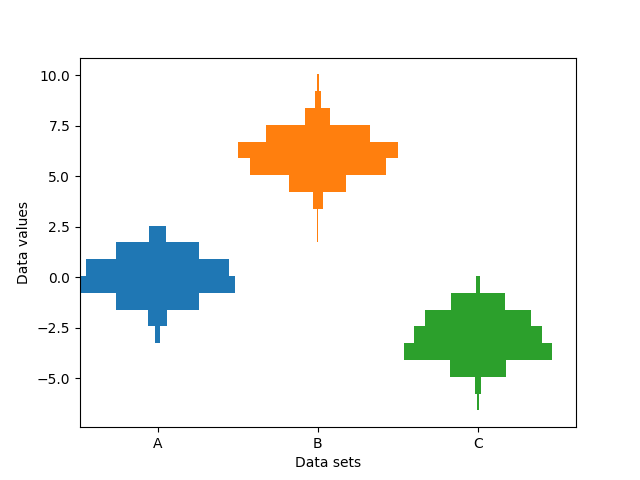
多個並排直方圖#
此範例沿著分類 x 軸繪製不同樣本的水平直方圖。此外,繪製的直方圖以其 x 位置為中心對稱,使其與小提琴圖非常相似。
為了製作這種高度專業化的圖表,我們無法使用標準的 hist 方法。相反地,我們使用 barh 直接繪製水平長條圖。長條圖的垂直位置和長度是透過 np.histogram 函數計算的。所有樣本的直方圖都使用相同的範圍(最小值和最大值)和 bin 數量計算,因此每個樣本的 bin 都處於相同的垂直位置。
選取不同的 bin 數量和大小會顯著影響直方圖的形狀。Astropy 文件中有一個很棒的章節說明如何選取這些參數:http://docs.astropy.org/en/stable/visualization/histogram.html
import matplotlib.pyplot as plt
import numpy as np

np.random.seed(19680801)
number_of_bins = 20

# An example of three data sets to compare
number_of_data_points = 387
labels = ["A", "B", "C"]
data_sets = [np.random.normal(0, 1, number_of_data_points),
             np.random.normal(6, 1, number_of_data_points),
             np.random.normal(-3, 1, number_of_data_points)]

# Computed quantities to aid plotting
hist_range = (np.min(data_sets), np.max(data_sets))
binned_data_sets = [
    np.histogram(d, range=hist_range, bins=number_of_bins)[0]
    for d in data_sets
]
binned_maximums = np.max(binned_data_sets, axis=1)
x_locations = np.arange(0, sum(binned_maximums), np.max(binned_maximums))

# The bin_edges are the same for all of the histograms
bin_edges = np.linspace(hist_range[0], hist_range[1], number_of_bins + 1)
heights = np.diff(bin_edges)
centers = bin_edges[:-1] + heights / 2

# Cycle through and plot each histogram
fig, ax = plt.subplots()
for x_loc, binned_data in zip(x_locations, binned_data_sets):
    lefts = x_loc - 0.5 * binned_data
    ax.barh(centers, binned_data, height=heights, left=lefts)

ax.set_xticks(x_locations, labels)

ax.set_ylabel("Data values")
ax.set_xlabel("Data sets")

plt.show()