注意
前往結尾下載完整的範例程式碼。
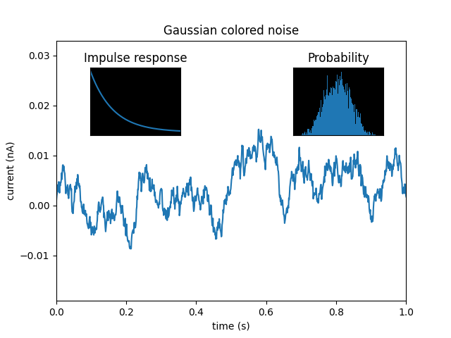
軸演示#
在主繪圖軸內建立嵌入軸的 fig.add_axes 使用範例。
另請參閱模組 - axes_grid1區段,以及以下三個範例
import matplotlib.pyplot as plt
import numpy as np

np.random.seed(19680801)  # Fixing random state for reproducibility.

# create some data to use for the plot
dt = 0.001
t = np.arange(0.0, 10.0, dt)
r = np.exp(-t[:1000] / 0.05)  # impulse response
x = np.random.randn(len(t))
s = np.convolve(x, r)[:len(x)] * dt  # colored noise

fig, main_ax = plt.subplots()
main_ax.plot(t, s)
main_ax.set_xlim(0, 1)
main_ax.set_ylim(1.1 * np.min(s), 2 * np.max(s))
main_ax.set_xlabel('time (s)')
main_ax.set_ylabel('current (nA)')
main_ax.set_title('Gaussian colored noise')

# this is an inset Axes over the main Axes
right_inset_ax = fig.add_axes([.65, .6, .2, .2], facecolor='k')
right_inset_ax.hist(s, 400, density=True)
right_inset_ax.set(title='Probability', xticks=[], yticks=[])

# this is another inset Axes over the main Axes
left_inset_ax = fig.add_axes([.2, .6, .2, .2], facecolor='k')
left_inset_ax.plot(t[:len(r)], r)
left_inset_ax.set(title='Impulse response', xlim=(0, .2), xticks=[], yticks=[])

plt.show()
腳本總執行時間:(0 分鐘 1.946 秒)