注意
跳至結尾以下載完整範例程式碼。
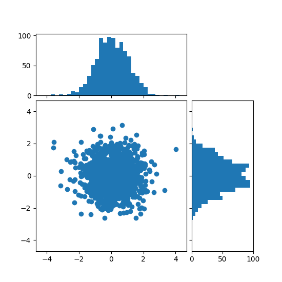
使用可定位軸對齊散佈圖的直方圖#
在圖形的側邊,以直方圖形式顯示散佈圖的邊際分佈。
為了使主軸與邊際軸對齊,軸的位置是由 Divider 定義,它是透過 make_axes_locatable 產生。請注意,Divider API 允許以英寸為單位設定軸的大小和邊距,這是其主要功能。
如果想要相對於主圖形設定軸的大小和邊距,請參閱 具有直方圖的散佈圖 範例。
import matplotlib.pyplot as plt
import numpy as np

from mpl_toolkits.axes_grid1 import make_axes_locatable

# Fixing random state for reproducibility
np.random.seed(19680801)

# the random data
x = np.random.randn(1000)
y = np.random.randn(1000)


fig, ax = plt.subplots(figsize=(5.5, 5.5))

# the scatter plot:
ax.scatter(x, y)

# Set aspect of the main Axes.
ax.set_aspect(1.)

# create new Axes on the right and on the top of the current Axes
divider = make_axes_locatable(ax)
# below height and pad are in inches
ax_histx = divider.append_axes("top", 1.2, pad=0.1, sharex=ax)
ax_histy = divider.append_axes("right", 1.2, pad=0.1, sharey=ax)

# make some labels invisible
ax_histx.xaxis.set_tick_params(labelbottom=False)
ax_histy.yaxis.set_tick_params(labelleft=False)

# now determine nice limits by hand:
binwidth = 0.25
xymax = max(np.max(np.abs(x)), np.max(np.abs(y)))
lim = (int(xymax/binwidth) + 1)*binwidth

bins = np.arange(-lim, lim + binwidth, binwidth)
ax_histx.hist(x, bins=bins)
ax_histy.hist(y, bins=bins, orientation='horizontal')

# the xaxis of ax_histx and yaxis of ax_histy are shared with ax,
# thus there is no need to manually adjust the xlim and ylim of these
# axis.

ax_histx.set_yticks([0, 50, 100])
ax_histy.set_xticks([0, 50, 100])

plt.show()
參考資料
此範例顯示了以下函數、方法、類別和模組的使用方法