注意
前往結尾以下載完整的範例程式碼。
在 2D 影像中混合透明度與色彩#
混合透明度與色彩,以使用 imshow 突出顯示資料的各個部分。
matplotlib.pyplot.imshow 的常見用途是繪製 2D 統計地圖。此函式可輕鬆將 2D 矩陣視覺化為影像,並將透明度新增至輸出。例如,可以繪製統計量(例如 t 統計量),並根據每個像素的 p 值對其透明度著色。此範例示範如何達成此效果。
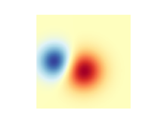
首先,我們將產生一些資料,在這種情況下,我們將在 2D 格線中建立兩個 2D「斑點」。一個斑點為正值,另一個為負值。
import matplotlib.pyplot as plt
import numpy as np

from matplotlib.colors import Normalize


def normal_pdf(x, mean, var):
    return np.exp(-(x - mean)**2 / (2*var))


# Generate the space in which the blobs will live
xmin, xmax, ymin, ymax = (0, 100, 0, 100)
n_bins = 100
xx = np.linspace(xmin, xmax, n_bins)
yy = np.linspace(ymin, ymax, n_bins)

# Generate the blobs. The range of the values is roughly -.0002 to .0002
means_high = [20, 50]
means_low = [50, 60]
var = [150, 200]

gauss_x_high = normal_pdf(xx, means_high[0], var[0])
gauss_y_high = normal_pdf(yy, means_high[1], var[0])

gauss_x_low = normal_pdf(xx, means_low[0], var[1])
gauss_y_low = normal_pdf(yy, means_low[1], var[1])

weights = (np.outer(gauss_y_high, gauss_x_high)
           - np.outer(gauss_y_low, gauss_x_low))

# We'll also create a grey background into which the pixels will fade
greys = np.full((*weights.shape, 3), 70, dtype=np.uint8)

# First we'll plot these blobs using ``imshow`` without transparency.
vmax = np.abs(weights).max()
imshow_kwargs = {
    'vmax': vmax,
    'vmin': -vmax,
    'cmap': 'RdYlBu',
    'extent': (xmin, xmax, ymin, ymax),
}

fig, ax = plt.subplots()
ax.imshow(greys)
ax.imshow(weights, **imshow_kwargs)
ax.set_axis_off()
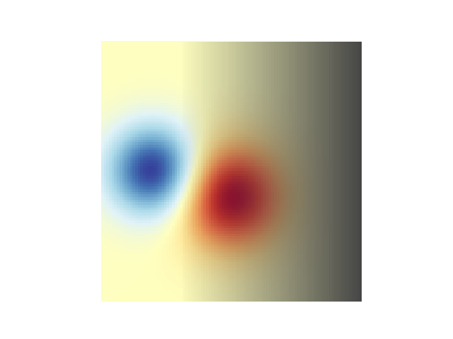
混合透明度#
當使用 matplotlib.pyplot.imshow 繪製資料時,包含透明度的最簡單方法是將與資料形狀相符的陣列傳遞給 alpha 引數。例如,我們將在下方建立一個從左到右移動的漸層。
# Create an alpha channel of linearly increasing values moving to the right.
alphas = np.ones(weights.shape)
alphas[:, 30:] = np.linspace(1, 0, 70)

# Create the figure and image
# Note that the absolute values may be slightly different
fig, ax = plt.subplots()
ax.imshow(greys)
ax.imshow(weights, alpha=alphas, **imshow_kwargs)
ax.set_axis_off()
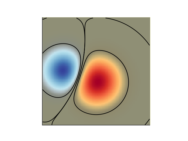
使用透明度突出顯示高振幅值#
最後,我們將重新建立相同的圖表,但這次我們將使用透明度來突出顯示資料中的極端值。這通常用於突出顯示具有較小 p 值資料點。我們還將新增等高線,以突出顯示影像值。
# Create an alpha channel based on weight values
# Any value whose absolute value is > .0001 will have zero transparency
alphas = Normalize(0, .3, clip=True)(np.abs(weights))
alphas = np.clip(alphas, .4, 1)  # alpha value clipped at the bottom at .4

# Create the figure and image
# Note that the absolute values may be slightly different
fig, ax = plt.subplots()
ax.imshow(greys)
ax.imshow(weights, alpha=alphas, **imshow_kwargs)

# Add contour lines to further highlight different levels.
ax.contour(weights[::-1], levels=[-.1, .1], colors='k', linestyles='-')
ax.set_axis_off()
plt.show()

ax.contour(weights[::-1], levels=[-.0001, .0001], colors='k', linestyles='-')
ax.set_axis_off()
plt.show()
參考文獻
此範例中顯示了以下函數、方法、類別和模組的使用
腳本總執行時間:(0 分鐘 2.027 秒)