註解
前往結尾以下載完整的範例程式碼。
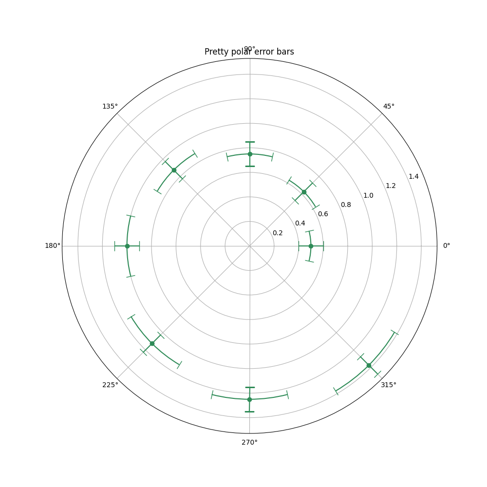
極座標軸上的誤差條呈現#
極座標中誤差條繪圖的示範。Theta 誤差條是以曲線表示,並以朝向中心的帽狀符號結束。半徑誤差條是以直線表示,並以朝向中心且與之垂直的帽狀符號結束。
import matplotlib.pyplot as plt
import numpy as np

theta = np.arange(0, 2 * np.pi, np.pi / 4)
r = theta / np.pi / 2 + 0.5

fig = plt.figure(figsize=(10, 10))
ax = fig.add_subplot(projection='polar')
ax.errorbar(theta, r, xerr=0.25, yerr=0.1, capsize=7, fmt="o", c="seagreen")
ax.set_title("Pretty polar error bars")
plt.show()
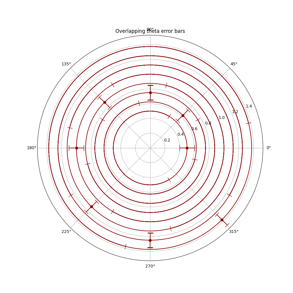
請注意,大型 Theta 誤差條會重疊。這可能會降低輸出圖的可讀性。請參閱下方範例圖
fig = plt.figure(figsize=(10, 10))
ax = fig.add_subplot(projection='polar')
ax.errorbar(theta, r, xerr=5.25, yerr=0.1, capsize=7, fmt="o", c="darkred")
ax.set_title("Overlapping theta error bars")
plt.show()
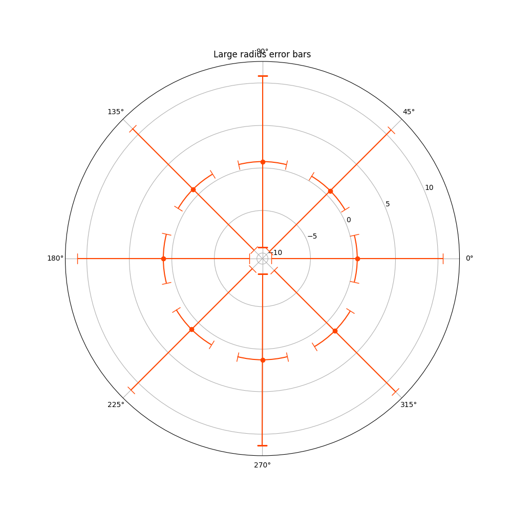
另一方面,大型半徑誤差條永遠不會重疊,它們只會導致資料中出現不必要的刻度,縮小顯示的範圍。
fig = plt.figure(figsize=(10, 10))
ax = fig.add_subplot(projection='polar')
ax.errorbar(theta, r, xerr=0.25, yerr=10.1, capsize=7, fmt="o", c="orangered")
ax.set_title("Large radius error bars")
plt.show()
參考文獻
此範例中顯示以下函式、方法、類別和模組的用法
腳本的總執行時間: (0 分鐘 3.959 秒)