注意
前往結尾以下載完整的範例程式碼。
次要軸#
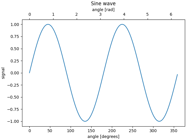
有時我們希望在圖表上設定次要軸,例如將同一圖表上的弧度轉換為度數。我們可以透過使用 axes.Axes.secondary_xaxis 和 axes.Axes.secondary_yaxis 建立只有一個軸可見的子軸來完成此操作。這個次要軸可以使用與主軸不同的刻度,方法是在 *functions* 關鍵字引數中以元組的形式提供正向和反向轉換函數。
import datetime

import matplotlib.pyplot as plt
import numpy as np

import matplotlib.dates as mdates

fig, ax = plt.subplots(layout='constrained')
x = np.arange(0, 360, 1)
y = np.sin(2 * x * np.pi / 180)
ax.plot(x, y)
ax.set_xlabel('angle [degrees]')
ax.set_ylabel('signal')
ax.set_title('Sine wave')


def deg2rad(x):
    return x * np.pi / 180


def rad2deg(x):
    return x * 180 / np.pi


secax = ax.secondary_xaxis('top', functions=(deg2rad, rad2deg))
secax.set_xlabel('angle [rad]')
plt.show()
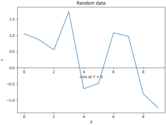
預設情況下,次要軸是在軸座標空間中繪製的。我們也可以提供自訂轉換,將它放置在不同的座標空間中。在此,我們將軸放置在資料座標的 Y = 0 處。
fig, ax = plt.subplots(layout='constrained')
x = np.arange(0, 10)
np.random.seed(19680801)
y = np.random.randn(len(x))
ax.plot(x, y)
ax.set_xlabel('X')
ax.set_ylabel('Y')
ax.set_title('Random data')

# Pass ax.transData as a transform to place the axis relative to our data
secax = ax.secondary_xaxis(0, transform=ax.transData)
secax.set_xlabel('Axis at Y = 0')
plt.show()
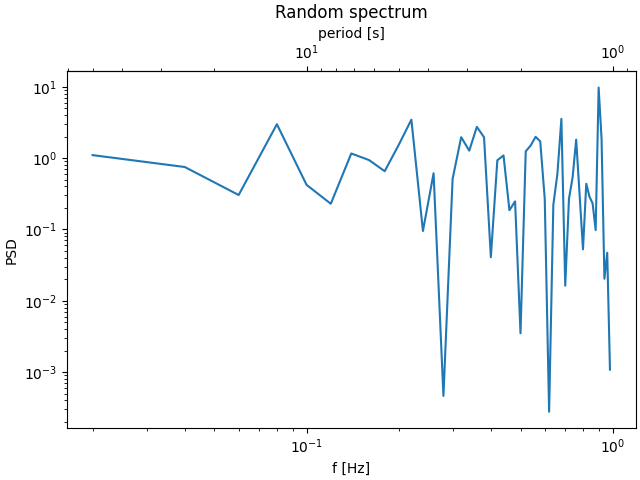
以下是以對數刻度將波数轉換為波長的範例。
注意
在此範例中,父軸的 xscale 是對數的,因此子軸也會設為對數。
fig, ax = plt.subplots(layout='constrained')
x = np.arange(0.02, 1, 0.02)
np.random.seed(19680801)
y = np.random.randn(len(x)) ** 2
ax.loglog(x, y)
ax.set_xlabel('f [Hz]')
ax.set_ylabel('PSD')
ax.set_title('Random spectrum')


def one_over(x):
    """Vectorized 1/x, treating x==0 manually"""
    x = np.array(x, float)
    near_zero = np.isclose(x, 0)
    x[near_zero] = np.inf
    x[~near_zero] = 1 / x[~near_zero]
    return x


# the function "1/x" is its own inverse
inverse = one_over


secax = ax.secondary_xaxis('top', functions=(one_over, inverse))
secax.set_xlabel('period [s]')
plt.show()
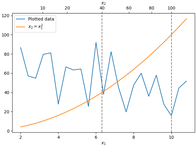
有時我們希望在轉換中關聯軸,該轉換是從資料臨時產生的,並且是根據經驗得出的。或者,一個軸可能是另一個軸的複雜非線性函數。在這些情況下,我們可以將正向和反向轉換函數設定為從一組自變數到另一組自變數的線性內插。
注意
為了適當處理資料邊距,需要將對應函數 (本範例中的 forward 和 inverse) 定義在名義繪圖限制之外。此條件可以透過將內插延伸到繪製值之外 (向左和向右) 來強制執行,請參閱下方的 x1n 和 x2n。
fig, ax = plt.subplots(layout='constrained')
x1_vals = np.arange(2, 11, 0.4)
# second independent variable is a nonlinear function of the other.
x2_vals = x1_vals ** 2
ydata = 50.0 + 20 * np.random.randn(len(x1_vals))
ax.plot(x1_vals, ydata, label='Plotted data')
ax.plot(x1_vals, x2_vals, label=r'$x_2 = x_1^2$')
ax.set_xlabel(r'$x_1$')
ax.legend()

# the forward and inverse functions must be defined on the complete visible axis range
x1n = np.linspace(0, 20, 201)
x2n = x1n**2


def forward(x):
    return np.interp(x, x1n, x2n)


def inverse(x):
    return np.interp(x, x2n, x1n)

# use axvline to prove that the derived secondary axis is correctly plotted
ax.axvline(np.sqrt(40), color="grey", ls="--")
ax.axvline(10, color="grey", ls="--")
secax = ax.secondary_xaxis('top', functions=(forward, inverse))
secax.set_xticks([10, 20, 40, 60, 80, 100])
secax.set_xlabel(r'$x_2$')

plt.show()
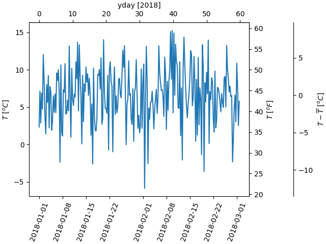
最後一個範例將 np.datetime64 轉換為 x 軸上的年度日,並將攝氏溫度轉換為 y 軸上的華氏溫度。請注意新增了第三個 y 軸,並且可以使用浮點數作為位置引數來放置它。
dates = [datetime.datetime(2018, 1, 1) + datetime.timedelta(hours=k * 6)
         for k in range(240)]
temperature = np.random.randn(len(dates)) * 4 + 6.7
fig, ax = plt.subplots(layout='constrained')

ax.plot(dates, temperature)
ax.set_ylabel(r'$T\ [^oC]$')
ax.xaxis.set_tick_params(rotation=70)


def date2yday(x):
    """Convert matplotlib datenum to days since 2018-01-01."""
    y = x - mdates.date2num(datetime.datetime(2018, 1, 1))
    return y


def yday2date(x):
    """Return a matplotlib datenum for *x* days after 2018-01-01."""
    y = x + mdates.date2num(datetime.datetime(2018, 1, 1))
    return y


secax_x = ax.secondary_xaxis('top', functions=(date2yday, yday2date))
secax_x.set_xlabel('yday [2018]')


def celsius_to_fahrenheit(x):
    return x * 1.8 + 32


def fahrenheit_to_celsius(x):
    return (x - 32) / 1.8


secax_y = ax.secondary_yaxis(
    'right', functions=(celsius_to_fahrenheit, fahrenheit_to_celsius))
secax_y.set_ylabel(r'$T\ [^oF]$')


def celsius_to_anomaly(x):
    return (x - np.mean(temperature))


def anomaly_to_celsius(x):
    return (x + np.mean(temperature))


# use of a float for the position:
secax_y2 = ax.secondary_yaxis(
    1.2, functions=(celsius_to_anomaly, anomaly_to_celsius))
secax_y2.set_ylabel(r'$T - \overline{T}\ [^oC]$')


plt.show()
參考資料
本範例中顯示以下函數、方法、類別和模組的使用方式
指令碼總執行時間: (0 分鐘 5.808 秒)