注意
前往結尾下載完整的範例程式碼。
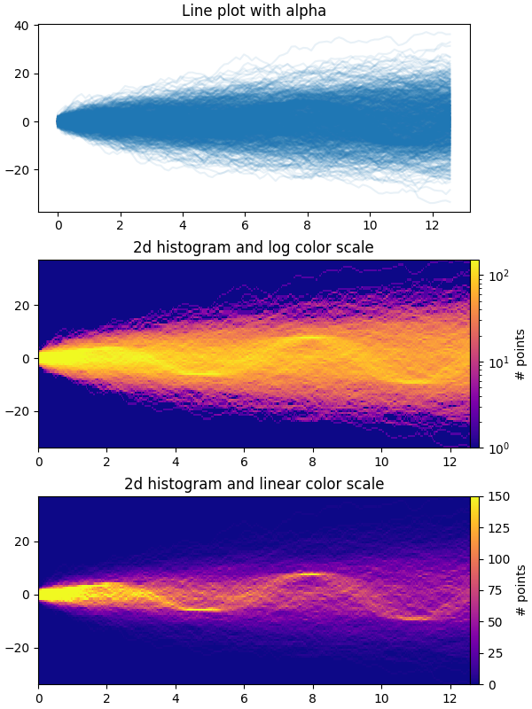
時間序列直方圖#
此範例示範如何有效率地視覺化大量的時間序列,以便潛在地揭示不明顯的隱藏子結構和模式,並以視覺上吸引人的方式顯示它們。
在此範例中,我們產生多個正弦「訊號」序列,這些序列埋藏在大量的隨機遊走「雜訊/背景」序列下。對於標準差為 σ 的無偏高斯隨機遊走,經過 n 步後與原點的 RMS 偏差為 σ*sqrt(n)。因此,為了使正弦波在與隨機遊走相同的尺度上可見,我們將振幅按隨機遊走 RMS 縮放。此外,我們還引入一個小的隨機偏移 phi 以左右移動正弦波,並添加一些加性隨機雜訊以向上/向下移動個別資料點,使訊號更「真實」一點(您不會期望在資料中出現完美正弦波)。
第一個圖顯示了使用 plt.plot 和一個小值 alpha 將多個時間序列彼此重疊的典型視覺化方式。第二個和第三個圖顯示了如何使用 np.histogram2d 和 plt.pcolormesh 將資料重新解釋為 2D 直方圖,並可在資料點之間進行內插。
import time

import matplotlib.pyplot as plt
import numpy as np

fig, axes = plt.subplots(nrows=3, figsize=(6, 8), layout='constrained')

# Fix random state for reproducibility
np.random.seed(19680801)
# Make some data; a 1D random walk + small fraction of sine waves
num_series = 1000
num_points = 100
SNR = 0.10  # Signal to Noise Ratio
x = np.linspace(0, 4 * np.pi, num_points)
# Generate unbiased Gaussian random walks
Y = np.cumsum(np.random.randn(num_series, num_points), axis=-1)
# Generate sinusoidal signals
num_signal = round(SNR * num_series)
phi = (np.pi / 8) * np.random.randn(num_signal, 1)  # small random offset
Y[-num_signal:] = (
    np.sqrt(np.arange(num_points))  # random walk RMS scaling factor
    * (np.sin(x - phi)
       + 0.05 * np.random.randn(num_signal, num_points))  # small random noise
)


# Plot series using `plot` and a small value of `alpha`. With this view it is
# very difficult to observe the sinusoidal behavior because of how many
# overlapping series there are. It also takes a bit of time to run because so
# many individual artists need to be generated.
tic = time.time()
axes[0].plot(x, Y.T, color="C0", alpha=0.1)
toc = time.time()
axes[0].set_title("Line plot with alpha")
print(f"{toc-tic:.3f} sec. elapsed")


# Now we will convert the multiple time series into a histogram. Not only will
# the hidden signal be more visible, but it is also a much quicker procedure.
tic = time.time()
# Linearly interpolate between the points in each time series
num_fine = 800
x_fine = np.linspace(x.min(), x.max(), num_fine)
y_fine = np.concatenate([np.interp(x_fine, x, y_row) for y_row in Y])
x_fine = np.broadcast_to(x_fine, (num_series, num_fine)).ravel()


# Plot (x, y) points in 2d histogram with log colorscale
# It is pretty evident that there is some kind of structure under the noise
# You can tune vmax to make signal more visible
cmap = plt.colormaps["plasma"]
cmap = cmap.with_extremes(bad=cmap(0))
h, xedges, yedges = np.histogram2d(x_fine, y_fine, bins=[400, 100])
pcm = axes[1].pcolormesh(xedges, yedges, h.T, cmap=cmap,
                         norm="log", vmax=1.5e2, rasterized=True)
fig.colorbar(pcm, ax=axes[1], label="# points", pad=0)
axes[1].set_title("2d histogram and log color scale")

# Same data but on linear color scale
pcm = axes[2].pcolormesh(xedges, yedges, h.T, cmap=cmap,
                         vmax=1.5e2, rasterized=True)
fig.colorbar(pcm, ax=axes[2], label="# points", pad=0)
axes[2].set_title("2d histogram and linear color scale")

toc = time.time()
print(f"{toc-tic:.3f} sec. elapsed")
plt.show()
0.424 sec. elapsed
0.106 sec. elapsed
參考文獻
此範例中顯示了下列函式、方法、類別和模組的使用
指令碼的總執行時間: (0 分鐘 3.888 秒)