注意
前往結尾以下載完整的範例程式碼。
選取事件演示 2#
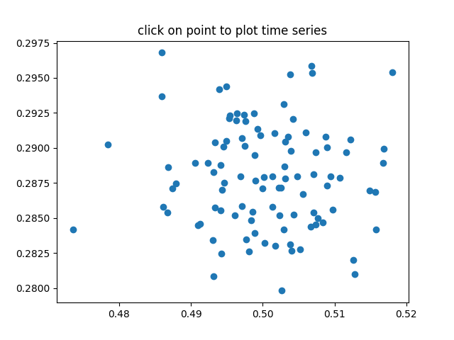
計算 100 個資料集的平均值 (mu) 和標準差 (sigma),並繪製 mu 與 sigma 的關係圖。當您按一下其中一個 (mu, sigma) 點時,繪製產生此點的資料集的原始資料。
注意
此範例會練習 Matplotlib 的互動功能,並且不會出現在靜態文件中。請在您的機器上執行此程式碼以查看互動性。
您可以複製並貼上個別部分,或使用頁面底部的連結下載整個範例。
import matplotlib.pyplot as plt
import numpy as np

# Fixing random state for reproducibility
np.random.seed(19680801)

X = np.random.rand(100, 1000)
xs = np.mean(X, axis=1)
ys = np.std(X, axis=1)

fig, ax = plt.subplots()
ax.set_title('click on point to plot time series')
line, = ax.plot(xs, ys, 'o', picker=True, pickradius=5)


def onpick(event):

    if event.artist != line:
        return

    N = len(event.ind)
    if not N:
        return

    figi, axs = plt.subplots(N, squeeze=False)
    for ax, dataind in zip(axs.flat, event.ind):
        ax.plot(X[dataind])
        ax.text(.05, .9, f'mu={xs[dataind]:1.3f}\nsigma={ys[dataind]:1.3f}',
                transform=ax.transAxes, va='top')
        ax.set_ylim(-0.5, 1.5)
    figi.show()


fig.canvas.mpl_connect('pick_event', onpick)

plt.show()