注意
跳到結尾以下載完整的範例程式碼。
直方圖#
如何使用 Matplotlib 繪製直方圖。
import matplotlib.pyplot as plt
import numpy as np

from matplotlib import colors
from matplotlib.ticker import PercentFormatter

# Create a random number generator with a fixed seed for reproducibility
rng = np.random.default_rng(19680801)
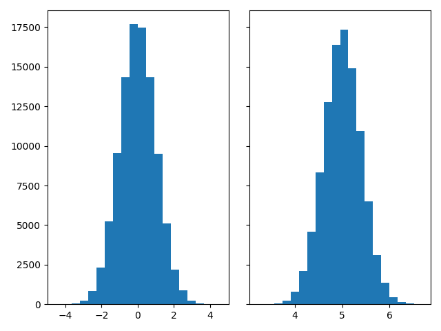
產生資料並繪製簡單的直方圖#
若要產生 1D 直方圖,我們只需要單一的數字向量。對於 2D 直方圖,我們需要第二個向量。我們將在下方產生兩個向量,並顯示每個向量的直方圖。
N_points = 100000
n_bins = 20

# Generate two normal distributions
dist1 = rng.standard_normal(N_points)
dist2 = 0.4 * rng.standard_normal(N_points) + 5

fig, axs = plt.subplots(1, 2, sharey=True, tight_layout=True)

# We can set the number of bins with the *bins* keyword argument.
axs[0].hist(dist1, bins=n_bins)
axs[1].hist(dist2, bins=n_bins)

plt.show()
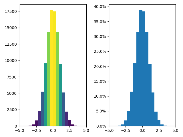
更新直方圖顏色#
直方圖方法會傳回(除其他外)一個 patches 物件。這讓我們可以存取所繪製物件的屬性。使用此功能,我們可以根據自己的喜好編輯直方圖。讓我們根據每個長條的 y 值變更其顏色。
fig, axs = plt.subplots(1, 2, tight_layout=True)

# N is the count in each bin, bins is the lower-limit of the bin
N, bins, patches = axs[0].hist(dist1, bins=n_bins)

# We'll color code by height, but you could use any scalar
fracs = N / N.max()

# we need to normalize the data to 0..1 for the full range of the colormap
norm = colors.Normalize(fracs.min(), fracs.max())

# Now, we'll loop through our objects and set the color of each accordingly
for thisfrac, thispatch in zip(fracs, patches):
    color = plt.cm.viridis(norm(thisfrac))
    thispatch.set_facecolor(color)

# We can also normalize our inputs by the total number of counts
axs[1].hist(dist1, bins=n_bins, density=True)

# Now we format the y-axis to display percentage
axs[1].yaxis.set_major_formatter(PercentFormatter(xmax=1))
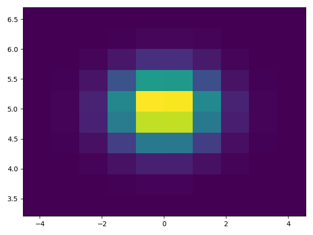
繪製 2D 直方圖#
若要繪製 2D 直方圖,只需要兩個相同長度的向量,對應於直方圖的每個軸。
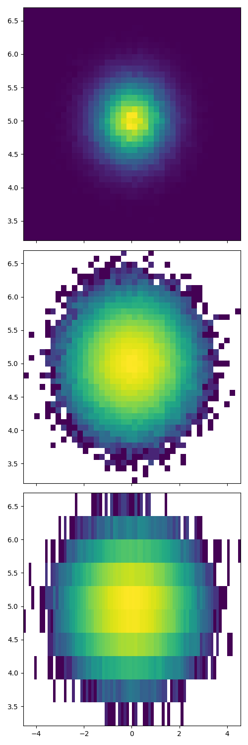
自訂直方圖#
自訂 2D 直方圖與 1D 直方圖類似,您可以控制視覺元件,例如長條大小或色彩正規化。
fig, axs = plt.subplots(3, 1, figsize=(5, 15), sharex=True, sharey=True,
                        tight_layout=True)

# We can increase the number of bins on each axis
axs[0].hist2d(dist1, dist2, bins=40)

# As well as define normalization of the colors
axs[1].hist2d(dist1, dist2, bins=40, norm=colors.LogNorm())

# We can also define custom numbers of bins for each axis
axs[2].hist2d(dist1, dist2, bins=(80, 10), norm=colors.LogNorm())
參考文獻
此範例中顯示下列函數、方法、類別和模組的使用
指令碼的總執行時間:(0 分鐘 3.457 秒)