注意
前往結尾以下載完整的範例程式碼。
圖表標籤:suptitle、supxlabel、supylabel#
每個軸都可以有一個標題(或實際上三個,每個標題的loc為「左」、「置中」和「右」),但有時需要使用Figure.suptitle為整個圖表(或SubFigure)提供整體標題。
我們也可以使用Figure.supxlabel和Figure.supylabel新增圖表層級的 x 和 y 標籤。
import matplotlib.pyplot as plt
import numpy as np
from matplotlib.cbook import get_sample_data
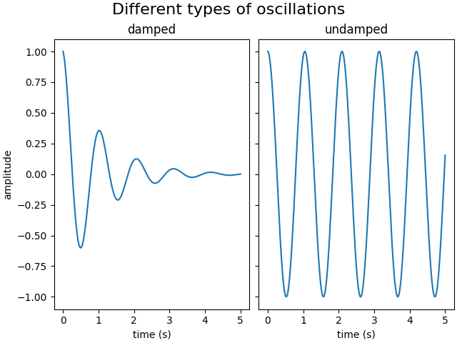
x = np.linspace(0.0, 5.0, 501)
fig, (ax1, ax2) = plt.subplots(1, 2, layout='constrained', sharey=True)
ax1.plot(x, np.cos(6*x) * np.exp(-x))
ax1.set_title('damped')
ax1.set_xlabel('time (s)')
ax1.set_ylabel('amplitude')
ax2.plot(x, np.cos(6*x))
ax2.set_xlabel('time (s)')
ax2.set_title('undamped')
fig.suptitle('Different types of oscillations', fontsize=16)
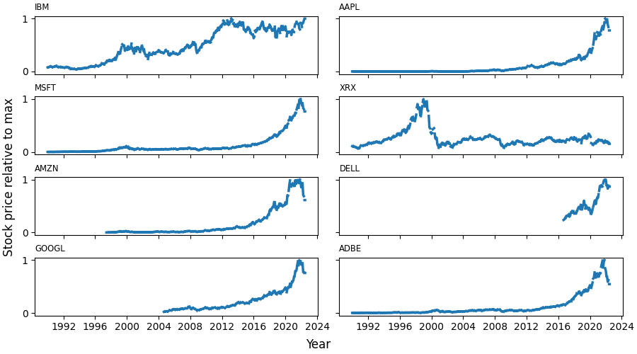
可以使用Figure.supxlabel和Figure.supylabel方法設定全域 x 或 y 標籤。
with get_sample_data('Stocks.csv') as file:
    stocks = np.genfromtxt(
        file, delimiter=',', names=True, dtype=None,
        converters={0: lambda x: np.datetime64(x, 'D')}, skip_header=1)

fig, axs = plt.subplots(4, 2, figsize=(9, 5), layout='constrained',
                        sharex=True, sharey=True)
for nn, ax in enumerate(axs.flat):
    column_name = stocks.dtype.names[1+nn]
    y = stocks[column_name]
    line, = ax.plot(stocks['Date'], y / np.nanmax(y), lw=2.5)
    ax.set_title(column_name, fontsize='small', loc='left')
fig.supxlabel('Year')
fig.supylabel('Stock price relative to max')

plt.show()
腳本的總執行時間:(0 分鐘 5.119 秒)