注意
前往末尾下載完整的範例程式碼。
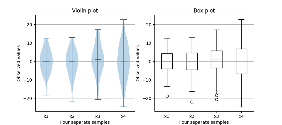
盒狀圖與小提琴圖比較#
請注意,雖然小提琴圖與 Tukey (1977) 的盒狀圖密切相關,但它們新增了有用的資訊,例如樣本資料的分配(密度追蹤)。
預設情況下,盒狀圖會將 1.5 * 四分位距之外的資料點顯示為晶鬚上方或下方的離群值,而小提琴圖會顯示資料的整個範圍。
關於盒狀圖及其歷史的良好一般參考文獻可以在這裡找到:http://vita.had.co.nz/papers/boxplots.pdf
小提琴圖需要 matplotlib >= 1.4。
如需有關小提琴圖的更多資訊,scikit-learn 文件中有一個很棒的章節:https://scikit-learn.dev.org.tw/stable/modules/density.html
import matplotlib.pyplot as plt
import numpy as np

fig, axs = plt.subplots(nrows=1, ncols=2, figsize=(9, 4))

# Fixing random state for reproducibility
np.random.seed(19680801)


# generate some random test data
all_data = [np.random.normal(0, std, 100) for std in range(6, 10)]

# plot violin plot
axs[0].violinplot(all_data,
                  showmeans=False,
                  showmedians=True)
axs[0].set_title('Violin plot')

# plot box plot
axs[1].boxplot(all_data)
axs[1].set_title('Box plot')

# adding horizontal grid lines
for ax in axs:
    ax.yaxis.grid(True)
    ax.set_xticks([y + 1 for y in range(len(all_data))],
                  labels=['x1', 'x2', 'x3', 'x4'])
    ax.set_xlabel('Four separate samples')
    ax.set_ylabel('Observed values')

plt.show()
參考
此範例中顯示了以下函數、方法、類別和模組的使用
腳本的總執行時間:(0 分鐘 1.281 秒)