注意
跳至結尾以下載完整的範例程式碼。
功率譜密度 (PSD)#
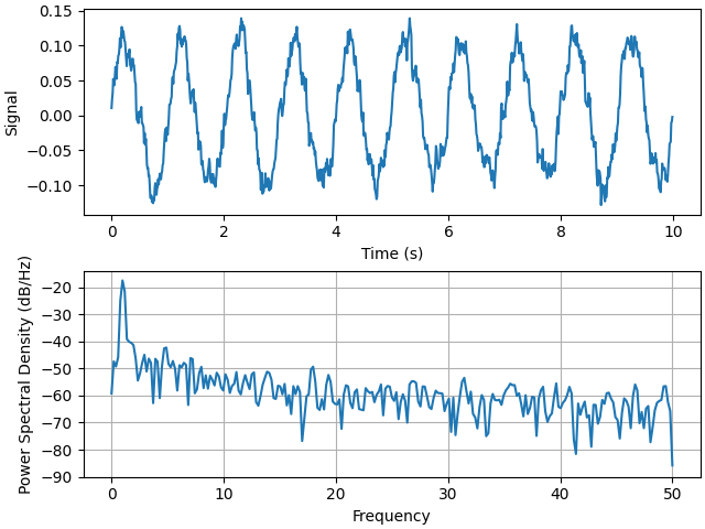
使用 psd 繪製功率譜密度 (PSD)。
PSD 是訊號處理領域中的常見圖形。NumPy 有許多有用的程式庫可計算 PSD。以下我們示範一些如何使用 Matplotlib 完成並視覺化此操作的範例。
import matplotlib.pyplot as plt
import numpy as np

import matplotlib.mlab as mlab

# Fixing random state for reproducibility
np.random.seed(19680801)

dt = 0.01
t = np.arange(0, 10, dt)
nse = np.random.randn(len(t))
r = np.exp(-t / 0.05)

cnse = np.convolve(nse, r) * dt
cnse = cnse[:len(t)]
s = 0.1 * np.sin(2 * np.pi * t) + cnse

fig, (ax0, ax1) = plt.subplots(2, 1, layout='constrained')
ax0.plot(t, s)
ax0.set_xlabel('Time (s)')
ax0.set_ylabel('Signal')
ax1.psd(s, NFFT=512, Fs=1 / dt)

plt.show()
將此與完成相同操作的等效 Matlab 程式碼進行比較
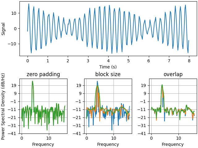
以下我們將展示一個稍微複雜的範例,示範填充如何影響結果 PSD。
dt = np.pi / 100.
fs = 1. / dt
t = np.arange(0, 8, dt)
y = 10. * np.sin(2 * np.pi * 4 * t) + 5. * np.sin(2 * np.pi * 4.25 * t)
y = y + np.random.randn(*t.shape)

# Plot the raw time series
fig, axs = plt.subplot_mosaic([
    ['signal', 'signal', 'signal'],
    ['zero padding', 'block size', 'overlap'],
], layout='constrained')

axs['signal'].plot(t, y)
axs['signal'].set_xlabel('Time (s)')
axs['signal'].set_ylabel('Signal')

# Plot the PSD with different amounts of zero padding. This uses the entire
# time series at once
axs['zero padding'].psd(y, NFFT=len(t), pad_to=len(t), Fs=fs)
axs['zero padding'].psd(y, NFFT=len(t), pad_to=len(t) * 2, Fs=fs)
axs['zero padding'].psd(y, NFFT=len(t), pad_to=len(t) * 4, Fs=fs)

# Plot the PSD with different block sizes, Zero pad to the length of the
# original data sequence.
axs['block size'].psd(y, NFFT=len(t), pad_to=len(t), Fs=fs)
axs['block size'].psd(y, NFFT=len(t) // 2, pad_to=len(t), Fs=fs)
axs['block size'].psd(y, NFFT=len(t) // 4, pad_to=len(t), Fs=fs)
axs['block size'].set_ylabel('')

# Plot the PSD with different amounts of overlap between blocks
axs['overlap'].psd(y, NFFT=len(t) // 2, pad_to=len(t), noverlap=0, Fs=fs)
axs['overlap'].psd(y, NFFT=len(t) // 2, pad_to=len(t),
                   noverlap=int(0.025 * len(t)), Fs=fs)
axs['overlap'].psd(y, NFFT=len(t) // 2, pad_to=len(t),
                   noverlap=int(0.1 * len(t)), Fs=fs)
axs['overlap'].set_ylabel('')
axs['overlap'].set_title('overlap')

for title, ax in axs.items():
    if title == 'signal':
        continue

    ax.set_title(title)
    ax.sharex(axs['zero padding'])
    ax.sharey(axs['zero padding'])

plt.show()
這是 MATLAB 訊號處理工具箱中的範例的移植版本,該範例一度顯示 Matplotlib 與 MATLAB 的 PSD 縮放比例之間存在一些差異。
fs = 1000
t = np.linspace(0, 0.3, 301)
A = np.array([2, 8]).reshape(-1, 1)
f = np.array([150, 140]).reshape(-1, 1)
xn = (A * np.sin(2 * np.pi * f * t)).sum(axis=0)
xn += 5 * np.random.randn(*t.shape)

fig, (ax0, ax1) = plt.subplots(ncols=2, layout='constrained')

yticks = np.arange(-50, 30, 10)
yrange = (yticks[0], yticks[-1])
xticks = np.arange(0, 550, 100)

ax0.psd(xn, NFFT=301, Fs=fs, window=mlab.window_none, pad_to=1024,
        scale_by_freq=True)
ax0.set_title('Periodogram')
ax0.set_yticks(yticks)
ax0.set_xticks(xticks)
ax0.grid(True)
ax0.set_ylim(yrange)

ax1.psd(xn, NFFT=150, Fs=fs, window=mlab.window_none, pad_to=512, noverlap=75,
        scale_by_freq=True)
ax1.set_title('Welch')
ax1.set_xticks(xticks)
ax1.set_yticks(yticks)
ax1.set_ylabel('')  # overwrite the y-label added by `psd`
ax1.grid(True)
ax1.set_ylim(yrange)

plt.show()
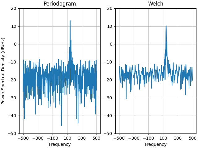
這是 MATLAB 訊號處理工具箱中的範例的移植版本,該範例一度顯示 Matplotlib 與 MATLAB 的 PSD 縮放比例之間存在一些差異。
它使用複雜訊號,因此我們可以看見複雜 PSD 正常運作。
prng = np.random.RandomState(19680801)  # to ensure reproducibility

fs = 1000
t = np.linspace(0, 0.3, 301)
A = np.array([2, 8]).reshape(-1, 1)
f = np.array([150, 140]).reshape(-1, 1)
xn = (A * np.exp(2j * np.pi * f * t)).sum(axis=0) + 5 * prng.randn(*t.shape)

fig, (ax0, ax1) = plt.subplots(ncols=2, layout='constrained')

yticks = np.arange(-50, 30, 10)
yrange = (yticks[0], yticks[-1])
xticks = np.arange(-500, 550, 200)

ax0.psd(xn, NFFT=301, Fs=fs, window=mlab.window_none, pad_to=1024,
        scale_by_freq=True)
ax0.set_title('Periodogram')
ax0.set_yticks(yticks)
ax0.set_xticks(xticks)
ax0.grid(True)
ax0.set_ylim(yrange)

ax1.psd(xn, NFFT=150, Fs=fs, window=mlab.window_none, pad_to=512, noverlap=75,
        scale_by_freq=True)
ax1.set_title('Welch')
ax1.set_xticks(xticks)
ax1.set_yticks(yticks)
ax1.set_ylabel('')  # overwrite the y-label added by `psd`
ax1.grid(True)
ax1.set_ylim(yrange)

plt.show()
指令碼的總執行時間:(0 分鐘 5.422 秒)