注意
跳到最後下載完整的範例程式碼。
快速入門指南#
本教學涵蓋一些基本的使用模式和最佳實踐,以幫助您開始使用 Matplotlib。
import matplotlib.pyplot as plt
import numpy as np
一個簡單的範例#
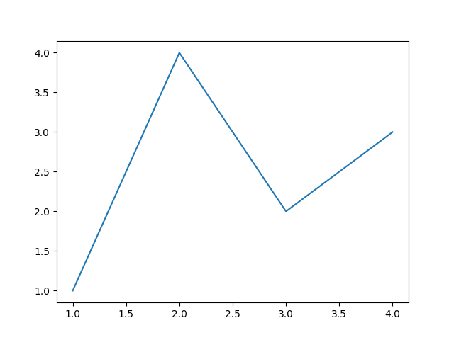
Matplotlib 將您的資料繪製在 Figure 上(例如,視窗、Jupyter 小工具等),每個 Figure 可以包含一個或多個 Axes,這是一個可以在 x-y 座標(或極座標圖中的 theta-r、3D 圖中的 x-y-z 等)中指定點的區域。建立包含 Axes 的 Figure 最簡單的方法是使用 pyplot.subplots。然後,我們可以透過 Axes.plot 在 Axes 上繪製一些資料,並使用 show 顯示圖形。
fig, ax = plt.subplots()             # Create a figure containing a single Axes.
ax.plot([1, 2, 3, 4], [1, 4, 2, 3])  # Plot some data on the Axes.
plt.show()                           # Show the figure.
根據您所處的環境,可以省略 plt.show()。例如,Jupyter 筆記本就是如此,它會自動顯示程式碼儲存格中建立的所有圖形。
圖形的組成部分#
以下是 Matplotlib 圖形的組成部分。
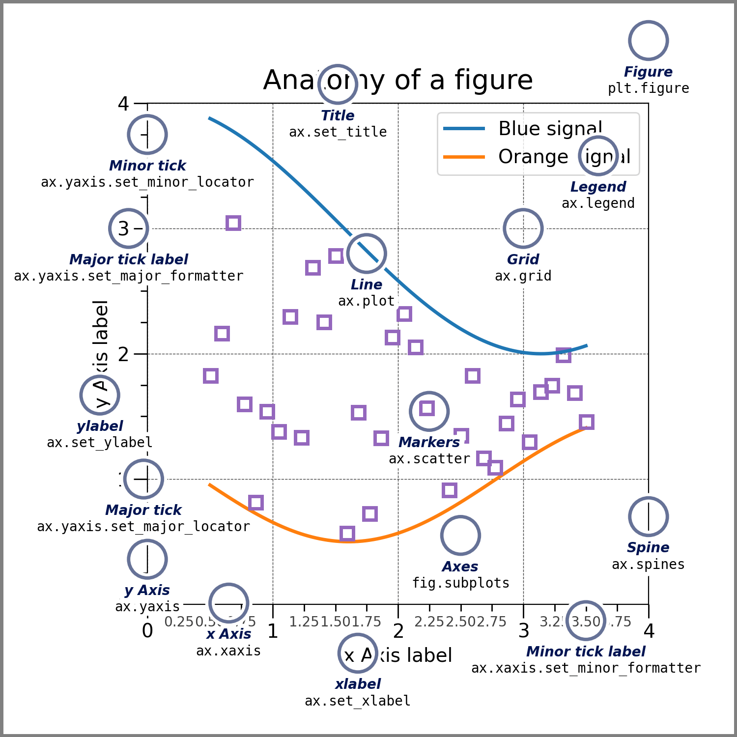
Figure#
整個圖形。Figure 會追蹤所有的子 Axes、一組「特殊」藝術家 (Artist)(標題、圖形圖例、顏色條等),甚至是巢狀子圖形。
通常,您將透過以下其中一個函數建立新的 Figure
fig = plt.figure()             # an empty figure with no Axes
fig, ax = plt.subplots()       # a figure with a single Axes
fig, axs = plt.subplots(2, 2)  # a figure with a 2x2 grid of Axes
# a figure with one Axes on the left, and two on the right:
fig, axs = plt.subplot_mosaic([['left', 'right_top'],
                               ['left', 'right_bottom']])
subplots() 和 subplot_mosaic 是方便的函數,它們還會在 Figure 內建立 Axes 物件,但您也可以稍後手動新增 Axes。
如需更多關於 Figure 的資訊,包括平移和縮放,請參閱圖形簡介。
Axes#
Axes 是一個附加到 Figure 的藝術家 (Artist),其中包含一個用於繪製資料的區域,通常包含兩個(或 3D 情況下三個)Axis 物件(請注意 Axes 和 Axis 之間的差異),這些物件提供刻度標記和刻度標籤,以提供 Axes 中資料的刻度。每個 Axes 還有一個標題(透過 set_title() 設定)、一個 x 標籤(透過 set_xlabel() 設定),以及一個透過 set_ylabel() 設定的 y 標籤)。
Axes 方法是配置大多數繪圖部分的主要介面(新增資料、控制軸刻度和限制、新增標籤等)。
Axis#
這些物件設定刻度和限制,並產生刻度標記(軸上的標記)和刻度標籤(標記刻度的字串)。刻度標記的位置由 Locator 物件決定,而刻度標籤字串則由 Formatter 格式化。正確的 Locator 和 Formatter 的組合可以對刻度標記位置和標籤進行非常精細的控制。
Artist#
基本上,Figure 上所有可見的內容都是藝術家 (Artist)(甚至是 Figure、Axes 和 Axis 物件)。這包括 Text 物件、Line2D 物件、collections 物件、Patch 物件等。當 Figure 渲染時,所有藝術家 (Artist) 都會繪製到畫布。大多數藝術家 (Artist) 都會連結到一個 Axes;這樣的藝術家 (Artist) 無法由多個 Axes 共用,或從一個 Axes 移動到另一個 Axes。
繪圖函數的輸入類型#
繪圖函式預期輸入為 numpy.array 或 numpy.ma.masked_array,或是可以傳遞給 numpy.asarray 的物件。類似陣列('array-like')的類別,如 pandas 資料物件和 numpy.matrix 可能無法如預期運作。常見的慣例是在繪圖之前將這些轉換為 numpy.array 物件。例如,要轉換一個 numpy.matrix
b = np.matrix([[1, 2], [3, 4]])
b_asarray = np.asarray(b)
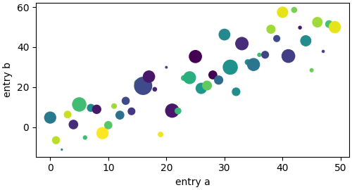
大多數方法也會解析類似字串索引物件,例如 dict、結構化的 numpy 陣列 或 pandas.DataFrame。 Matplotlib 允許您提供 data 關鍵字參數,並產生繪圖,傳遞對應於 x 和 y 變數的字串。
np.random.seed(19680801)  # seed the random number generator.
data = {'a': np.arange(50),
        'c': np.random.randint(0, 50, 50),
        'd': np.random.randn(50)}
data['b'] = data['a'] + 10 * np.random.randn(50)
data['d'] = np.abs(data['d']) * 100

fig, ax = plt.subplots(figsize=(5, 2.7), layout='constrained')
ax.scatter('a', 'b', c='c', s='d', data=data)
ax.set_xlabel('entry a')
ax.set_ylabel('entry b')
程式碼風格#
顯式和隱式介面#
如上所述,使用 Matplotlib 主要有兩種方式
顯式地建立 Figures 和 Axes,並在其上呼叫方法(「物件導向(OO)風格」)。
依靠 pyplot 隱式地建立和管理 Figures 和 Axes,並使用 pyplot 函式進行繪圖。
有關隱式和顯式介面之間權衡的說明,請參閱 Matplotlib 應用程式介面 (API)。
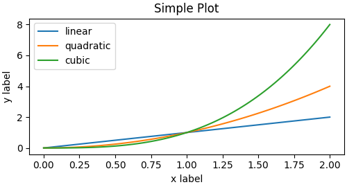
所以可以使用 OO 風格
x = np.linspace(0, 2, 100)  # Sample data.

# Note that even in the OO-style, we use `.pyplot.figure` to create the Figure.
fig, ax = plt.subplots(figsize=(5, 2.7), layout='constrained')
ax.plot(x, x, label='linear')  # Plot some data on the Axes.
ax.plot(x, x**2, label='quadratic')  # Plot more data on the Axes...
ax.plot(x, x**3, label='cubic')  # ... and some more.
ax.set_xlabel('x label')  # Add an x-label to the Axes.
ax.set_ylabel('y label')  # Add a y-label to the Axes.
ax.set_title("Simple Plot")  # Add a title to the Axes.
ax.legend()  # Add a legend.
或 pyplot 風格
x = np.linspace(0, 2, 100)  # Sample data.

plt.figure(figsize=(5, 2.7), layout='constrained')
plt.plot(x, x, label='linear')  # Plot some data on the (implicit) Axes.
plt.plot(x, x**2, label='quadratic')  # etc.
plt.plot(x, x**3, label='cubic')
plt.xlabel('x label')
plt.ylabel('y label')
plt.title("Simple Plot")
plt.legend()

(此外,還有一種第三種方法,用於將 Matplotlib 嵌入 GUI 應用程式的情況,它完全捨棄了 pyplot,即使是建立圖形也是如此。請參閱圖庫中的相應章節以獲取更多資訊:在圖形使用者介面中嵌入 Matplotlib。)
Matplotlib 的文件和範例同時使用 OO 和 pyplot 風格。一般來說,我們建議使用 OO 風格,特別是對於複雜的圖形,以及旨在作為更大專案一部分重複使用的函式和腳本。然而,對於快速互動式工作,pyplot 風格可能非常方便。
注意
您可能會發現較舊的範例使用 pylab 介面,透過 from pylab import *。這種方法已強烈不建議使用。
建立輔助函式#
如果您需要使用不同的資料集一遍又一遍地繪製相同的圖形,或者想要輕鬆地封裝 Matplotlib 方法,請使用以下建議的簽名函式。
然後您可以使用兩次來填充兩個子圖
請注意,如果您想將這些安裝為 python 套件,或進行任何其他自訂,您可以使用網路上的許多範本之一;Matplotlib 在 mpl-cookiecutter 有一個範本
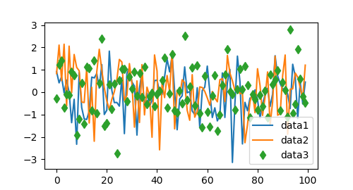
設定 Artist 的樣式#
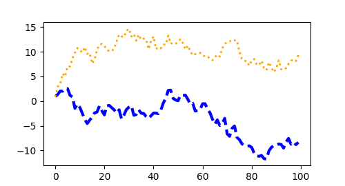
大多數繪圖方法都有用於 Artist 的樣式選項,可以在呼叫繪圖方法時存取,也可以從 Artist 的「setter」存取。在下面的繪圖中,我們手動設定了由 plot 建立的 Artist 的 color、linewidth 和 linestyle,並且我們在事後使用 set_linestyle 設定了第二條線的線條樣式。
色彩#
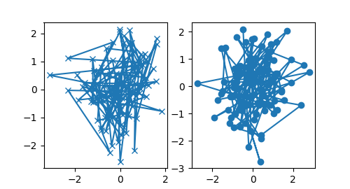
Matplotlib 有非常靈活的色彩陣列,大多數 Artist 都接受這些色彩;請參閱 允許的色彩定義 以取得規格列表。某些 Artist 會採用多種色彩。例如,對於 scatter 繪圖,標記的邊緣可以與內部顏色不同
fig, ax = plt.subplots(figsize=(5, 2.7))
ax.scatter(data1, data2, s=50, facecolor='C0', edgecolor='k')
線寬、線條樣式和標記大小#
線寬通常以印刷點為單位(1 pt = 1/72 英寸),適用於具有筆劃線的 Artist。同樣,筆劃線可以具有線條樣式。請參閱 線條樣式範例。
標記大小取決於所使用的方法。plot 以點為單位指定標記大小,通常是標記的「直徑」或寬度。scatter 將標記大小指定為與標記的視覺區域大致成比例。有一系列的標記樣式可以作為字串程式碼使用(請參閱 markers),或者使用者可以定義自己的 MarkerStyle(請參閱 標記參考)
標記繪圖#
軸標籤和文字#
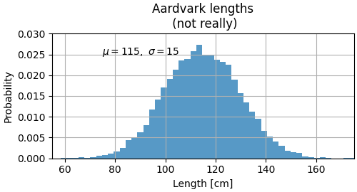
set_xlabel、set_ylabel 和 set_title 用於在指示的位置新增文字(有關更多討論,請參閱 Matplotlib 中的文字)。也可以使用 text 將文字直接新增到繪圖中
mu, sigma = 115, 15
x = mu + sigma * np.random.randn(10000)
fig, ax = plt.subplots(figsize=(5, 2.7), layout='constrained')
# the histogram of the data
n, bins, patches = ax.hist(x, 50, density=True, facecolor='C0', alpha=0.75)

ax.set_xlabel('Length [cm]')
ax.set_ylabel('Probability')
ax.set_title('Aardvark lengths\n (not really)')
ax.text(75, .025, r'$\mu=115,\ \sigma=15$')
ax.axis([55, 175, 0, 0.03])
ax.grid(True)
所有 text 函式都會傳回 matplotlib.text.Text 實例。就像上面的線條一樣,您可以透過將關鍵字參數傳遞到文字函式中來自訂屬性
t = ax.set_xlabel('my data', fontsize=14, color='red')
這些屬性在 文字屬性和版面配置 中有更詳細的介紹。
在文字中使用數學表達式#
Matplotlib 接受任何文字表達式中的 TeX 方程式表達式。例如,要在標題中寫入表達式 \(\sigma_i=15\),您可以寫入以美元符號括住的 TeX 表達式
ax.set_title(r'$\sigma_i=15$')
其中標題字串前面的 r 表示該字串是 raw 字串,不將反斜線視為 python 跳脫字元。 Matplotlib 有內建的 TeX 表達式剖析器和佈局引擎,並提供自己的數學字型 – 有關詳細資訊,請參閱 撰寫數學表達式。您也可以直接使用 LaTeX 來格式化文字,並將輸出直接合併到顯示圖形或儲存的後腳本中 – 請參閱 使用 LaTeX 進行文字渲染。
註解#
我們也可以註解繪圖上的點,通常透過連接指向 xy 的箭頭到 xytext 處的文字
fig, ax = plt.subplots(figsize=(5, 2.7))

t = np.arange(0.0, 5.0, 0.01)
s = np.cos(2 * np.pi * t)
line, = ax.plot(t, s, lw=2)

ax.annotate('local max', xy=(2, 1), xytext=(3, 1.5),
            arrowprops=dict(facecolor='black', shrink=0.05))

ax.set_ylim(-2, 2)
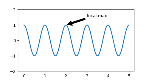
在這個基本範例中,xy 和 xytext 都位於資料座標中。還有其他各種座標系統可供選擇 – 有關詳細資訊,請參閱 基本註解 和 進階註解。更多範例也可以在 註解繪圖 中找到。
圖例#
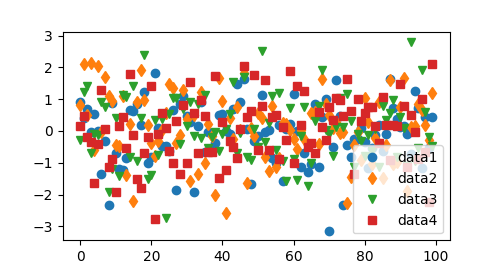
通常我們希望使用 Axes.legend 來識別線條或標記
Matplotlib 中的圖例在佈局、位置以及它們可以代表的 Artist 方面非常靈活。它們在 圖例指南 中有詳細的討論。
軸刻度和刻度#
每個 Axes 都有兩個(或三個)Axis 物件,分別表示 x 軸和 y 軸。這些控制軸的比例、刻度定位器和刻度格式化器。可以附加其他 Axes 來顯示其他 Axis 物件。
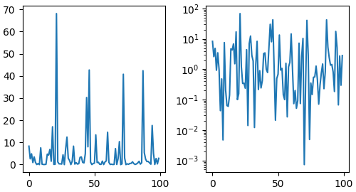
比例#
除了線性刻度外,Matplotlib 還提供非線性刻度,例如對數刻度。由於對數刻度使用頻繁,因此也有直接的方法,如 loglog、semilogx 和 semilogy。還有許多其他刻度可供選擇(請參閱 刻度 以了解其他範例)。在這裡,我們將手動設定刻度。
刻度設定了數據值到軸上間距的映射。這種映射會雙向發生,並組合成一個轉換,這是 Matplotlib 將數據座標映射到軸、圖形或螢幕座標的方式。請參閱 轉換教學。
刻度定位器和格式化器#
每個軸都有一個刻度定位器和格式化器,用於選擇沿軸放置刻度線的位置。一個簡單的介面是 set_xticks。
fig, axs = plt.subplots(2, 1, layout='constrained')
axs[0].plot(xdata, data1)
axs[0].set_title('Automatic ticks')

axs[1].plot(xdata, data1)
axs[1].set_xticks(np.arange(0, 100, 30), ['zero', '30', 'sixty', '90'])
axs[1].set_yticks([-1.5, 0, 1.5])  # note that we don't need to specify labels
axs[1].set_title('Manual ticks')
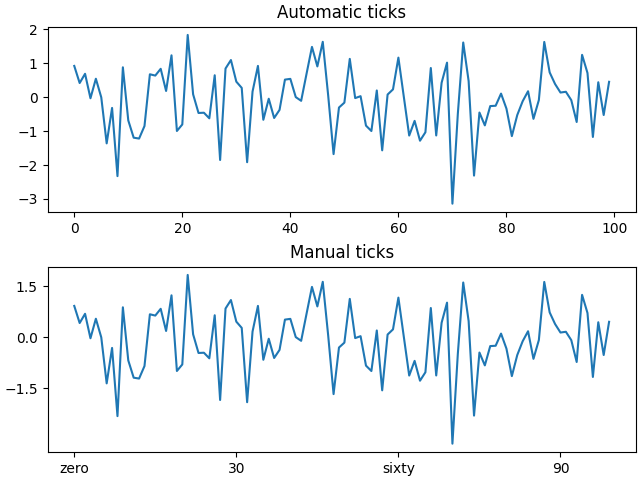
不同的刻度可以有不同的定位器和格式化器;例如,上面的對數刻度使用 LogLocator 和 LogFormatter。請參閱 刻度定位器 和 刻度格式化器,以了解其他格式化器和定位器,以及撰寫您自己的資訊。
繪製日期和字串#
Matplotlib 可以處理繪製日期陣列和字串陣列,以及浮點數。這些將會根據情況獲得特殊的定位器和格式化器。對於日期
from matplotlib.dates import ConciseDateFormatter

fig, ax = plt.subplots(figsize=(5, 2.7), layout='constrained')
dates = np.arange(np.datetime64('2021-11-15'), np.datetime64('2021-12-25'),
                  np.timedelta64(1, 'h'))
data = np.cumsum(np.random.randn(len(dates)))
ax.plot(dates, data)
ax.xaxis.set_major_formatter(ConciseDateFormatter(ax.xaxis.get_major_locator()))
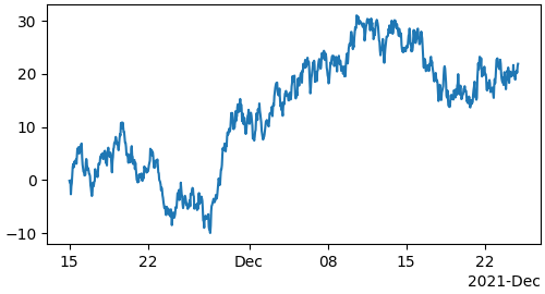
如需更多資訊,請參閱日期範例(例如 日期刻度標籤)。
對於字串,我們得到分類繪圖(請參閱:繪製分類變數)。
fig, ax = plt.subplots(figsize=(5, 2.7), layout='constrained')
categories = ['turnips', 'rutabaga', 'cucumber', 'pumpkins']

ax.bar(categories, np.random.rand(len(categories)))
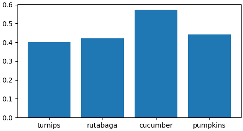
關於分類繪圖的一個注意事項是,某些解析文字檔案的方法會傳回字串列表,即使這些字串都代表數字或日期。如果您傳遞 1000 個字串,Matplotlib 會認為您想要 1000 個類別,並在您的繪圖中新增 1000 個刻度!
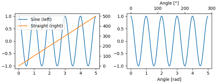
額外的軸物件#
在一個圖表中繪製不同量級的數據可能需要一個額外的 y 軸。可以使用 twinx 來建立這樣一個軸,以新增一個具有不可見 x 軸和位於右側的 y 軸的新軸(類似地,可以使用 twiny)。請參閱 具有不同刻度的繪圖,以了解其他範例。
同樣地,您可以新增一個 secondary_xaxis 或 secondary_yaxis,它們的刻度與主軸不同,以不同的刻度或單位來表示資料。請參閱 次要軸,以了解更多範例。
fig, (ax1, ax3) = plt.subplots(1, 2, figsize=(7, 2.7), layout='constrained')
l1, = ax1.plot(t, s)
ax2 = ax1.twinx()
l2, = ax2.plot(t, range(len(t)), 'C1')
ax2.legend([l1, l2], ['Sine (left)', 'Straight (right)'])

ax3.plot(t, s)
ax3.set_xlabel('Angle [rad]')
ax4 = ax3.secondary_xaxis('top', (np.rad2deg, np.deg2rad))
ax4.set_xlabel('Angle [°]')
顏色對應數據#
通常,我們希望在繪圖中使用顏色對應來表示第三個維度。Matplotlib 有許多繪圖類型可以做到這一點。
from matplotlib.colors import LogNorm

X, Y = np.meshgrid(np.linspace(-3, 3, 128), np.linspace(-3, 3, 128))
Z = (1 - X/2 + X**5 + Y**3) * np.exp(-X**2 - Y**2)

fig, axs = plt.subplots(2, 2, layout='constrained')
pc = axs[0, 0].pcolormesh(X, Y, Z, vmin=-1, vmax=1, cmap='RdBu_r')
fig.colorbar(pc, ax=axs[0, 0])
axs[0, 0].set_title('pcolormesh()')

co = axs[0, 1].contourf(X, Y, Z, levels=np.linspace(-1.25, 1.25, 11))
fig.colorbar(co, ax=axs[0, 1])
axs[0, 1].set_title('contourf()')

pc = axs[1, 0].imshow(Z**2 * 100, cmap='plasma', norm=LogNorm(vmin=0.01, vmax=100))
fig.colorbar(pc, ax=axs[1, 0], extend='both')
axs[1, 0].set_title('imshow() with LogNorm()')

pc = axs[1, 1].scatter(data1, data2, c=data3, cmap='RdBu_r')
fig.colorbar(pc, ax=axs[1, 1], extend='both')
axs[1, 1].set_title('scatter()')
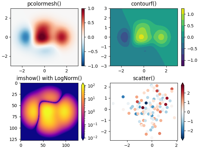
色圖#
這些都是從 ScalarMappable 物件衍生的藝術家範例。它們都可以設定 vmin 和 vmax 之間的線性映射到 cmap 指定的色圖中。Matplotlib 有許多色圖可供選擇 (在 Matplotlib 中選擇色圖),您可以建立自己的色圖 (在 Matplotlib 中建立色圖) 或從 第三方套件 下載。
正規化#
有時我們希望將數據非線性映射到色圖,如上面的 LogNorm 範例所示。我們可以通過為 ScalarMappable 提供 norm 參數而不是 vmin 和 vmax 來實現這一點。更多正規化請見 色圖正規化。
色條#
新增 colorbar 提供了一個將顏色與基礎資料關聯起來的索引。色條是圖形層級的藝術家,並附加到 ScalarMappable(從中取得有關正規化和色圖的資訊),並且通常會從父軸中竊取空間。色條的放置可能很複雜:請參閱 放置色條 以了解詳細資訊。您還可以使用 extend 關鍵字在末端新增箭頭,並使用 shrink 和 aspect 來控制大小,以變更色條的外觀。最後,色條將具有適用於正規化的預設定位器和格式化器。這些可以像其他軸物件一樣進行變更。
使用多個圖形和軸#
您可以使用多次呼叫 fig = plt.figure() 或 fig2, ax = plt.subplots() 來開啟多個圖形。通過保留物件引用,您可以將藝術家新增到任一圖形。
可以通過多種方式新增多個軸,但最基本的方式是使用上面使用的 plt.subplots()。可以使用 subplot_mosaic 實現更複雜的佈局,其中軸物件跨越多個列或行。
Matplotlib 具有用於排列軸的非常複雜的工具:請參閱 在圖形中排列多個軸 和 複雜且語意的圖形組成 (subplot_mosaic)。
更多閱讀資料#
如需更多繪圖類型,請參閱 繪圖類型 和 API 參考,尤其是 軸 API。
腳本的總執行時間: (0 分鐘 8.373 秒)