注意
前往結尾下載完整範例程式碼。
轉換教學#
如同任何圖形套件,Matplotlib 的建構基礎是轉換框架,以便輕鬆地在座標系統之間移動,包括使用者端的資料座標系統、軸座標系統、圖表座標系統和顯示座標系統。在您 95% 的繪圖工作中,您不需要考慮這一點,因為它會在底層執行。但是,當您突破自訂圖表生成的限制時,了解這些物件會有幫助,如此您便能重複使用 Matplotlib 提供給您的現有轉換,或建立您自己的轉換(請參閱 matplotlib.transforms)。下表總結了一些有用的座標系統、每個系統的描述,以及從每個座標系統轉換到顯示座標的轉換物件。在「轉換物件」欄中,ax 是 Axes 實例,fig 是 Figure 實例,而 subfigure 是 SubFigure 實例。
座標系統 |
描述 |
從系統到顯示的轉換物件 |
|---|---|---|
"資料" |
軸中資料的座標系統。 |
|
"軸" |
|
|
"子圖" |
|
|
"圖表" |
|
|
"圖表-英吋" |
|
|
"xaxis"、"yaxis" |
混合座標系統,一個方向使用資料座標,另一個方向使用軸座標。 |
|
"顯示" |
輸出的原生座標系統;(0, 0) 是視窗的左下角,而 (寬度,高度) 是輸出以「顯示單位」為單位的右上角。 單位的確切解釋取決於後端。例如,Agg 的單位是像素,而 svg/pdf 的單位是點。 |
Transform 物件對於來源和目標座標系統來說是天真的,但是上表中引用的物件會建構為在其座標系統中取得輸入,並將輸入轉換為顯示座標系統。這就是為什麼顯示座標系統在「轉換物件」欄中為 None 的原因 - 它已經在顯示座標中。命名和目標慣例有助於追蹤可用的「標準」座標系統和轉換。
轉換也知道如何自我反轉(通過 Transform.inverted)來生成從輸出座標系統返回到輸入座標系統的轉換。例如,ax.transData 將資料座標中的值轉換為顯示座標,而 ax.transData.inverted() 是一個 matplotlib.transforms.Transform,它從顯示座標轉換為資料座標。當處理使用者介面的事件時,這特別有用,這些事件通常發生在顯示空間中,而且您想知道滑鼠點擊或按鍵發生在資料座標系統中的哪個位置。
請注意,如果圖表的 dpi 或大小發生變更,以顯示座標指定圖元的位置可能會變更其相對位置。當列印或變更螢幕解析度時,這可能會造成混淆,因為物件可能會變更位置和大小。因此,放置在軸或圖表中的圖元最常見的情況是將其轉換設定為不是 IdentityTransform() 的值;當使用 add_artist 將圖元新增至軸時,預設的轉換值為 ax.transData,以便您可以使用資料座標進行工作和思考,並讓 Matplotlib 處理到顯示的轉換。
資料座標#
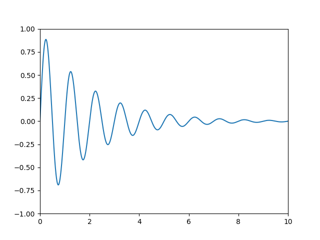
我們先從最常用的座標(資料座標系統)開始。每當您將資料新增至軸時,Matplotlib 都會更新資料限制,最常見的是使用 set_xlim() 和 set_ylim() 方法進行更新。例如,在下圖中,x 軸的資料限制從 0 延伸到 10,而 y 軸的資料限制從 -1 延伸到 1。
您可以使用 ax.transData 實例將資料從您的資料轉換為您的顯示座標系統,可以轉換單個點或一系列點,如下所示
In [14]: type(ax.transData)
Out[14]: <class 'matplotlib.transforms.CompositeGenericTransform'>

In [15]: ax.transData.transform((5, 0))
Out[15]: array([ 335.175,  247.   ])

In [16]: ax.transData.transform([(5, 0), (1, 2)])
Out[16]:
array([[ 335.175,  247.   ],
       [ 132.435,  642.2  ]])
您可以使用 inverted() 方法建立一個轉換,將您從顯示帶到資料座標
In [41]: inv = ax.transData.inverted()

In [42]: type(inv)
Out[42]: <class 'matplotlib.transforms.CompositeGenericTransform'>

In [43]: inv.transform((335.175,  247.))
Out[43]: array([ 5.,  0.])
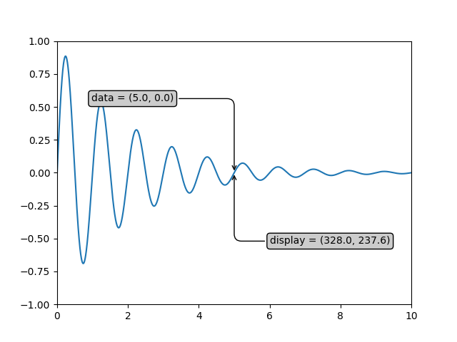
如果您正跟著本教學進行輸入,則如果您有不同的視窗大小或 dpi 設定,則顯示座標的確切值可能會有所不同。同樣地,在下圖中,標示的顯示點可能與 ipython 會話中的點不同,因為文件圖表大小的預設值不同。
x = np.arange(0, 10, 0.005)
y = np.exp(-x/2.) * np.sin(2*np.pi*x)

fig, ax = plt.subplots()
ax.plot(x, y)
ax.set_xlim(0, 10)
ax.set_ylim(-1, 1)

xdata, ydata = 5, 0
# This computing the transform now, if anything
# (figure size, dpi, axes placement, data limits, scales..)
# changes re-calling transform will get a different value.
xdisplay, ydisplay = ax.transData.transform((xdata, ydata))

bbox = dict(boxstyle="round", fc="0.8")
arrowprops = dict(
    arrowstyle="->",
    connectionstyle="angle,angleA=0,angleB=90,rad=10")

offset = 72
ax.annotate(f'data = ({xdata:.1f}, {ydata:.1f})',
            (xdata, ydata), xytext=(-2*offset, offset), textcoords='offset points',
            bbox=bbox, arrowprops=arrowprops)

disp = ax.annotate(f'display = ({xdisplay:.1f}, {ydisplay:.1f})',
                   (xdisplay, ydisplay), xytext=(0.5*offset, -offset),
                   xycoords='figure pixels',
                   textcoords='offset points',
                   bbox=bbox, arrowprops=arrowprops)

plt.show()
警告
如果您在 GUI 後端中執行上述範例中的原始程式碼,您可能也會發現,資料和顯示註釋的兩個箭頭並未指向完全相同的點。這是因為顯示點是在顯示圖表之前計算的,而且 GUI 後端在建立圖表時可能會稍微調整圖表大小。如果您自己調整圖表大小,則效果會更加明顯。這是一個很好的理由,說明為什麼您很少想在顯示空間中工作,但是您可以連線到 'on_draw' Event,以便在圖表繪製時更新圖表座標;請參閱 事件處理與選取。
當您變更軸的 x 或 y 範圍時,資料範圍也會隨之更新,以便轉換產生新的顯示點。請注意,當我們只變更 ylim 時,只會變更 y 顯示座標;而當我們同時變更 xlim 時,則兩者都會變更。稍後在討論 Bbox 時,我們會深入探討這一點。
In [54]: ax.transData.transform((5, 0))
Out[54]: array([ 335.175,  247.   ])

In [55]: ax.set_ylim(-1, 2)
Out[55]: (-1, 2)

In [56]: ax.transData.transform((5, 0))
Out[56]: array([ 335.175     ,  181.13333333])

In [57]: ax.set_xlim(10, 20)
Out[57]: (10, 20)

In [58]: ax.transData.transform((5, 0))
Out[58]: array([-171.675     ,  181.13333333])
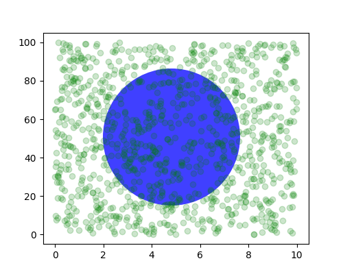
軸座標#
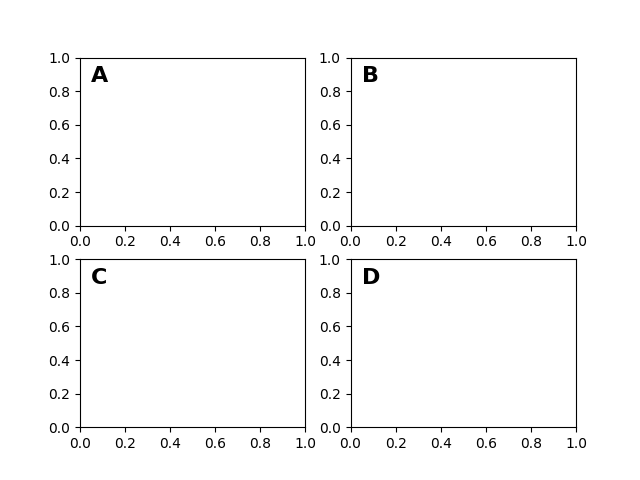
在資料座標系統之後,軸可能是第二個最有用的座標系統。在這裡,點 (0, 0) 是您的軸或子圖的左下角,(0.5, 0.5) 是中心,而 (1.0, 1.0) 是右上角。您也可以參照範圍外的點,因此 (-0.1, 1.1) 會在您的軸的左側和上方。當您要在軸中放置文字時,此座標系統非常有用,因為您通常希望文字泡泡位於固定位置,例如,軸窗格的左上角,並且在您平移或縮放時,該位置保持固定。以下是一個簡單的範例,它會建立四個面板,並將它們標記為 'A'、'B'、'C'、'D',如您在期刊中經常看到的那樣。在 標記子圖 中提供了一種更複雜的標記方法。
fig = plt.figure()
for i, label in enumerate(('A', 'B', 'C', 'D')):
    ax = fig.add_subplot(2, 2, i+1)
    ax.text(0.05, 0.95, label, transform=ax.transAxes,
            fontsize=16, fontweight='bold', va='top')

plt.show()
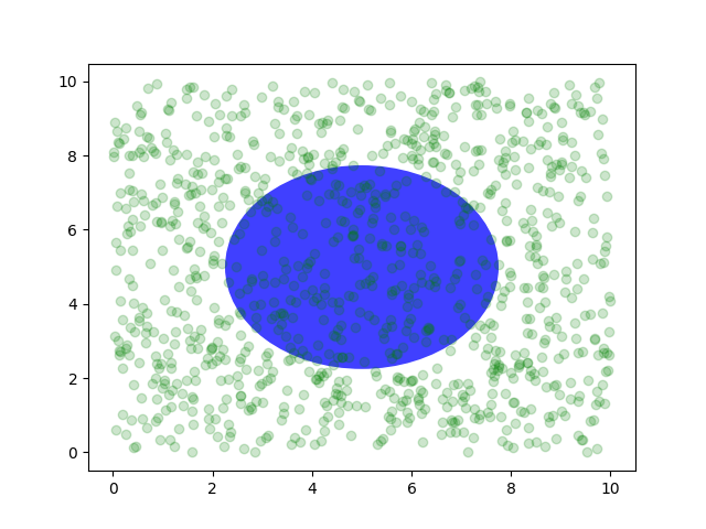
您也可以在軸座標系統中繪製線條或面片,但在我的經驗中,這不如使用 ax.transAxes 來放置文字有用。儘管如此,這裡有一個愚蠢的範例,它會在資料空間中繪製一些隨機點,並覆蓋一個半透明的 Circle,該圓心位於軸的中央,半徑為軸的四分之一——如果您的軸未保留長寬比(請參閱 set_aspect()),則它看起來會像一個橢圓。使用平移/縮放工具來移動,或手動變更資料 xlim 和 ylim,您將會看到資料移動,但圓形將保持固定,因為它不在資料座標中,並且將始終保持在軸的中心。
fig, ax = plt.subplots()
x, y = 10*np.random.rand(2, 1000)
ax.plot(x, y, 'go', alpha=0.2)  # plot some data in data coordinates

circ = mpatches.Circle((0.5, 0.5), 0.25, transform=ax.transAxes,
                       facecolor='blue', alpha=0.75)
ax.add_patch(circ)
plt.show()
混合轉換#
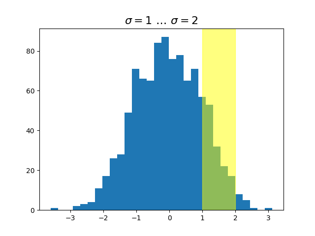
在混合的座標空間中繪圖,其中混合了軸和資料座標,這非常有用,例如,建立一個水平跨度,以醒目顯示 y 資料的某些區域,但跨越 x 軸,而與資料範圍、平移或縮放級別等無關。事實上,這些混合線條和跨度非常有用,我們已建立內建函式,使其易於繪製(請參閱 axhline()、axvline()、axhspan()、axvspan()),但為了教學目的,我們將在此處使用混合轉換來實作水平跨度。此技巧僅適用於可分離的轉換,就像您在普通的笛卡爾座標系統中看到的那樣,但不適用於不可分離的轉換,例如 PolarTransform。
import matplotlib.transforms as transforms

fig, ax = plt.subplots()
x = np.random.randn(1000)

ax.hist(x, 30)
ax.set_title(r'$\sigma=1 \/ \dots \/ \sigma=2$', fontsize=16)

# the x coords of this transformation are data, and the y coord are axes
trans = transforms.blended_transform_factory(
    ax.transData, ax.transAxes)
# highlight the 1..2 stddev region with a span.
# We want x to be in data coordinates and y to span from 0..1 in axes coords.
rect = mpatches.Rectangle((1, 0), width=1, height=1, transform=trans,
                          color='yellow', alpha=0.5)
ax.add_patch(rect)

plt.show()
注意
其中 x 位於資料座標,y 位於軸座標的混合轉換非常有用,因此我們有輔助方法可以傳回 Matplotlib 內部用於繪製刻度、刻度標籤等的版本。這些方法是 matplotlib.axes.Axes.get_xaxis_transform() 和 matplotlib.axes.Axes.get_yaxis_transform()。因此,在上面的範例中,對 blended_transform_factory() 的呼叫可以使用 get_xaxis_transform 來取代。
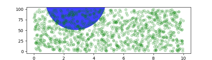
以實際座標繪圖#
有時我們希望物件在圖表上具有特定的實際大小。在這裡,我們以實際座標繪製與上方相同的圓形。如果以互動方式完成,您可以看到變更圖形的大小不會變更圓形與左下角的偏移量,也不會變更其大小,並且無論軸的長寬比如何,圓形都保持為圓形。
fig, ax = plt.subplots(figsize=(5, 4))
x, y = 10*np.random.rand(2, 1000)
ax.plot(x, y*10., 'go', alpha=0.2)  # plot some data in data coordinates
# add a circle in fixed-coordinates
circ = mpatches.Circle((2.5, 2), 1.0, transform=fig.dpi_scale_trans,
                       facecolor='blue', alpha=0.75)
ax.add_patch(circ)
plt.show()
如果我們變更圖形大小,則圓形不會變更其絕對位置,並且會被裁剪。
fig, ax = plt.subplots(figsize=(7, 2))
x, y = 10*np.random.rand(2, 1000)
ax.plot(x, y*10., 'go', alpha=0.2)  # plot some data in data coordinates
# add a circle in fixed-coordinates
circ = mpatches.Circle((2.5, 2), 1.0, transform=fig.dpi_scale_trans,
                       facecolor='blue', alpha=0.75)
ax.add_patch(circ)
plt.show()
另一個用途是將具有設定的實際尺寸的面片放置在軸上的資料點周圍。在這裡,我們將兩個轉換加在一起。第一個設定橢圓應該有多大的縮放比例,第二個設定其位置。然後將橢圓放置在原點,然後我們使用輔助轉換 ScaledTranslation 將其移動到 ax.transData 座標系統中的正確位置。此輔助轉換會使用下列項目來實例化
trans = ScaledTranslation(xt, yt, scale_trans)
其中 xt 和 yt 是平移偏移量,而 scale_trans 是一個轉換,它會在套用偏移量之前,在轉換時縮放 xt 和 yt。
請注意下方轉換中加號運算子的使用。此程式碼表示:首先套用縮放轉換 fig.dpi_scale_trans,使橢圓具有適當的大小,但仍以 (0, 0) 為中心,然後將資料平移到資料空間中的 xdata[0] 和 ydata[0]。
在互動式使用中,即使透過縮放變更軸的範圍,橢圓的大小仍保持不變。
fig, ax = plt.subplots()
xdata, ydata = (0.2, 0.7), (0.5, 0.5)
ax.plot(xdata, ydata, "o")
ax.set_xlim((0, 1))

trans = (fig.dpi_scale_trans +
         transforms.ScaledTranslation(xdata[0], ydata[0], ax.transData))

# plot an ellipse around the point that is 150 x 130 points in diameter...
circle = mpatches.Ellipse((0, 0), 150/72, 130/72, angle=40,
                          fill=None, transform=trans)
ax.add_patch(circle)
plt.show()
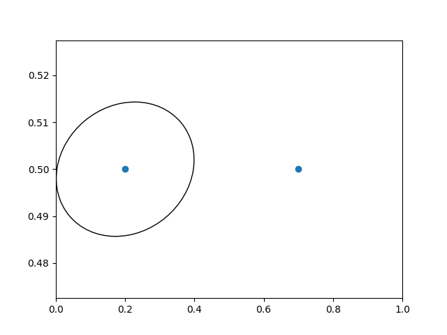
注意
轉換的順序很重要。在這裡,橢圓首先在顯示空間中被賦予正確的尺寸,然後在資料空間中移動到正確的位置。如果我們先執行 ScaledTranslation,則 xdata[0] 和 ydata[0] 將首先轉換為顯示座標(在 200-dpi 監視器上為 [ 358.4 475.2]),然後這些座標將由 fig.dpi_scale_trans 縮放,將橢圓的中心推離螢幕(即 [ 71680. 95040.])。
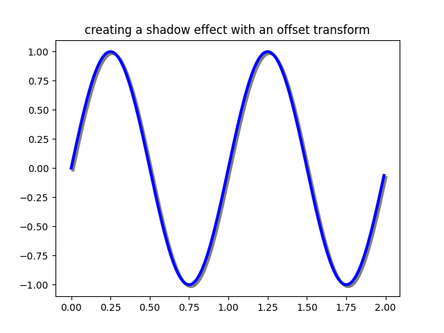
使用偏移轉換來建立陰影效果#
ScaledTranslation 的另一個用途是建立一個從另一個轉換偏移的新轉換,例如,將一個物件相對於另一個物件稍微移動一點。通常,您希望以某些實際尺寸(如點或英吋)而不是以資料座標來表示偏移量,以便在不同的縮放級別和 dpi 設定下,偏移效果保持不變。
偏移量的一個用途是建立陰影效果,其中您繪製一個與第一個物件相同的物件,只是在其右側和下方,調整 zorder 以確保先繪製陰影,然後在其上方繪製陰影物件。
在這裡,我們以與上方使用 ScaledTranslation 時相反的順序套用轉換。首先在資料座標中(ax.transData)建立圖表,然後使用 fig.dpi_scale_trans 將其移動 dx 和 dy 點。(在排版中,點為 1/72 英吋,並且透過以點為單位指定偏移量,您的圖形將在儲存時看起來相同,而與 dpi 解析度無關。)
fig, ax = plt.subplots()

# make a simple sine wave
x = np.arange(0., 2., 0.01)
y = np.sin(2*np.pi*x)
line, = ax.plot(x, y, lw=3, color='blue')

# shift the object over 2 points, and down 2 points
dx, dy = 2/72., -2/72.
offset = transforms.ScaledTranslation(dx, dy, fig.dpi_scale_trans)
shadow_transform = ax.transData + offset

# now plot the same data with our offset transform;
# use the zorder to make sure we are below the line
ax.plot(x, y, lw=3, color='gray',
        transform=shadow_transform,
        zorder=0.5*line.get_zorder())

ax.set_title('creating a shadow effect with an offset transform')
plt.show()
注意
dpi 和英吋偏移量是一個常見的用例,因此我們有一個特殊的輔助函式可以在 matplotlib.transforms.offset_copy() 中建立它,該函式會傳回一個具有新增偏移量的新轉換。因此,在上方,我們可以執行
shadow_transform = transforms.offset_copy(ax.transData,
         fig, dx, dy, units='inches')
轉換管道#
我們在本教學中一直使用的 ax.transData 轉換是三個不同轉換的組合,這些轉換組成了從資料 -> 顯示座標的轉換管道。Michael Droettboom 實作了轉換框架,並注意提供了一個乾淨的 API,該 API 將在極座標和對數圖中發生的非線性投影和縮放,與在您平移和縮放時發生的線性仿射轉換分隔開來。這裡有一個效率,因為您可以在影響仿射轉換的軸中平移和縮放,但您可能不需要在簡單的導覽事件中計算可能昂貴的非線性縮放或投影。也可以將仿射轉換矩陣相乘,然後一步將它們套用至座標。並非所有可能的轉換都如此。
以下是在基本可分離軸 Axes 類別中定義 ax.transData 實例的方式
self.transData = self.transScale + (self.transLimits + self.transAxes)
我們已在 軸座標 上方的 transAxes 實例中介紹了它,它將軸或子圖邊界框的 (0, 0)、(1, 1) 角對應到顯示空間,因此讓我們看看其他兩個部分。
self.transLimits 是將您從資料帶到軸座標的轉換;也就是說,它將您的檢視 xlim 和 ylim 對應到軸的單位空間(而 transAxes 然後將該單位空間帶到顯示空間)。我們可以在這裡看到它的作用
In [80]: ax = plt.subplot()

In [81]: ax.set_xlim(0, 10)
Out[81]: (0, 10)

In [82]: ax.set_ylim(-1, 1)
Out[82]: (-1, 1)

In [84]: ax.transLimits.transform((0, -1))
Out[84]: array([ 0.,  0.])

In [85]: ax.transLimits.transform((10, -1))
Out[85]: array([ 1.,  0.])

In [86]: ax.transLimits.transform((10, 1))
Out[86]: array([ 1.,  1.])

In [87]: ax.transLimits.transform((5, 0))
Out[87]: array([ 0.5,  0.5])
而且我們可以使用相同的反向轉換,從單位軸座標返回到資料座標。
In [90]: inv.transform((0.25, 0.25))
Out[90]: array([ 2.5, -0.5])
最後一個部分是 self.transScale 屬性,它負責資料的可選非線性縮放,例如用於對數軸。當初始設定 Axes 時,這僅設定為恆等轉換,因為基本的 Matplotlib 軸具有線性刻度,但是當您呼叫對數縮放函式(例如 semilogx())或使用 set_xscale() 明確地將刻度設定為對數時,則會設定 ax.transScale 屬性來處理非線性投影。刻度轉換是各自 xaxis 和 yaxis Axis 實例的屬性。例如,當您呼叫 ax.set_xscale('log') 時,xaxis 會將其刻度更新為 matplotlib.scale.LogScale 實例。
對於不可分離的軸(PolarAxes),還有一個需要考慮的部分,即投影轉換。transData matplotlib.projections.polar.PolarAxes 與典型的可分離 matplotlib Axes 相似,但多了一個部分 transProjection
self.transData = (
    self.transScale + self.transShift + self.transProjection +
    (self.transProjectionAffine + self.transWedge + self.transAxes))
transProjection 處理從空間(例如,地圖資料的緯度和經度,或極座標資料的半徑和角度)到可分離的笛卡爾坐標系的投影。在 matplotlib.projections 套件中有幾個投影範例,而了解更多的最佳方法是開啟這些套件的原始碼,並查看如何建立自己的投影,因為 Matplotlib 支援可擴展的軸和投影。Michael Droettboom 提供了一個很好的建立 Hammer 投影軸的教學範例;請參閱 自訂投影。
腳本的總執行時間: (0 分鐘 3.236 秒)