軸(或子圖)簡介#
Matplotlib Axes 是建立資料視覺化的通道。一旦將 Axes 放置在圖表上,就可以使用許多方法將資料新增到 Axes。Axes 通常有一對 Axis 藝術家 (Artists),用於定義資料座標系統,並包含新增註釋的方法,例如 x 和 y 標籤、標題和圖例。
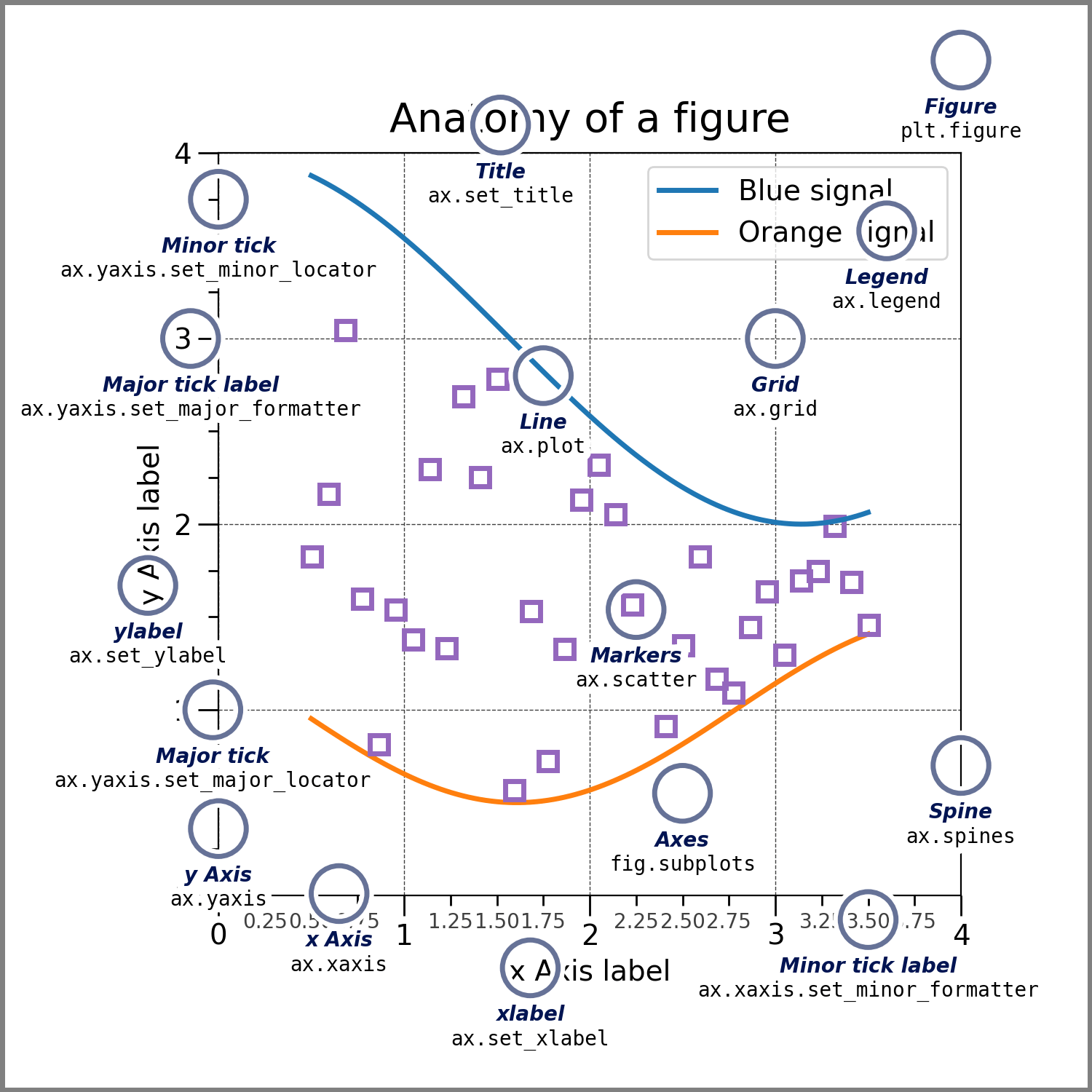
圖表剖析#
在上圖中,Axes 物件是使用 ax = fig.subplots() 建立的。圖表上的其他所有內容都是使用此 ax 物件上的方法建立的,或可以從中存取。如果我們要變更 x 軸上的標籤,我們呼叫 ax.set_xlabel('New Label'),如果我們要繪製一些資料,我們呼叫 ax.plot(x, y)。實際上,在上圖中,唯一不屬於 Axes 的藝術家 (Artist) 是圖表本身,因此 axes.Axes 類別實際上是通往 Matplotlib 大部分功能的通道。
請注意,Axes 對 Matplotlib 的運作至關重要,因此這裡的許多內容與 快速入門指南 中的內容重複。
建立 Axes#
import matplotlib.pyplot as plt
import numpy as np

fig, axs = plt.subplots(ncols=2, nrows=2, figsize=(3.5, 2.5),
                        layout="constrained")
# for each Axes, add an artist, in this case a nice label in the middle...
for row in range(2):
    for col in range(2):
        axs[row, col].annotate(f'axs[{row}, {col}]', (0.5, 0.5),
                            transform=axs[row, col].transAxes,
                            ha='center', va='center', fontsize=18,
                            color='darkgrey')
fig.suptitle('plt.subplots()')
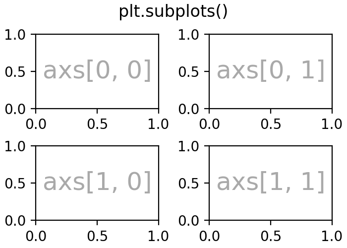
Axes 是使用 Figure 物件上的方法或透過 pyplot 介面新增的。這些方法在 建立圖表 和 在圖表中排列多個軸 中有更詳細的討論。但是,例如 add_axes 會手動將 Axes 定位在頁面上。在上面的範例中,subplots 在圖表上放置了一個子圖網格,而 axs 是一個 (2, 2) 的 Axes 陣列,每個 Axes 都可以新增資料。
還有許多其他方法可將 Axes 新增至圖表
Figure.add_axes:手動定位 Axes。fig.add_axes([0, 0, 1, 1])建立一個填滿整個圖表的 Axes。pyplot.subplots和Figure.subplots:如上面的範例所示,新增一個 Axes 網格。pyplot 版本會傳回圖表物件和 Axes 陣列。請注意,fig, ax = plt.subplots()會將單個 Axes 新增至圖表。pyplot.subplot_mosaic和Figure.subplot_mosaic:新增一個命名 Axes 網格,並傳回軸的字典。對於fig, axs = plt.subplot_mosaic([['left', 'right'], ['bottom', 'bottom']]),axs['left']是左上方的 Axes,而axs['bottom']是一個跨越底部兩列的 Axes。
如需有關如何在圖表上排列 Axes 網格的詳細資訊,請參閱 在圖表中排列多個軸。
Axes 繪圖方法#
大多數高階繪圖方法都可以從 axes.Axes 類別存取。如需完整的精選清單,請參閱 API 文件,如需範例,請參閱 繪圖類型。一個基本範例是 axes.Axes.plot
fig, ax = plt.subplots(figsize=(4, 3))
np.random.seed(19680801)
t = np.arange(100)
x = np.cumsum(np.random.randn(100))
lines = ax.plot(t, x)
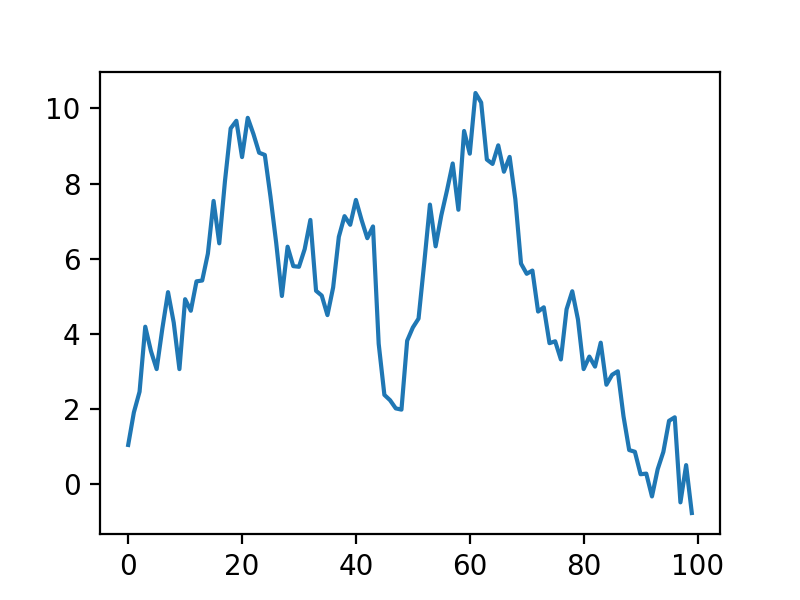
請注意,plot 會傳回 線條藝術家 (Artists) 的清單,這些線條可以隨後進行操作,如 藝術家 (Artists) 簡介 中所述。
下面是一個非常不完整的繪圖方法清單。同樣,如需更多範例,請參閱 繪圖類型,如需完整的方法清單,請參閱 axes.Axes。
座標軸標籤和註解#
通常我們希望使用 xlabel、ylabel 和 title 來標記座標軸,並且經常需要圖例來區分繪圖元素。Axes 類別有多種方法來建立這些註解。
fig, ax = plt.subplots(figsize=(5, 3), layout='constrained')
np.random.seed(19680801)
t = np.arange(200)
x = np.cumsum(np.random.randn(200))
y = np.cumsum(np.random.randn(200))
linesx = ax.plot(t, x, label='Random walk x')
linesy = ax.plot(t, y, label='Random walk y')

ax.set_xlabel('Time [s]')
ax.set_ylabel('Distance [km]')
ax.set_title('Random walk example')
ax.legend()
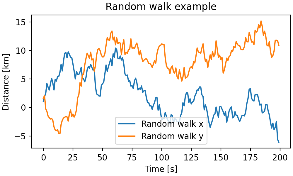
這些方法相對簡單,但可以在文字物件上設定許多文字屬性和佈局,例如 *fontsize*、*fontname*、*horizontalalignment*。圖例可能複雜得多;請參閱 圖例指南 以獲取更多詳細資訊。
請注意,也可以使用 text 和 annotate 將文字加入到座標軸。這可以非常複雜:請參閱 文字屬性和佈局 和 註解 以獲取更多資訊。
座標軸範圍、比例和刻度#
每個座標軸都有兩個(或更多)Axis 物件,可以透過 xaxis 和 yaxis 屬性存取。它們有大量的方法,對於高度可自訂的 Axis,閱讀 Axis 的 API 會很有用。然而,Axes 類別為這些方法中最常見的部分提供了許多輔助方法。實際上,上面討論的 set_xlabel 是 set_label_text 的輔助方法。
其他重要的方法設定座標軸的範圍 (set_xlim、set_ylim),或更根本地設定座標軸的比例。例如,我們可以使 Axis 具有對數比例,並放大資料的子部分
fig, ax = plt.subplots(figsize=(4, 2.5), layout='constrained')
np.random.seed(19680801)
t = np.arange(200)
x = 2**np.cumsum(np.random.randn(200))
linesx = ax.plot(t, x)
ax.set_yscale('log')
ax.set_xlim([20, 180])

Axes 類別還提供了處理 Axis 刻度和其標籤的輔助方法。最直接的方法是 set_xticks 和 set_yticks,它們會手動設定刻度位置,並可選擇設定其標籤。次要刻度可以使用 minorticks_on 或 minorticks_off 來切換。
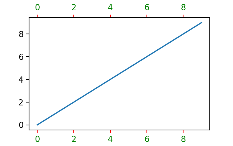
可以使用 tick_params 調整座標軸刻度和刻度標籤的許多方面。例如,將標籤放在座標軸的頂部而不是底部,將刻度著色為紅色,並將刻度標籤著色為綠色
fig, ax = plt.subplots(figsize=(4, 2.5))
ax.plot(np.arange(10))
ax.tick_params(top=True, labeltop=True, color='red', axis='x',
               labelcolor='green')
對於刻度、設定比例和控制 Axis 的更精細控制可以高度自訂,超出這些 Axes 層級的輔助方法。
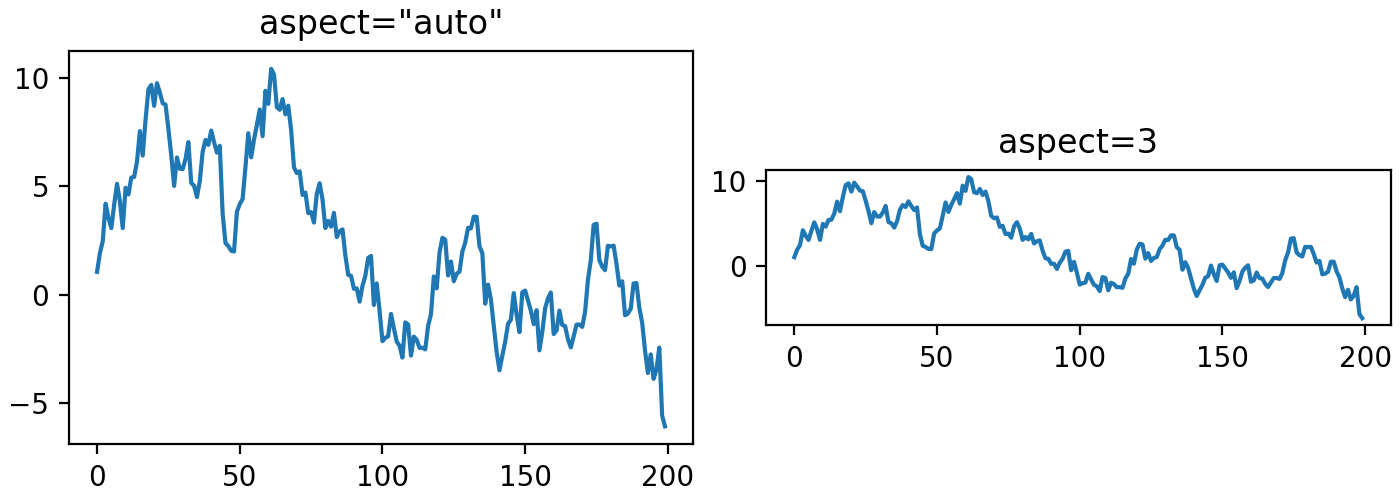
座標軸佈局#
有時在資料空間中設定繪圖的長寬比很重要,我們可以使用 set_aspect 來實現
fig, axs = plt.subplots(ncols=2, figsize=(7, 2.5), layout='constrained')
np.random.seed(19680801)
t = np.arange(200)
x = np.cumsum(np.random.randn(200))
axs[0].plot(t, x)
axs[0].set_title('aspect="auto"')

axs[1].plot(t, x)
axs[1].set_aspect(3)
axs[1].set_title('aspect=3')