注意
前往結尾以下載完整範例程式碼。
Matplotlib 中的文字#
Matplotlib 具有廣泛的文字支援,包括數學表達式支援、用於點陣和向量輸出的 truetype 支援、具有任意旋轉的新行分隔文字,以及 Unicode 支援。
因為它將字體直接嵌入到輸出文件中,例如,對於 postscript 或 PDF,您在螢幕上看到的與您在硬拷貝中得到的相同。 FreeType 支援產生非常漂亮的反鋸齒字體,即使在小點陣尺寸下看起來也很棒。 Matplotlib 包含其自己的 matplotlib.font_manager (感謝 Paul Barrett),它實作了一個跨平台、W3C 相容的字體搜尋演算法。
使用者可以透過在 rc 檔案 中設定合理的預設值來對文字屬性 (字體大小、字體粗細、文字位置和顏色等) 進行大量控制。 而且重要的是,對於那些對數學或科學圖形感興趣的人來說,Matplotlib 實作了大量的 TeX 數學符號和命令,支援圖形中任何位置的數學表達式。
基本文字指令#
以下指令用於在隱式和顯式介面中建立文字 (有關權衡的說明,請參閱Matplotlib 應用程式介面 (API))
隱式 API |
顯式 API |
描述 |
|---|---|---|
在 |
||
在 |
||
在 |
||
在 |
||
在 |
||
在 |
||
在 |
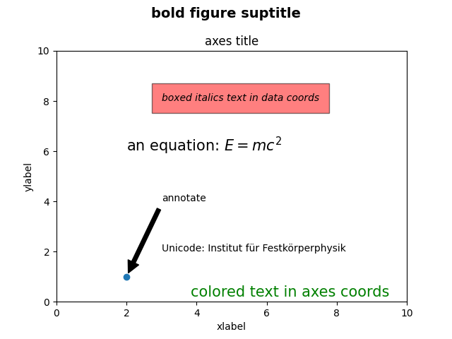
所有這些函數都會建立並傳回一個 Text 實例,可以使用各種字體和其他屬性進行配置。 下面的範例顯示了所有這些指令的運作方式,並且在後續章節中提供了更多詳細資訊。
import matplotlib.pyplot as plt

import matplotlib

fig = plt.figure()
ax = fig.add_subplot()
fig.subplots_adjust(top=0.85)

# Set titles for the figure and the subplot respectively
fig.suptitle('bold figure suptitle', fontsize=14, fontweight='bold')
ax.set_title('axes title')

ax.set_xlabel('xlabel')
ax.set_ylabel('ylabel')

# Set both x- and y-axis limits to [0, 10] instead of default [0, 1]
ax.axis([0, 10, 0, 10])

ax.text(3, 8, 'boxed italics text in data coords', style='italic',
        bbox={'facecolor': 'red', 'alpha': 0.5, 'pad': 10})

ax.text(2, 6, r'an equation: $E=mc^2$', fontsize=15)

ax.text(3, 2, 'Unicode: Institut für Festkörperphysik')

ax.text(0.95, 0.01, 'colored text in axes coords',
        verticalalignment='bottom', horizontalalignment='right',
        transform=ax.transAxes,
        color='green', fontsize=15)

ax.plot([2], [1], 'o')
ax.annotate('annotate', xy=(2, 1), xytext=(3, 4),
            arrowprops=dict(facecolor='black', shrink=0.05))

plt.show()
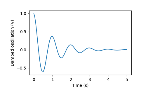
x 軸和 y 軸的標籤#
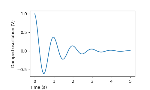
透過 set_xlabel 和 set_ylabel 方法,可以輕鬆地指定 x 軸和 y 軸的標籤。
import matplotlib.pyplot as plt
import numpy as np

x1 = np.linspace(0.0, 5.0, 100)
y1 = np.cos(2 * np.pi * x1) * np.exp(-x1)

fig, ax = plt.subplots(figsize=(5, 3))
fig.subplots_adjust(bottom=0.15, left=0.2)
ax.plot(x1, y1)
ax.set_xlabel('Time (s)')
ax.set_ylabel('Damped oscillation (V)')

plt.show()
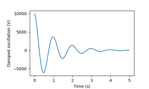
x 軸和 y 軸標籤會自動放置,使其清除 x 軸和 y 軸刻度標籤。 將下面的圖與上面的圖進行比較,並注意 y 軸標籤位於上方標籤的左側。
fig, ax = plt.subplots(figsize=(5, 3))
fig.subplots_adjust(bottom=0.15, left=0.2)
ax.plot(x1, y1*10000)
ax.set_xlabel('Time (s)')
ax.set_ylabel('Damped oscillation (V)')

plt.show()
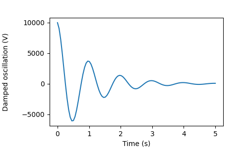
如果要移動標籤,可以指定 *labelpad* 關鍵字參數,其中值為點 (1/72 英吋,與用於指定字體大小的單位相同)。
fig, ax = plt.subplots(figsize=(5, 3))
fig.subplots_adjust(bottom=0.15, left=0.2)
ax.plot(x1, y1*10000)
ax.set_xlabel('Time (s)')
ax.set_ylabel('Damped oscillation (V)', labelpad=18)

plt.show()
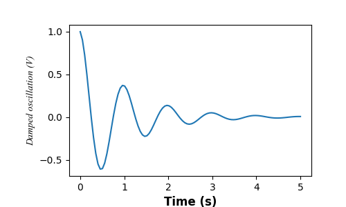
或者,標籤接受所有 Text 關鍵字參數,包括 *position*,透過它可以手動指定標籤位置。 在此,我們將 xlabel 放在座標軸的最左側。 請注意,此位置的 y 座標無效 - 要調整 y 位置,我們需要使用 *labelpad* 關鍵字參數。
fig, ax = plt.subplots(figsize=(5, 3))
fig.subplots_adjust(bottom=0.15, left=0.2)
ax.plot(x1, y1)
ax.set_xlabel('Time (s)', position=(0., 1e6), horizontalalignment='left')
ax.set_ylabel('Damped oscillation (V)')

plt.show()
此教學中的所有標籤都可以透過操作 matplotlib.font_manager.FontProperties 方法,或透過 set_xlabel 的命名關鍵字參數來變更。
from matplotlib.font_manager import FontProperties

font = FontProperties(family='Times New Roman', style='italic')

fig, ax = plt.subplots(figsize=(5, 3))
fig.subplots_adjust(bottom=0.15, left=0.2)
ax.plot(x1, y1)
ax.set_xlabel('Time (s)', fontsize='large', fontweight='bold')
ax.set_ylabel('Damped oscillation (V)', fontproperties=font)

plt.show()
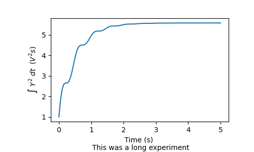
最後,我們可以在所有文字物件中使用原生 TeX 渲染,並且可以有多行文字
fig, ax = plt.subplots(figsize=(5, 3))
fig.subplots_adjust(bottom=0.2, left=0.2)
ax.plot(x1, np.cumsum(y1**2))
ax.set_xlabel('Time (s) \n This was a long experiment')
ax.set_ylabel(r'$\int\ Y^2\ dt\ \ (V^2 s)$')
plt.show()
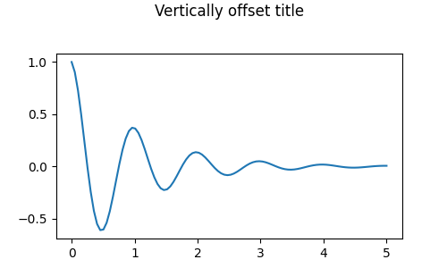
標題#
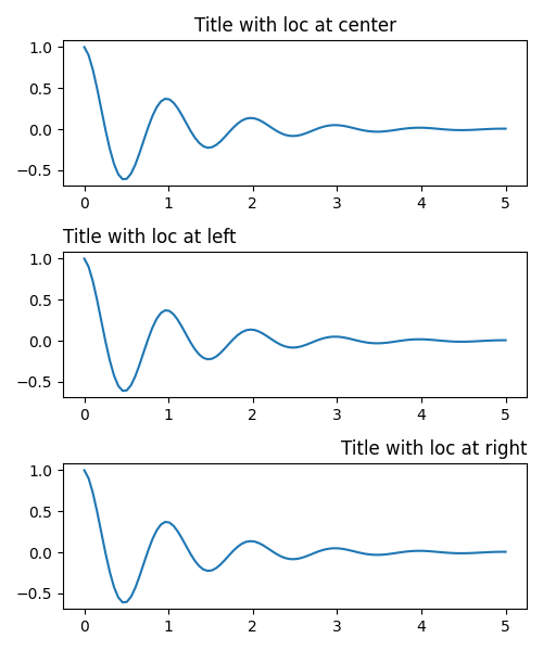
子圖標題的設定方式與標籤非常相似,但有一個 *loc* 關鍵字參數可以變更位置和對齊方式 (預設值為 "center")。
標題的垂直間距由 rcParams["axes.titlepad"] (預設值:6.0) 控制。 設定為不同的值會移動標題。
fig, ax = plt.subplots(figsize=(5, 3))
fig.subplots_adjust(top=0.8)
ax.plot(x1, y1)
ax.set_title('Vertically offset title', pad=30)
plt.show()
刻度和刻度標籤#
放置刻度和刻度標籤是製作圖形的非常棘手的一方面。 Matplotlib 會盡力自動完成此任務,但它也提供了一個非常靈活的架構,用於確定刻度位置的選擇方式,以及如何標記它們。
術語#
座標軸具有 ax.xaxis 和 ax.yaxis 的 matplotlib.axis.Axis 物件,其中包含有關座標軸中標籤的佈局方式的資訊。
座標軸 API 在 axis 的文件中詳細說明。
一個軸物件(Axis object)有主要刻度(major ticks)和次要刻度(minor ticks)。軸物件有 Axis.set_major_locator 和 Axis.set_minor_locator 方法,這些方法會使用繪製的數據來決定主要和次要刻度的位置。此外,還有 Axis.set_major_formatter 和 Axis.set_minor_formatter 方法來格式化刻度標籤。
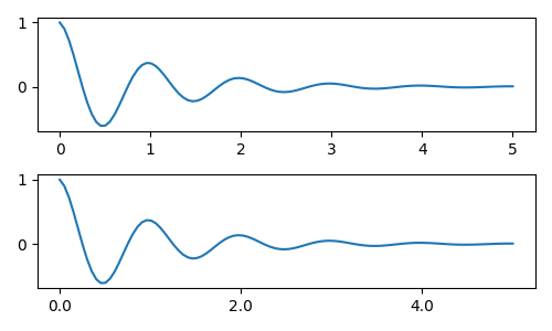
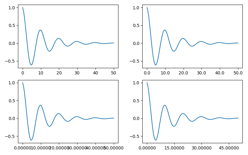
簡單刻度#
通常,簡單地定義刻度值,有時也定義刻度標籤是很方便的,這樣可以覆寫預設的定位器和格式器。然而,我們不鼓勵這樣做,因為這會破壞圖表的互動式導覽。這也可能重設軸的限制:請注意,第二個圖表有我們要求的刻度,包括那些遠遠超出自動視圖限制的刻度。
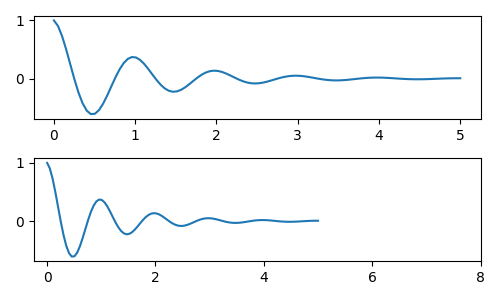
我們當然可以在事後修正這個問題,但這確實突顯了硬編碼刻度的缺點。這個例子也改變了刻度的格式
fig, axs = plt.subplots(2, 1, figsize=(5, 3), tight_layout=True)
axs[0].plot(x1, y1)
axs[1].plot(x1, y1)
ticks = np.arange(0., 8.1, 2.)
# list comprehension to get all tick labels...
tickla = [f'{tick:1.2f}' for tick in ticks]
axs[1].xaxis.set_ticks(ticks)
axs[1].xaxis.set_ticklabels(tickla)
axs[1].set_xlim(axs[0].get_xlim())
plt.show()

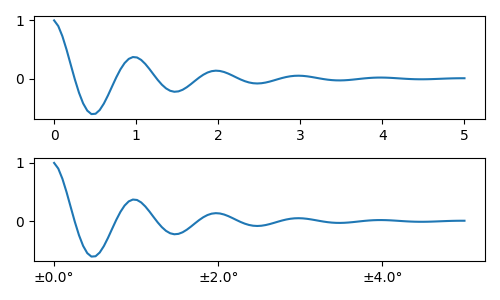
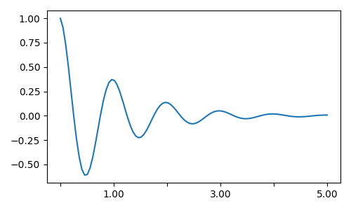
刻度定位器和格式器#
我們可以不建立所有刻度標籤的列表,而是可以使用 matplotlib.ticker.StrMethodFormatter (新式 str.format() 格式字串) 或 matplotlib.ticker.FormatStrFormatter (舊式 '%' 格式字串),並將其傳遞給 ax.xaxis。matplotlib.ticker.StrMethodFormatter 也可以透過傳遞一個 str 來建立,而無需顯式建立格式器。
當然,我們也可以使用非預設的定位器來設定刻度的位置。請注意,我們仍然傳遞刻度值,但上面使用的 x 軸限制修正並不需要。
預設的格式器是 matplotlib.ticker.MaxNLocator,呼叫方式為 ticker.MaxNLocator(self, nbins='auto', steps=[1, 2, 2.5, 5, 10])。steps 引數包含可以用於刻度值的倍數列表。在這種情況下,2、4、6 將是可以接受的刻度,20、40、60 或 0.2、0.4、0.6 也是如此。然而,3、6、9 將是不可接受的,因為 3 不在步驟列表中。
設定 nbins=auto 會使用一種演算法,根據軸的長度來決定可以接受多少刻度。刻度標籤的字型大小會被考慮進去,但刻度字串的長度則不會(因為它還不為人所知)。在底部這一列,刻度標籤非常大,所以我們設定 nbins=4,使標籤適合在右側圖表中。
fig, axs = plt.subplots(2, 2, figsize=(8, 5), tight_layout=True)
for n, ax in enumerate(axs.flat):
    ax.plot(x1*10., y1)

formatter = matplotlib.ticker.FormatStrFormatter('%1.1f')
locator = matplotlib.ticker.MaxNLocator(nbins='auto', steps=[1, 4, 10])
axs[0, 1].xaxis.set_major_locator(locator)
axs[0, 1].xaxis.set_major_formatter(formatter)

formatter = matplotlib.ticker.FormatStrFormatter('%1.5f')
locator = matplotlib.ticker.AutoLocator()
axs[1, 0].xaxis.set_major_formatter(formatter)
axs[1, 0].xaxis.set_major_locator(locator)

formatter = matplotlib.ticker.FormatStrFormatter('%1.5f')
locator = matplotlib.ticker.MaxNLocator(nbins=4)
axs[1, 1].xaxis.set_major_formatter(formatter)
axs[1, 1].xaxis.set_major_locator(locator)

plt.show()
最後,我們可以利用 matplotlib.ticker.FuncFormatter 指定格式器的函式。此外,就像 matplotlib.ticker.StrMethodFormatter 一樣,傳遞一個函式會自動建立一個 matplotlib.ticker.FuncFormatter。
def formatoddticks(x, pos):
    """Format odd tick positions."""
    if x % 2:
        return f'{x:1.2f}'
    else:
        return ''


fig, ax = plt.subplots(figsize=(5, 3), tight_layout=True)
ax.plot(x1, y1)
locator = matplotlib.ticker.MaxNLocator(nbins=6)
ax.xaxis.set_major_formatter(formatoddticks)
ax.xaxis.set_major_locator(locator)

plt.show()
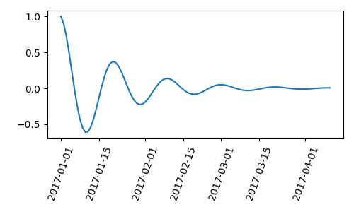
日期刻度#
Matplotlib 可以接受 datetime.datetime 和 numpy.datetime64 物件作為繪圖引數。日期和時間需要特殊的格式化,這通常可以受益於人工介入。為了提供幫助,日期有特殊的定位器和格式器,定義在 matplotlib.dates 模組中。
以下簡單的例子說明了這個概念。請注意,我們如何旋轉刻度標籤,使其不會重疊。
import datetime

fig, ax = plt.subplots(figsize=(5, 3), tight_layout=True)
base = datetime.datetime(2017, 1, 1, 0, 0, 1)
time = [base + datetime.timedelta(days=x) for x in range(len(x1))]

ax.plot(time, y1)
ax.tick_params(axis='x', rotation=70)
plt.show()
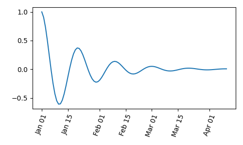
我們可以將格式傳遞給 matplotlib.dates.DateFormatter。如果兩個刻度標籤非常接近,我們可以使用 dates.DayLocator 類別,這允許我們指定要使用的一個月中的天數列表。類似的格式器列在 matplotlib.dates 模組中。
import matplotlib.dates as mdates

locator = mdates.DayLocator(bymonthday=[1, 15])
formatter = mdates.DateFormatter('%b %d')

fig, ax = plt.subplots(figsize=(5, 3), tight_layout=True)
ax.xaxis.set_major_locator(locator)
ax.xaxis.set_major_formatter(formatter)
ax.plot(time, y1)
ax.tick_params(axis='x', rotation=70)
plt.show()
圖例和註解#
腳本的總執行時間: (0 分鐘 6.161 秒)