注意
前往結尾下載完整的範例程式碼。
在 Matplotlib 中選擇色彩映射#
Matplotlib 有許多內建的色彩映射,可透過 matplotlib.colormaps 存取。還有外部函式庫提供了許多額外的色彩映射,可在 Matplotlib 文件的第三方色彩映射章節中檢視。在這裡,我們簡要討論如何在眾多選項之間選擇。如需建立您自己的色彩映射的相關協助,請參閱在 Matplotlib 中建立色彩映射。
若要取得所有已註冊的色彩映射的清單,您可以執行
from matplotlib import colormaps
list(colormaps)
概述#
選擇良好色彩映射背後的概念是為您的資料集在 3D 色彩空間中找到良好的表示法。任何給定資料集最佳的色彩映射取決於許多因素,包括
是否表示形狀或度量資料 ([Ware])
您對資料集的了解(例如,是否存在一個臨界值,其他值會從該值偏離?)
您要繪製的參數是否有直觀的配色方案
該領域是否有受眾可能會期望的標準
對於許多應用程式而言,感知上均勻的色彩映射是最佳選擇;也就是說,在這種色彩映射中,資料中的相等步驟會被感知為色彩空間中的相等步驟。研究人員發現,人腦感知亮度參數的變化比色調的變化更能感知資料的變化。因此,在整個色彩映射中亮度單調增加的色彩映射將更容易被觀看者解讀。感知上均勻的色彩映射的精彩範例也可以在第三方色彩映射章節中找到。
色彩可以用多種方式在 3D 空間中表示。一種表示色彩的方法是使用 CIELAB。在 CIELAB 中,色彩空間由亮度 \(L^*\);紅-綠 \(a^*\);和黃-藍 \(b^*\) 表示。然後,亮度參數 \(L^*\) 可以用來深入了解觀看者將如何感知 matplotlib 色彩映射。
如需了解人腦對色彩映射的感知的絕佳入門資源,請參閱[IBM]。
色彩映射的類別#
色彩映射通常根據其功能分為幾個類別(請參閱,例如,[Moreland])
循序:亮度變化,通常以單一色調漸進地改變色彩飽和度;應使用於表示具有順序的資訊。
發散:兩個不同色彩的亮度變化,且可能飽和度也不同,在中間以不飽和的色彩交會;應在繪製的資訊具有關鍵中間值時使用,例如地形或資料在零附近偏離時。
循環:兩個不同色彩的亮度變化,在中間交會,並且在不飽和的色彩的開始/結尾處交會;應使用於端點處環繞的值,例如相位角、風向或一天中的時間。
定性:通常是各式各樣的色彩;應使用於表示不具有順序或關係的資訊。
from colorspacious import cspace_converter

import matplotlib.pyplot as plt
import numpy as np

import matplotlib as mpl
首先,我們將顯示每個色彩映射的範圍。請注意,有些色彩映射的變化似乎比其他色彩映射「快速」得多。
cmaps = {}

gradient = np.linspace(0, 1, 256)
gradient = np.vstack((gradient, gradient))


def plot_color_gradients(category, cmap_list):
    # Create figure and adjust figure height to number of colormaps
    nrows = len(cmap_list)
    figh = 0.35 + 0.15 + (nrows + (nrows - 1) * 0.1) * 0.22
    fig, axs = plt.subplots(nrows=nrows + 1, figsize=(6.4, figh))
    fig.subplots_adjust(top=1 - 0.35 / figh, bottom=0.15 / figh,
                        left=0.2, right=0.99)
    axs[0].set_title(f'{category} colormaps', fontsize=14)

    for ax, name in zip(axs, cmap_list):
        ax.imshow(gradient, aspect='auto', cmap=mpl.colormaps[name])
        ax.text(-0.01, 0.5, name, va='center', ha='right', fontsize=10,
                transform=ax.transAxes)

    # Turn off *all* ticks & spines, not just the ones with colormaps.
    for ax in axs:
        ax.set_axis_off()

    # Save colormap list for later.
    cmaps[category] = cmap_list
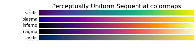
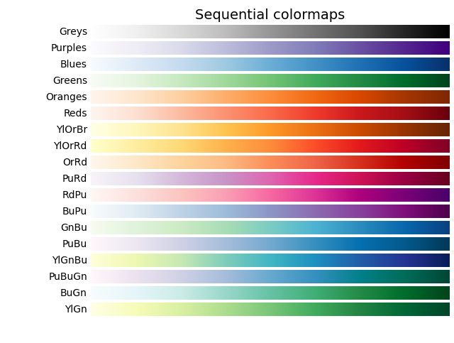
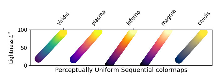
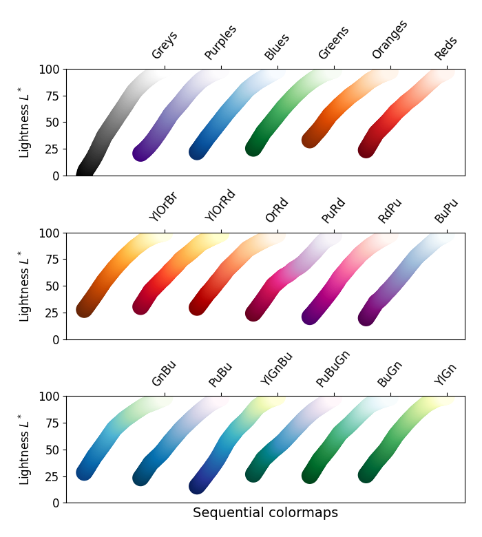
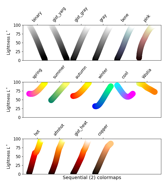
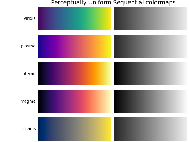
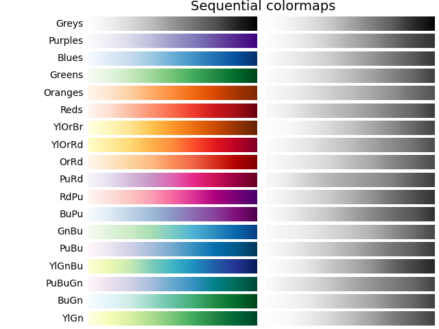
循序#
對於循序繪圖,亮度值在整個色彩映射中單調增加。這很好。色彩映射中的某些 \(L^*\) 值範圍從 0 到 100(二進位和其他灰階),而其他值則從 \(L^*=20\) 附近開始。具有較小 \(L^*\) 範圍的色彩映射,其感知範圍也會相應地較小。另請注意,\(L^*\) 函數在色彩映射之間有所不同:有些在 \(L^*\) 中近似線性,而另一些則更彎曲。
plot_color_gradients('Perceptually Uniform Sequential',
                     ['viridis', 'plasma', 'inferno', 'magma', 'cividis'])
plot_color_gradients('Sequential',
                     ['Greys', 'Purples', 'Blues', 'Greens', 'Oranges', 'Reds',
                      'YlOrBr', 'YlOrRd', 'OrRd', 'PuRd', 'RdPu', 'BuPu',
                      'GnBu', 'PuBu', 'YlGnBu', 'PuBuGn', 'BuGn', 'YlGn'])
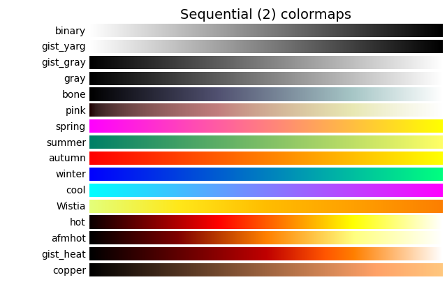
循序 2#
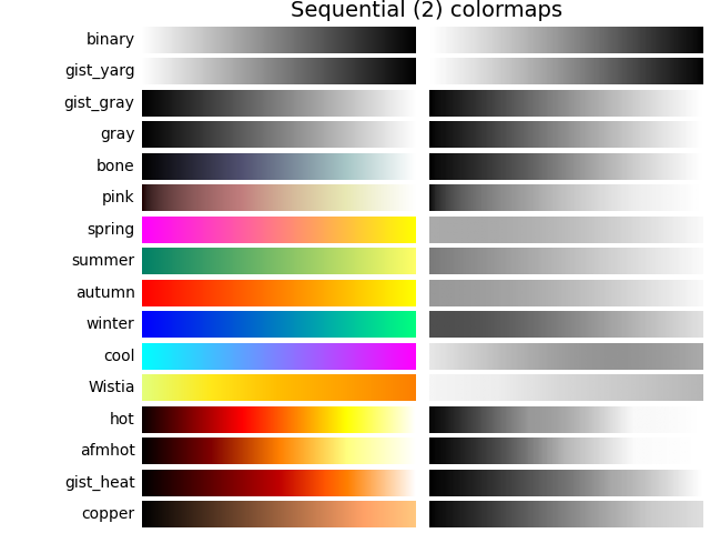
來自循序 2 繪圖的許多 \(L^*\) 值單調增加,但有些(autumn、cool、spring 和 winter)在 \(L^*\) 空間中達到穩定狀態,甚至上下起伏。其他(afmhot、copper、gist_heat 和 hot)在 \(L^*\) 函數中出現扭結。在色彩映射的穩定狀態或扭結區域中表示的資料會導致在色彩映射中這些值處的資料出現條紋狀感知(請參閱 [mycarta-banding],以取得這方面的絕佳範例)。
plot_color_gradients('Sequential (2)',
                     ['binary', 'gist_yarg', 'gist_gray', 'gray', 'bone',
                      'pink', 'spring', 'summer', 'autumn', 'winter', 'cool',
                      'Wistia', 'hot', 'afmhot', 'gist_heat', 'copper'])
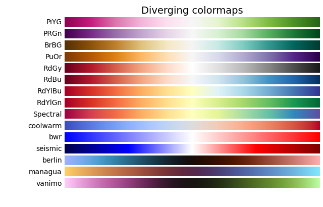
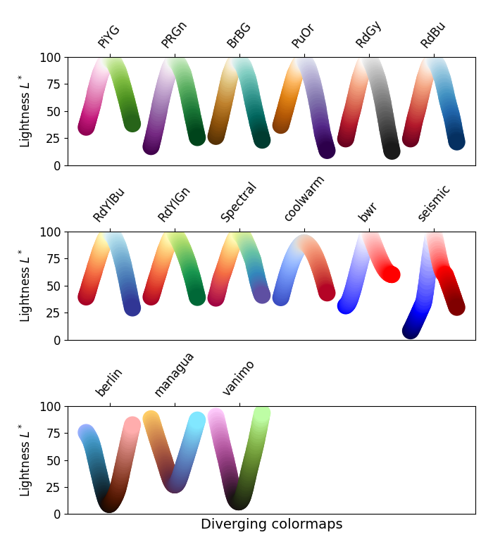
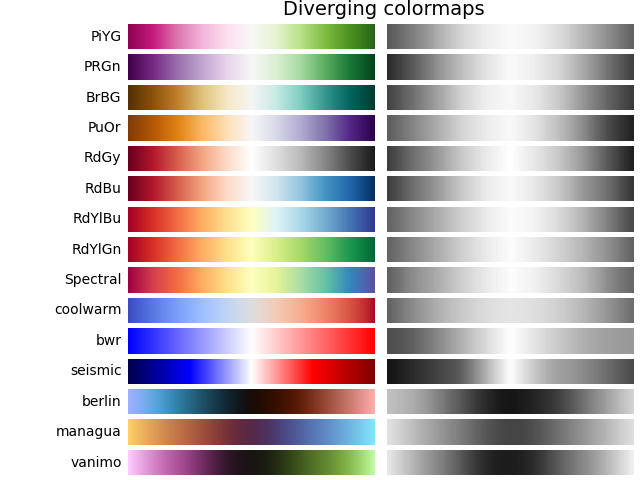
發散#
對於發散映射,我們希望 \(L^*\) 值單調增加到最大值,該最大值應接近 \(L^*=100\),然後是 \(L^*\) 值單調遞減。我們正在尋找在色彩映射相反端具有近似相等的最小 \(L^*\) 值。透過這些衡量標準,BrBG 和 RdBu 是不錯的選擇。coolwarm 是一個不錯的選擇,但它沒有跨越廣泛的 \(L^*\) 值範圍(請參閱下面的灰階章節)。
Berlin、Managua 和 Vanimo 是深色模式發散色彩映射,中心亮度最小,極端處亮度最大。這些取自 F. Crameri 的 [scientific-colour-maps] 8.0.1 版。
plot_color_gradients('Diverging',
                     ['PiYG', 'PRGn', 'BrBG', 'PuOr', 'RdGy', 'RdBu', 'RdYlBu',
                      'RdYlGn', 'Spectral', 'coolwarm', 'bwr', 'seismic',
                      'berlin', 'managua', 'vanimo'])
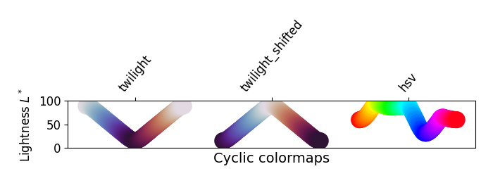
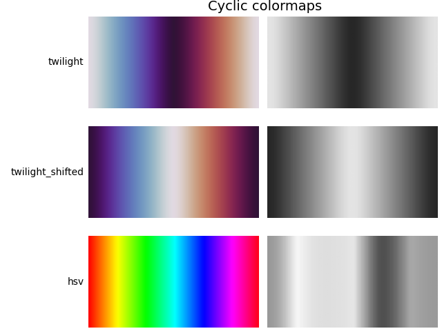
循環#
對於循環映射,我們希望以相同的色彩開始和結束,並在中間滿足對稱的中心點。\(L^*\) 應從開始到中間單調變化,並從中間到結束反向變化。在遞增和遞減側應是對稱的,並且僅在色調上有所不同。在末端和中間,\(L^*\) 將反轉方向,這應在 \(L^*\) 空間中平滑,以減少瑕疵。有關循環映射的設計的更多資訊,請參閱 [kovesi-colormaps]。
此組色彩映射中包含常用的 HSV 色彩映射,儘管它不對稱於中心點。此外,\(L^*\) 值在整個色彩映射中變化很大,使其成為視覺上感知資料的觀看者時的不良選擇。請參閱 [mycarta-jet] 中的此概念的擴展。
plot_color_gradients('Cyclic', ['twilight', 'twilight_shifted', 'hsv'])

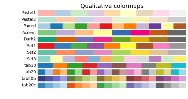
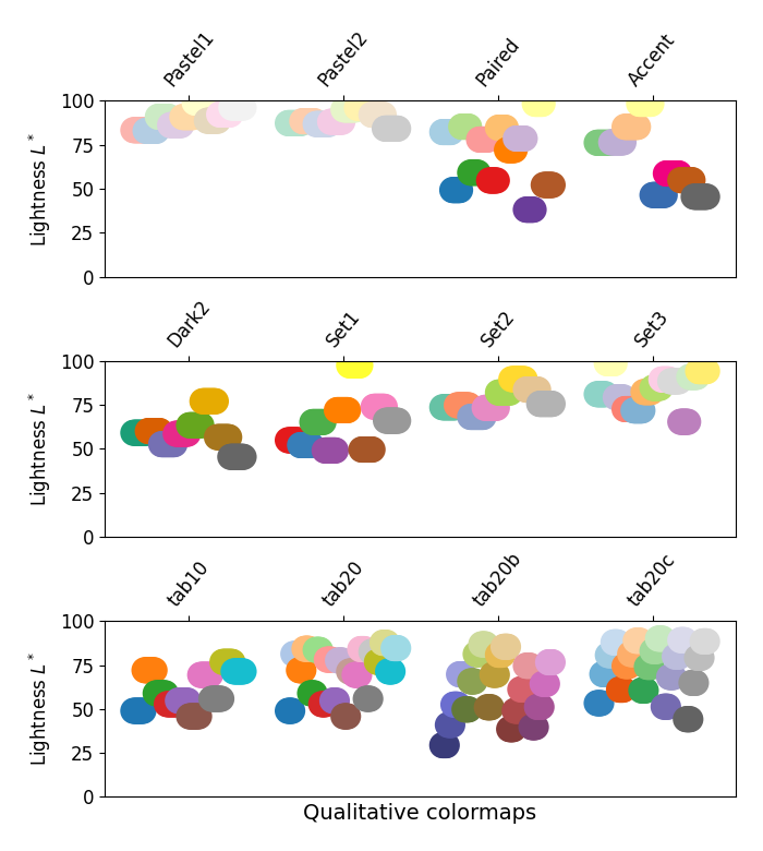
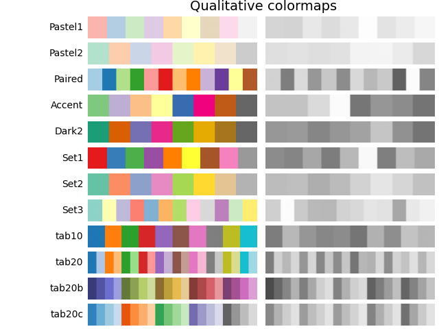
定性#
定性色彩映射的目的不是作為感知映射,但查看亮度參數可以幫助我們驗證這一點。\(L^*\) 值在整個色彩映射中到處移動,並且顯然不是單調遞增。這些不適合作為感知色彩映射使用。
plot_color_gradients('Qualitative',
                     ['Pastel1', 'Pastel2', 'Paired', 'Accent', 'Dark2',
                      'Set1', 'Set2', 'Set3', 'tab10', 'tab20', 'tab20b',
                      'tab20c'])
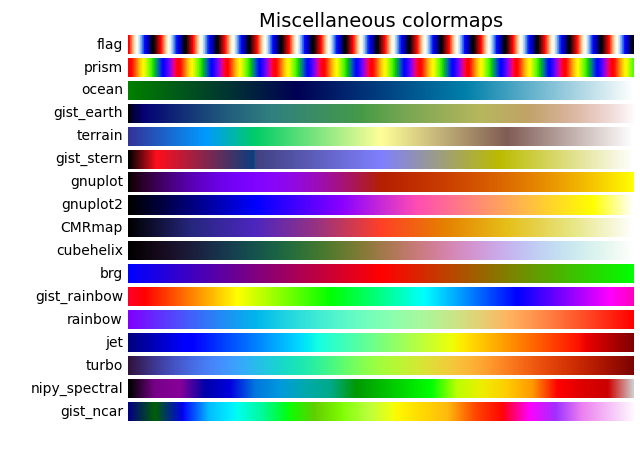
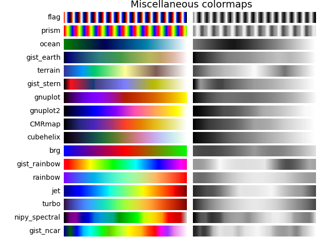
其他#
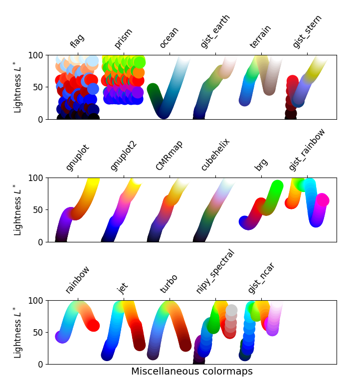
一些其他色彩映射具有已建立的特定用途。例如,gist_earth、ocean 和 terrain 似乎都是為了一起繪製地形(綠色/棕色)和水深(藍色)而建立的。然後,我們會期望在這些色彩映射中看到發散,但多個扭結可能不理想,例如在 gist_earth 和 terrain 中。CMRmap 是為了很好地轉換為灰階而建立的,儘管它似乎在 \(L^*\) 中有一些小扭結。cubehelix 建立的目的是在亮度和色調中平穩變化,但似乎在綠色色調區域中略有凸起。turbo 建立的目的是顯示深度和視差資料。
此組色彩映射中包含常用的 jet 色彩映射。我們可以看到,\(L^*\) 值在整個色彩映射中變化很大,使其成為視覺上感知資料的觀看者時的不良選擇。請參閱 [mycarta-jet] 和 [turbo] 中的此概念的擴展。
plot_color_gradients('Miscellaneous',
                     ['flag', 'prism', 'ocean', 'gist_earth', 'terrain',
                      'gist_stern', 'gnuplot', 'gnuplot2', 'CMRmap',
                      'cubehelix', 'brg', 'gist_rainbow', 'rainbow', 'jet',
                      'turbo', 'nipy_spectral', 'gist_ncar'])

plt.show()
Matplotlib 色彩映射的亮度#
在這裡,我們檢視 matplotlib 色彩映射的亮度值。請注意,有一些關於色彩映射的文件可用 ([list-colormaps])。
mpl.rcParams.update({'font.size': 12})

# Number of colormap per subplot for particular cmap categories
_DSUBS = {'Perceptually Uniform Sequential': 5, 'Sequential': 6,
          'Sequential (2)': 6, 'Diverging': 6, 'Cyclic': 3,
          'Qualitative': 4, 'Miscellaneous': 6}

# Spacing between the colormaps of a subplot
_DC = {'Perceptually Uniform Sequential': 1.4, 'Sequential': 0.7,
       'Sequential (2)': 1.4, 'Diverging': 1.4, 'Cyclic': 1.4,
       'Qualitative': 1.4, 'Miscellaneous': 1.4}

# Indices to step through colormap
x = np.linspace(0.0, 1.0, 100)

# Do plot
for cmap_category, cmap_list in cmaps.items():

    # Do subplots so that colormaps have enough space.
    # Default is 6 colormaps per subplot.
    dsub = _DSUBS.get(cmap_category, 6)
    nsubplots = int(np.ceil(len(cmap_list) / dsub))

    # squeeze=False to handle similarly the case of a single subplot
    fig, axs = plt.subplots(nrows=nsubplots, squeeze=False,
                            figsize=(7, 2.6*nsubplots))

    for i, ax in enumerate(axs.flat):

        locs = []  # locations for text labels

        for j, cmap in enumerate(cmap_list[i*dsub:(i+1)*dsub]):

            # Get RGB values for colormap and convert the colormap in
            # CAM02-UCS colorspace.  lab[0, :, 0] is the lightness.
            rgb = mpl.colormaps[cmap](x)[np.newaxis, :, :3]
            lab = cspace_converter("sRGB1", "CAM02-UCS")(rgb)

            # Plot colormap L values.  Do separately for each category
            # so each plot can be pretty.  To make scatter markers change
            # color along plot:
            # https://stackoverflow.com/q/8202605/

            if cmap_category == 'Sequential':
                # These colormaps all start at high lightness, but we want them
                # reversed to look nice in the plot, so reverse the order.
                y_ = lab[0, ::-1, 0]
                c_ = x[::-1]
            else:
                y_ = lab[0, :, 0]
                c_ = x

            dc = _DC.get(cmap_category, 1.4)  # cmaps horizontal spacing
            ax.scatter(x + j*dc, y_, c=c_, cmap=cmap, s=300, linewidths=0.0)

            # Store locations for colormap labels
            if cmap_category in ('Perceptually Uniform Sequential',
                                 'Sequential'):
                locs.append(x[-1] + j*dc)
            elif cmap_category in ('Diverging', 'Qualitative', 'Cyclic',
                                   'Miscellaneous', 'Sequential (2)'):
                locs.append(x[int(x.size/2.)] + j*dc)

        # Set up the axis limits:
        #   * the 1st subplot is used as a reference for the x-axis limits
        #   * lightness values goes from 0 to 100 (y-axis limits)
        ax.set_xlim(axs[0, 0].get_xlim())
        ax.set_ylim(0.0, 100.0)

        # Set up labels for colormaps
        ax.xaxis.set_ticks_position('top')
        ticker = mpl.ticker.FixedLocator(locs)
        ax.xaxis.set_major_locator(ticker)
        formatter = mpl.ticker.FixedFormatter(cmap_list[i*dsub:(i+1)*dsub])
        ax.xaxis.set_major_formatter(formatter)
        ax.xaxis.set_tick_params(rotation=50)
        ax.set_ylabel('Lightness $L^*$', fontsize=12)

    ax.set_xlabel(cmap_category + ' colormaps', fontsize=14)

    fig.tight_layout(h_pad=0.0, pad=1.5)
    plt.show()
灰階轉換#
務必留意色彩圖轉換為灰階的情形,因為它們可能會被列印在黑白印表機上。若未仔細考量,您的讀者可能會因為色彩圖的灰階變化難以預測,而導致圖表無法辨識。
轉換為灰階有多種不同的方法[bw]。一些較好的方法是使用像素 RGB 值的線性組合,但會根據我們感知色彩強度的程度進行加權。轉換為灰階的非線性方法是使用像素的 \(L^*\) 值。一般來說,此問題的原則與感知上呈現資訊的原則類似;也就是說,如果選擇的色彩圖在 \(L^*\) 值上是單調遞增的,那麼它列印為灰階時將會呈現合理的效果。
考慮到這一點,我們發現「循序」色彩圖在灰階中具有合理的呈現效果。「循序2」色彩圖中的某些(雖然有些如秋天、春天、夏天、冬天)灰階變化很小。如果在圖表中使用此類色彩圖,然後將圖表列印為灰階,則許多資訊可能會對應到相同的灰階值。發散色彩圖大多從外緣的較深灰色變為中間的白色。有些(例如 PuOr 和 seismic)在一側的灰色明顯比另一側深,因此不是很對稱。coolwarm 的灰階範圍很小,列印出來會是一個較為均勻的圖表,會損失許多細節。請注意,覆蓋的、標記的輪廓線可以幫助區分色彩圖的一側與另一側,因為一旦將圖表列印為灰階就無法使用顏色。許多「定性」和「其他」色彩圖,例如 Accent、hsv、jet 和 turbo,在整個色彩圖中會從較深的灰色變為較淺的灰色,然後又變回較深的灰色。這會使觀看者在將圖表列印為灰階後,無法解讀圖表中的資訊。
mpl.rcParams.update({'font.size': 14})

# Indices to step through colormap.
x = np.linspace(0.0, 1.0, 100)

gradient = np.linspace(0, 1, 256)
gradient = np.vstack((gradient, gradient))


def plot_color_gradients(cmap_category, cmap_list):
    fig, axs = plt.subplots(nrows=len(cmap_list), ncols=2)
    fig.subplots_adjust(top=0.95, bottom=0.01, left=0.2, right=0.99,
                        wspace=0.05)
    fig.suptitle(cmap_category + ' colormaps', fontsize=14, y=1.0, x=0.6)

    for ax, name in zip(axs, cmap_list):

        # Get RGB values for colormap.
        rgb = mpl.colormaps[name](x)[np.newaxis, :, :3]

        # Get colormap in CAM02-UCS colorspace. We want the lightness.
        lab = cspace_converter("sRGB1", "CAM02-UCS")(rgb)
        L = lab[0, :, 0]
        L = np.float32(np.vstack((L, L, L)))

        ax[0].imshow(gradient, aspect='auto', cmap=mpl.colormaps[name])
        ax[1].imshow(L, aspect='auto', cmap='binary_r', vmin=0., vmax=100.)
        pos = list(ax[0].get_position().bounds)
        x_text = pos[0] - 0.01
        y_text = pos[1] + pos[3]/2.
        fig.text(x_text, y_text, name, va='center', ha='right', fontsize=10)

    # Turn off *all* ticks & spines, not just the ones with colormaps.
    for ax in axs.flat:
        ax.set_axis_off()

    plt.show()


for cmap_category, cmap_list in cmaps.items():

    plot_color_gradients(cmap_category, cmap_list)
色覺辨識障礙#
有許多關於色盲的資訊(例如,[colorblindness])。此外,還有一些工具可用於將圖像轉換為不同類型色覺辨識障礙者所看到的樣子。
最常見的色覺辨識障礙形式涉及區分紅色和綠色。因此,一般來說,避免使用同時具有紅色和綠色的色彩圖可以避免許多問題。
參考文獻#
腳本總執行時間:(0 分鐘 14.954 秒)