注意
前往結尾下載完整的範例程式碼。
Pyplot 教學#
pyplot 介面簡介。另請參閱 快速入門指南,了解 Matplotlib 的運作方式,以及 Matplotlib 應用程式介面 (API),了解支援的使用者 API 之間的權衡取捨。
Pyplot 簡介#
matplotlib.pyplot 是一系列函式,可讓 matplotlib 的運作方式類似 MATLAB。每個 pyplot 函式都會對圖形進行一些變更:例如,建立圖形、在圖形中建立繪圖區域、在繪圖區域中繪製一些線條、以標籤裝飾繪圖等等。
在 matplotlib.pyplot 中,各種狀態會在函式呼叫之間保留,使其可以追蹤目前圖形和繪圖區域之類的項目,並且繪圖函式會導向目前的 Axes (請注意,我們使用大寫的 Axes 來指稱 Axes 概念,這是 圖形的中心部分,而不僅僅是 axis 的複數形式)。
注意
隱式的 pyplot API 通常較不冗長,但彈性不如顯式的 API。您在此看到的大多數函式呼叫也可以從 Axes 物件中作為方法呼叫。我們建議瀏覽教學和範例,以了解其運作方式。請參閱 Matplotlib 應用程式介面 (API),了解支援的使用者 API 的權衡取捨。
使用 pyplot 產生視覺化圖表非常快速
import matplotlib.pyplot as plt

plt.plot([1, 2, 3, 4])
plt.ylabel('some numbers')
plt.show()
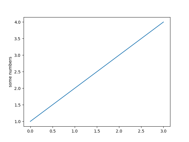
您可能會想知道為什麼 x 軸範圍為 0-3,而 y 軸範圍為 1-4。如果您為 plot 提供單一清單或陣列,matplotlib 會假設它是一系列 y 值,並自動為您產生 x 值。由於 python 範圍從 0 開始,因此預設的 x 向量與 y 的長度相同,但從 0 開始;因此,x 資料為 [0, 1, 2, 3]。
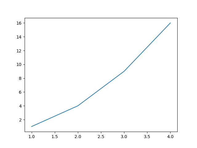
plot 是一個多功能的函式,將會接受任意數量的引數。例如,若要繪製 x 對 y 的圖形,您可以寫入
plt.plot([1, 2, 3, 4], [1, 4, 9, 16])
設定繪圖樣式格式#
針對每個 x、y 引數對,都有一個選用的第三個引數,該引數是格式字串,表示繪圖的色彩和線條類型。格式字串的字母和符號來自 MATLAB,您可以將色彩字串與線條樣式字串串聯。預設格式字串為 'b-',這是一條實心藍線。例如,若要以紅色圓圈繪製上述圖形,您將發出
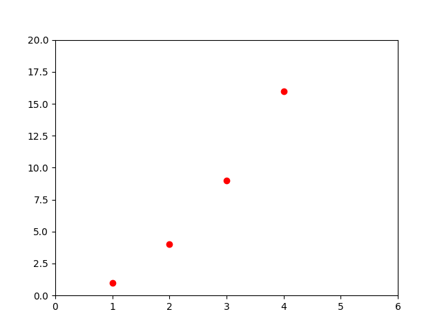
如需線條樣式和格式字串的完整清單,請參閱 plot 文件。上述範例中的 axis 函式會採用 [xmin, xmax, ymin, ymax] 的清單,並指定 Axes 的檢視區。
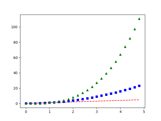
如果 matplotlib 僅限於使用清單,那麼它對於數值處理來說就相當無用。一般而言,您會使用 numpy 陣列。實際上,所有序列都會在內部轉換為 numpy 陣列。以下範例說明如何使用陣列在一個函式呼叫中繪製數條具有不同格式樣式的線條。
使用關鍵字字串繪圖#
在某些情況下,您的資料格式可讓您使用字串存取特定變數。例如,使用 結構化陣列 或 pandas.DataFrame。
Matplotlib 允許您使用 data 關鍵字引數來提供這類物件。如果提供,您可以使用對應這些變數的字串來產生繪圖。
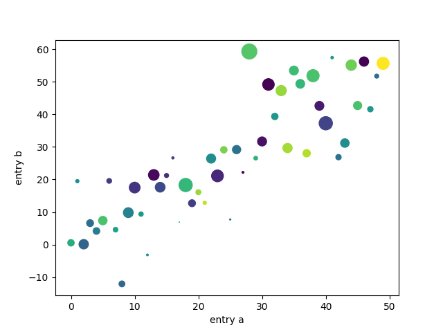
data = {'a': np.arange(50),
        'c': np.random.randint(0, 50, 50),
        'd': np.random.randn(50)}
data['b'] = data['a'] + 10 * np.random.randn(50)
data['d'] = np.abs(data['d']) * 100

plt.scatter('a', 'b', c='c', s='d', data=data)
plt.xlabel('entry a')
plt.ylabel('entry b')
plt.show()
使用類別變數繪圖#
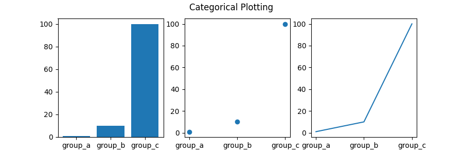
也可以使用類別變數建立繪圖。Matplotlib 允許您直接將類別變數傳遞至許多繪圖函式。例如
names = ['group_a', 'group_b', 'group_c']
values = [1, 10, 100]

plt.figure(figsize=(9, 3))

plt.subplot(131)
plt.bar(names, values)
plt.subplot(132)
plt.scatter(names, values)
plt.subplot(133)
plt.plot(names, values)
plt.suptitle('Categorical Plotting')
plt.show()
控制線條屬性#
線條有許多您可以設定的屬性:線條寬度、虛線樣式、反鋸齒等等;請參閱 matplotlib.lines.Line2D。有多種方法可以設定線條屬性
使用關鍵字引數
使用
Line2D執行個體的 setter 方法。plot會傳回Line2D物件的清單;例如,line1, line2 = plot(x1, y1, x2, y2)。在以下程式碼中,我們假設只有一條線,因此傳回的清單長度為 1。我們使用具有line,的 tuple 解包來取得該清單的第一個元素使用
setp。以下範例使用 MATLAB 樣式的函式,來設定線條清單中的多個屬性。setp可以與物件清單或單一物件透明地運作。您可以使用 python 關鍵字引數或 MATLAB 樣式的字串/值配對lines = plt.plot(x1, y1, x2, y2) # use keyword arguments plt.setp(lines, color='r', linewidth=2.0) # or MATLAB style string value pairs plt.setp(lines, 'color', 'r', 'linewidth', 2.0)
以下是可用的 Line2D 屬性。
屬性 |
值類型 |
|---|---|
alpha |
float |
animated |
[True | False] |
antialiased 或 aa |
[True | False] |
clip_box |
一個 matplotlib.transform.Bbox 執行個體 |
clip_on |
[True | False] |
clip_path |
一個 Path 執行個體和一個 Transform 執行個體、一個 Patch |
color 或 c |
任何 matplotlib 色彩 |
contains |
點擊測試函式 |
dash_capstyle |
[ |
dash_joinstyle |
[ |
dashes |
點中開/關墨水的順序 |
data |
(np.array xdata, np.array ydata) |
figure |
一個 matplotlib.figure.Figure 執行個體 |
label |
任何字串 |
linestyle 或 ls |
[ |
linewidth 或 lw |
點中的 float 值 |
marker |
[ |
markeredgecolor 或 mec |
任何 matplotlib 色彩 |
markeredgewidth 或 mew |
點中的 float 值 |
markerfacecolor 或 mfc |
任何 matplotlib 色彩 |
markersize 或 ms |
float |
markevery |
[ None | 整數 | (startind, stride) ] |
picker |
用於互動式線條選取 |
pickradius |
線條選取半徑 |
solid_capstyle |
[ |
solid_joinstyle |
[ |
transform |
一個 matplotlib.transforms.Transform 執行個體 |
visible |
[True | False] |
xdata |
np.array |
ydata |
np.array |
zorder |
任何數字 |
若要取得可設定的線條屬性清單,請使用線條或線條作為引數呼叫 setp 函式
In [69]: lines = plt.plot([1, 2, 3])

In [70]: plt.setp(lines)
  alpha: float
  animated: [True | False]
  antialiased or aa: [True | False]
  ...snip
使用多個圖形和 Axes#
MATLAB 和 pyplot 都有目前圖形和目前 Axes 的概念。所有繪圖函式都會套用至目前的 Axes。gca 函式會傳回目前的 Axes (一個 matplotlib.axes.Axes 執行個體),而 gcf 會傳回目前的圖形 (一個 matplotlib.figure.Figure 執行個體)。通常,您不必擔心這個問題,因為所有這些都會在幕後處理。以下是建立兩個子圖的指令碼。
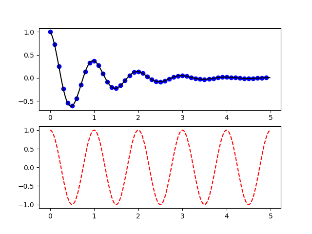
這裡的 figure 呼叫是可選的,因為如果不存在圖形,就會建立一個,就像如果不存在軸(相當於顯式 subplot() 呼叫)就會建立一樣。 subplot 呼叫指定 numrows, numcols, plot_number,其中 plot_number 的範圍從 1 到 numrows*numcols。如果 numrows*numcols<10,subplot 呼叫中的逗號是可選的。因此,subplot(211) 與 subplot(2, 1, 1) 相同。
您可以建立任意數量的子圖和軸。 如果您想手動放置軸,即不在矩形網格上,請使用 axes,它可以讓您將位置指定為 axes([left, bottom, width, height]),其中所有值都是分數(0 到 1)座標。有關手動放置軸的範例,請參閱軸示範,以及有關大量子圖的範例,請參閱多個子圖。
您可以通過使用多個帶有遞增圖形編號的 figure 呼叫來建立多個圖形。當然,每個圖形都可以包含任意數量的軸和子圖。
import matplotlib.pyplot as plt
plt.figure(1)                # the first figure
plt.subplot(211)             # the first subplot in the first figure
plt.plot([1, 2, 3])
plt.subplot(212)             # the second subplot in the first figure
plt.plot([4, 5, 6])


plt.figure(2)                # a second figure
plt.plot([4, 5, 6])          # creates a subplot() by default

plt.figure(1)                # first figure current;
                             # subplot(212) still current
plt.subplot(211)             # make subplot(211) in the first figure
                             # current
plt.title('Easy as 1, 2, 3') # subplot 211 title
您可以使用 clf 清除當前圖形,並使用 cla 清除當前軸。如果您覺得幕後維護狀態(特別是當前影像、圖形和軸)很煩人,請不要灰心:這只是一個圍繞物件導向 API 的薄狀態封裝器,您可以改用它(請參閱 Artist 教學)
如果您要製作大量圖形,您需要注意一件事:在明確使用 close 關閉圖形之前,圖形所需的記憶體不會完全釋放。刪除對圖形的所有參考,和/或使用視窗管理器來終止圖形在螢幕上出現的視窗是不夠的,因為 pyplot 會維護內部參考,直到呼叫 close 為止。
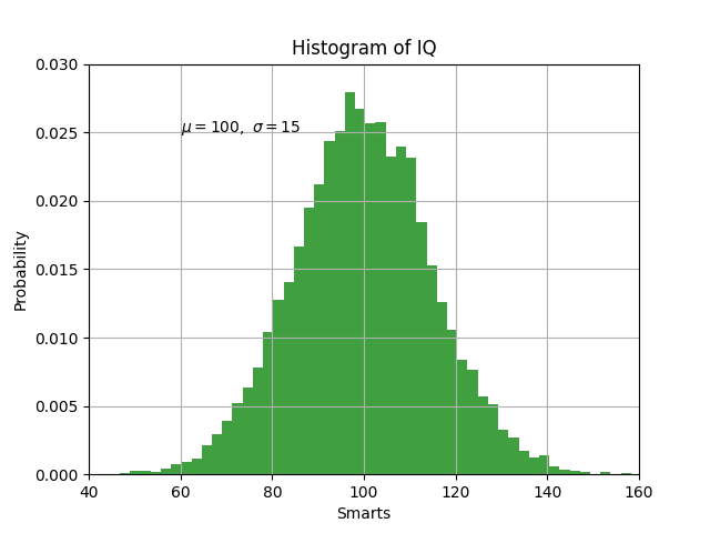
處理文字#
text 可以用於在任意位置新增文字,而 xlabel、 ylabel 和 title 用於在指示的位置新增文字(有關更詳細的範例,請參閱Matplotlib 中的文字)
mu, sigma = 100, 15
x = mu + sigma * np.random.randn(10000)

# the histogram of the data
n, bins, patches = plt.hist(x, 50, density=True, facecolor='g', alpha=0.75)


plt.xlabel('Smarts')
plt.ylabel('Probability')
plt.title('Histogram of IQ')
plt.text(60, .025, r'$\mu=100,\ \sigma=15$')
plt.axis([40, 160, 0, 0.03])
plt.grid(True)
plt.show()
所有 text 函式都會傳回一個 matplotlib.text.Text 實例。就像上面的線條一樣,您可以通過將關鍵字引數傳遞到文字函式或使用 setp 來自訂屬性
t = plt.xlabel('my data', fontsize=14, color='red')
這些屬性在 文字屬性和版面配置 中有更詳細的介紹。
在文字中使用數學表達式#
Matplotlib 在任何文字表達式中都接受 TeX 方程式表達式。例如,要在標題中寫入表達式 \(\sigma_i=15\),您可以寫入以美元符號括起來的 TeX 表達式
plt.title(r'$\sigma_i=15$')
標題字串前面的 r 很重要,它表示該字串是一個原始字串,而不是將反斜線視為 python 跳脫字元。 matplotlib 有一個內建的 TeX 表達式剖析器和版面配置引擎,並附帶自己的數學字型 - 詳細資訊請參閱 寫入數學表達式。因此,您可以在不同平台上使用數學文字,而無需安裝 TeX。對於那些已安裝 LaTeX 和 dvipng 的使用者,您也可以使用 LaTeX 來格式化文字,並將輸出直接合併到您的顯示圖形或已儲存的 postscript 中 - 請參閱 使用 LaTeX 呈現文字。
註解文字#
上述基本 text 函式的使用會在軸上的任意位置放置文字。文字的常見用途是註解繪圖的某些功能,而 annotate 方法提供了輔助功能,使註解變得容易。在註解中,有兩點需要考慮:要註解的位置,由引數 xy 表示,以及文字的位置 xytext。這兩個引數都是 (x, y) 元組。
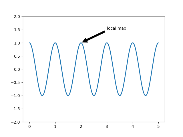
在這個基本範例中,xy(箭頭尖端)和 xytext 位置(文字位置)都位於資料座標中。您可以選擇各種其他座標系統 - 詳細資訊請參閱 基本註解 和 進階註解。您可以在註解繪圖中找到更多範例。
對數和其他非線性軸#
matplotlib.pyplot 不僅支援線性軸刻度,還支援對數和 logit 刻度。如果資料跨越多個數量級,通常會使用此功能。變更軸的刻度很容易
plt.xscale('log')
下面顯示了四個具有相同資料和不同 y 軸刻度的繪圖範例。
# Fixing random state for reproducibility
np.random.seed(19680801)

# make up some data in the open interval (0, 1)
y = np.random.normal(loc=0.5, scale=0.4, size=1000)
y = y[(y > 0) & (y < 1)]
y.sort()
x = np.arange(len(y))

# plot with various axes scales
plt.figure()

# linear
plt.subplot(221)
plt.plot(x, y)
plt.yscale('linear')
plt.title('linear')
plt.grid(True)

# log
plt.subplot(222)
plt.plot(x, y)
plt.yscale('log')
plt.title('log')
plt.grid(True)

# symmetric log
plt.subplot(223)
plt.plot(x, y - y.mean())
plt.yscale('symlog', linthresh=0.01)
plt.title('symlog')
plt.grid(True)

# logit
plt.subplot(224)
plt.plot(x, y)
plt.yscale('logit')
plt.title('logit')
plt.grid(True)
# Adjust the subplot layout, because the logit one may take more space
# than usual, due to y-tick labels like "1 - 10^{-3}"
plt.subplots_adjust(top=0.92, bottom=0.08, left=0.10, right=0.95, hspace=0.25,
                    wspace=0.35)

plt.show()
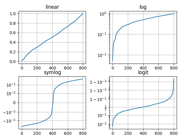
也可以新增自己的刻度,詳細資訊請參閱 matplotlib.scale。
腳本的總執行時間: (0 分鐘 4.399 秒)