新的更易於存取的色彩循環#
新增了一個名為 'petroff10' 的新色彩循環。此循環是使用演算法強制執行的可及性約束(包括色覺障礙建模)以及基於群眾外包的色彩偏好調查開發的機器學習美學模型建構的。它的目標是既在美學上普遍令人愉悅,又對色盲人士可存取,使其可作為通用設計的預設值。如需更多詳細資訊,請參閱 Petroff, M. A.: "Accessible Color Sequences for Data Visualization" 以及相關的 SciPy 演講。樣式表 參考中包含示範。若要載入此色彩循環來取代預設值
import matplotlib.pyplot as plt
plt.style.use('petroff10')
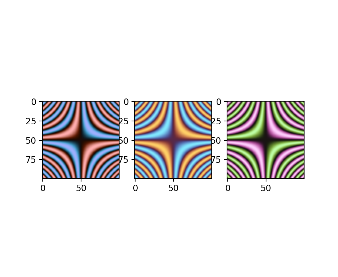
深色模式發散式色彩圖#
已新增三個發散式色彩圖:「berlin」、「managua」和「vanimo」。它們是深色模式發散式色彩圖,中心具有最小亮度,兩端具有最大亮度。這些取自 F. Crameri 的科學色彩圖版本 8.0.1 (DOI: https://doi.org/10.5281/zenodo.1243862)。
import numpy as np
import matplotlib.pyplot as plt

vals = np.linspace(-5, 5, 100)
x, y = np.meshgrid(vals, vals)
img = np.sin(x*y)

_, ax = plt.subplots(1, 3)
ax[0].imshow(img, cmap=plt.cm.berlin)
ax[1].imshow(img, cmap=plt.cm.managua)
ax[2].imshow(img, cmap=plt.cm.vanimo)
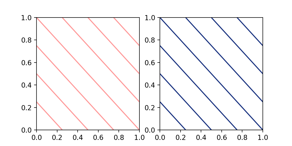
在 contour 和 contourf 中指定單一色彩#
contour 和 contourf 先前接受以字串形式表示的單一色彩。此限制現已移除,並且可以傳遞在指定色彩教學中描述的任何格式的單一色彩。
import matplotlib.pyplot as plt

fig, (ax1, ax2) = plt.subplots(ncols=2, figsize=(6, 3))
z = [[0, 1], [1, 2]]

ax1.contour(z, colors=('r', 0.4))
ax2.contour(z, colors=(0.1, 0.2, 0.5))

plt.show()
例外處理控制#
現在,當傳遞無效的關鍵字參數時引發的例外會將該參數名稱包含為例外的 name 屬性。這為例外處理提供更多控制權
import matplotlib.pyplot as plt

def wobbly_plot(args, **kwargs):
    w = kwargs.pop('wobble_factor', None)

    try:
        plt.plot(args, **kwargs)
    except AttributeError as e:
        raise AttributeError(f'wobbly_plot does not take parameter {e.name}') from e


wobbly_plot([0, 1], wibble_factor=5)
AttributeError: wobbly_plot does not take parameter wibble_factor
初步支援 CPython 3.13 的自由執行緒#
Matplotlib 3.10 初步支援 CPython 3.13 的自由執行緒組建。請參閱 https://py-free-threading.github.io、PEP 703 和 CPython 3.13 發行說明,以取得更多關於自由執行緒 Python 的詳細資訊。
支援自由執行緒 Python 並不代表 Matplotlib 完全是執行緒安全的。我們預期在單一執行緒中使用 Figure 應可正常運作,雖然輸入資料通常會被複製,但從另一個執行緒修改用於繪圖的資料物件,在某些情況下可能會導致不一致。強烈不建議使用任何全域狀態(例如 pyplot 模組),並且可能無法穩定運作。另請注意,大多數 GUI 工具組都預期在主執行緒上執行,因此在其他執行緒上的互動式使用可能會受到限制或不支援。
如果您對自由執行緒 Python 感興趣,例如,因為您有興趣使用 Python 執行緒來運行基於多處理的工作流程,我們鼓勵您進行測試和實驗。如果您遇到懷疑是 Matplotlib 造成的問題,請開啟一個 issue,並先檢查該錯誤是否也會發生在「常規」非自由執行緒的 CPython 3.13 版本中。
使用 Agg 渲染器增加 Figure 限制#
使用 Agg 渲染器的 Figures 現在每個方向的像素限制為 2**23,而不是 2**16。此外,修復了導致 artist 無法水平渲染超過 2**15 像素的錯誤。
請注意,如果您使用的是 GUI 後端,它可能有自己的較小限制(這些限制本身可能取決於螢幕大小)。
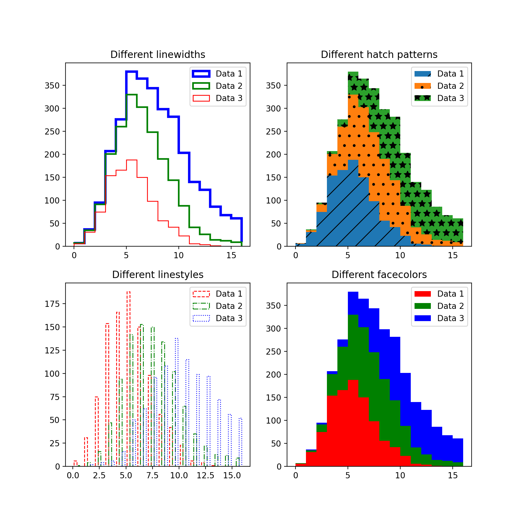
向量化 hist 樣式參數#
hist 方法的 hatch、edgecolor、facecolor、linewidth 和 linestyle 參數現在已向量化。這表示當輸入的 x 有多個資料集時,您可以為每個直方圖傳遞個別參數。
import matplotlib.pyplot as plt
import numpy as np
np.random.seed(19680801)

fig, ((ax1, ax2), (ax3, ax4)) = plt.subplots(2, 2, figsize=(9, 9))

data1 = np.random.poisson(5, 1000)
data2 = np.random.poisson(7, 1000)
data3 = np.random.poisson(10, 1000)

labels = ["Data 1", "Data 2", "Data 3"]

ax1.hist([data1, data2, data3], bins=range(17), histtype="step", stacked=True,
         edgecolor=["red", "green", "blue"], linewidth=[1, 2, 3])
ax1.set_title("Different linewidths")
ax1.legend(labels)

ax2.hist([data1, data2, data3], bins=range(17), histtype="barstacked",
         hatch=["/", ".", "*"])
ax2.set_title("Different hatch patterns")
ax2.legend(labels)

ax3.hist([data1, data2, data3], bins=range(17), histtype="bar", fill=False,
         edgecolor=["red", "green", "blue"], linestyle=["--", "-.", ":"])
ax3.set_title("Different linestyles")
ax3.legend(labels)

ax4.hist([data1, data2, data3], bins=range(17), histtype="barstacked",
         facecolor=["red", "green", "blue"])
ax4.set_title("Different facecolors")
ax4.legend(labels)

plt.show()
InsetIndicator artist#
indicate_inset 和 indicate_inset_zoom 現在會傳回 InsetIndicator 的實例,其中包含矩形和連接器 patch。這些 patch 現在會自動更新,所以
ax.indicate_inset_zoom(ax_inset)
ax_inset.set_xlim(new_lim)
現在會產生與以下相同的結果
ax_inset.set_xlim(new_lim)
ax.indicate_inset_zoom(ax_inset)
matplotlib.ticker.EngFormatter 現在可以計算偏移量#
matplotlib.ticker.EngFormatter 增加了在軸附近顯示偏移文字的功能。它使用與 matplotlib.ticker.ScalarFormatter 相同的邏輯,可以判斷資料是否符合具有偏移量的條件,並使用適當的 SI 數量字首以及提供的 unit 來顯示。
若要啟用此新行為,只需在實例化 matplotlib.ticker.EngFormatter 時傳遞 useOffset=True 即可。請參閱範例 SI 字首偏移量和自然數量級。
修正 ImageGrid 單一 colorbar 的邊距#
當 cbar_mode="single" 時,ImageGrid 不再為 cbar_location 為 "left" 和 "bottom" 的情況在軸和 colorbar 之間新增 axes_pad。如果需要,請使用 cbar_pad 新增額外間距。
ax.table 將接受 pandas DataFrame#
table 方法現在可以接受 Pandas DataFrame 作為 cellText 參數。
import matplotlib.pyplot as plt
import pandas as pd

data = {
    'Letter': ['A', 'B', 'C'],
    'Number': [100, 200, 300]
}

df = pd.DataFrame(data)
fig, ax = plt.subplots()
table = ax.table(df, loc='center')  # or table = ax.table(cellText=df, loc='center')
ax.axis('off')
plt.show()
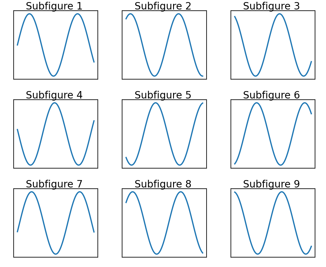
Subfigures 現在以列優先順序新增#
為了 API 的一致性,Figure.subfigures 現在以列優先順序新增。
import matplotlib.pyplot as plt

fig = plt.figure()
subfigs = fig.subfigures(3, 3)
x = np.linspace(0, 10, 100)

for i, sf in enumerate(fig.subfigs):
    ax = sf.subplots()
    ax.plot(x, np.sin(x + i), label=f'Subfigure {i+1}')
    sf.suptitle(f'Subfigure {i+1}')
    ax.set_xticks([])
    ax.set_yticks([])
plt.show()
svg.id rcParam#
rcParams["svg.id"] (預設值:None)可讓您將 id 屬性插入到最上層的 <svg> 標籤中。
例如,rcParams["svg.id"] = "svg1" 的結果為預設值),不包含 id 標籤
<svg
    xmlns:xlink="http://www.w3.org/1999/xlink"
    width="50pt" height="50pt"
    viewBox="0 0 50 50"
    xmlns="http://www.w3.org/2000/svg"
    version="1.1"
    id="svg1"
></svg>
如果您想使用 <use> 標籤將整個 matplotlib SVG 檔案連結到另一個 SVG 檔案中,這會很有用。
<svg>
<use
    width="50" height="50"
    xlink:href="mpl.svg#svg1" id="use1"
    x="0" y="0"
/></svg>
其中 #svg1 指示符號現在會參照最上層的 <svg> 標籤,因此會導致包含整個檔案。
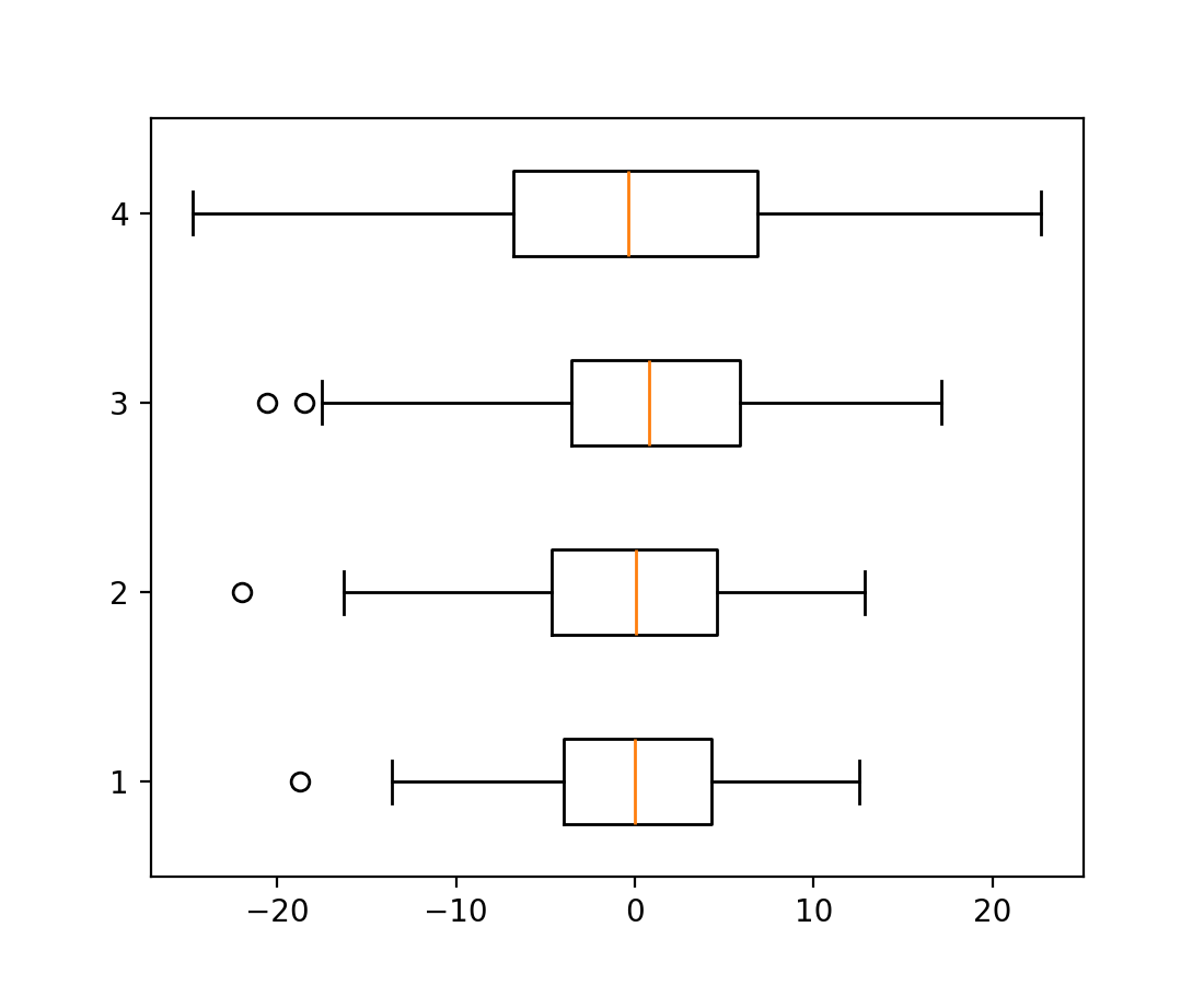
boxplot 和 bxp 方向參數#
箱形圖有一個新的參數 *orientation: {"vertical", "horizontal"}* 來變更繪圖方向。這會取代已棄用的 *vert: bool* 參數。
import matplotlib.pyplot as plt
import numpy as np

fig, ax = plt.subplots()
np.random.seed(19680801)
all_data = [np.random.normal(0, std, 100) for std in range(6, 10)]

ax.boxplot(all_data, orientation='horizontal')
plt.show()
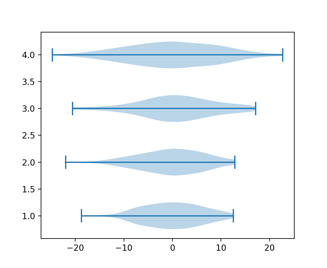
violinplot 和 violin 方向參數#
小提琴圖有一個新的參數 *orientation: {"vertical", "horizontal"}* 來變更繪圖方向。這將會取代已棄用的 *vert: bool* 參數。
import matplotlib.pyplot as plt
import numpy as np

fig, ax = plt.subplots()
np.random.seed(19680801)
all_data = [np.random.normal(0, std, 100) for std in range(6, 10)]

ax.violinplot(all_data, orientation='horizontal')
plt.show()
FillBetweenPolyCollection#
新的類別 matplotlib.collections.FillBetweenPolyCollection 提供了 set_data 方法,可啟用例如重新取樣 (galleries/event_handling/resample.html)。matplotlib.axes.Axes.fill_between() 和 matplotlib.axes.Axes.fill_betweenx() 現在會傳回這個新的類別。
import numpy as np
from matplotlib import pyplot as plt

t = np.linspace(0, 1)

fig, ax = plt.subplots()
coll = ax.fill_between(t, -t**2, t**2)
fig.savefig("before.png")

coll.set_data(t, -t**4, t**4)
fig.savefig("after.png")
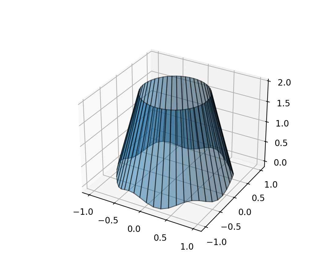
填充 3D 線條之間區域#
新的方法 Axes3D.fill_between 允許使用多邊形填充兩條 3D 線條之間的曲面。
N = 50
theta = np.linspace(0, 2*np.pi, N)

x1 = np.cos(theta)
y1 = np.sin(theta)
z1 = 0.1 * np.sin(6 * theta)

x2 = 0.6 * np.cos(theta)
y2 = 0.6 * np.sin(theta)
z2 = 2  # Note that scalar values work in addition to length N arrays

fig = plt.figure()
ax = fig.add_subplot(projection='3d')
ax.fill_between(x1, y1, z1, x2, y2, z2,
                alpha=0.5, edgecolor='k')
使用滑鼠旋轉 3D 圖表#
使用滑鼠旋轉三維圖表變得更直觀。現在,圖表對滑鼠移動的反應方式相同,不受當前特定方向的影響;並且可以控制所有 3 個旋轉自由度(方位角、仰角和滾動)。預設情況下,它使用 Ken Shoemake 的 ARCBALL 的變體 [1]。滑鼠旋轉的特定樣式可以通過 rcParams["axes3d.mouserotationstyle"] 設定(預設值: 'arcball')。另請參閱 使用滑鼠旋轉。
要還原為原始的滑鼠旋轉樣式,請建立一個名為 matplotlibrc 的檔案,內容如下
axes3d.mouserotationstyle: azel
要試用各種滑鼠旋轉樣式之一
import matplotlib as mpl
mpl.rcParams['axes3d.mouserotationstyle'] = 'trackball'  # 'azel', 'trackball', 'sphere', or 'arcball'

import numpy as np
import matplotlib.pyplot as plt
from matplotlib import cm

ax = plt.figure().add_subplot(projection='3d')

X = np.arange(-5, 5, 0.25)
Y = np.arange(-5, 5, 0.25)
X, Y = np.meshgrid(X, Y)
R = np.sqrt(X**2 + Y**2)
Z = np.sin(R)

surf = ax.plot_surface(X, Y, Z, cmap=cm.coolwarm,
                       linewidth=0, antialiased=False)

plt.show()
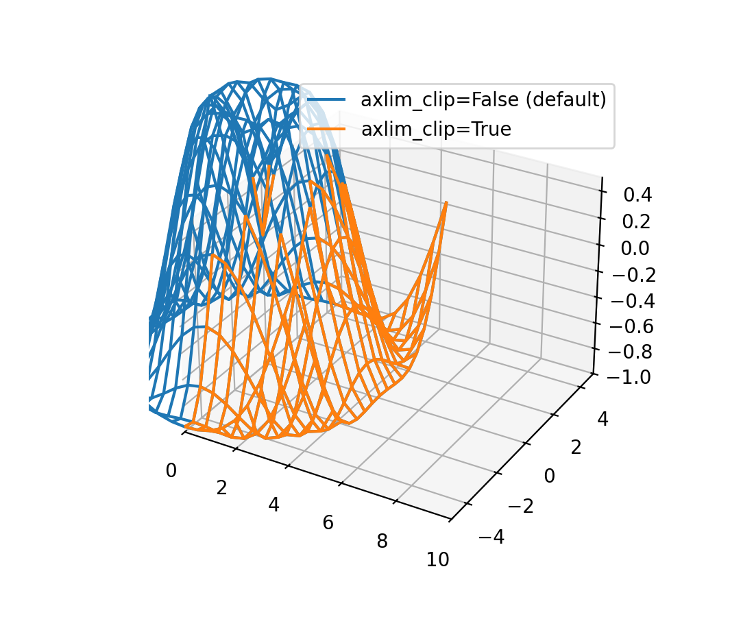
3D 圖表中的資料現在可以動態裁剪到軸視圖限制#
所有 3D 繪圖函數現在都支援 axlim_clip 關鍵字引數,它會將資料裁剪到軸視圖限制,隱藏這些邊界之外的所有資料。此裁剪將在平移和縮放時即時動態套用。
請注意,如果線段或 3D 面的其中一個頂點被裁剪,則整個線段或面將被隱藏。無法顯示部分線條或面,使其在視圖方塊的邊界處「平滑」地截斷,這是目前渲染器的限制。
import matplotlib.pyplot as plt
import numpy as np

fig, ax = plt.subplots(subplot_kw={"projection": "3d"})
x = np.arange(-5, 5, 0.5)
y = np.arange(-5, 5, 0.5)
X, Y = np.meshgrid(x, y)
R = np.sqrt(X**2 + Y**2)
Z = np.sin(R)

# Note that when a line has one vertex outside the view limits, the entire
# line is hidden. The same is true for 3D patches (not shown).
# In this example, data where x < 0 or z > 0.5 is clipped.
ax.plot_wireframe(X, Y, Z, color='C0')
ax.plot_wireframe(X, Y, Z, color='C1', axlim_clip=True)
ax.set(xlim=(0, 10), ylim=(-5, 5), zlim=(-1, 0.5))
ax.legend(['axlim_clip=False (default)', 'axlim_clip=True'])
其他變更#
matplotlib.ticker.ScalarFormatter類別獲得了一個新的實例化參數usetex。由於內部最佳化,建立 Axes 現在速度快了 20-25%。
Figure.subfigures和SubFigure上的 API 現在被認為是穩定的。