Matplotlib 3.9.0 的新功能(2024 年 5 月 15 日)#
如需自上次修訂以來的所有問題和提取請求的列表,請參閱3.10.0 (2024 年 12 月 13 日) 的 GitHub 統計資料。
繪圖和註釋改進#
Axes.inset_axes 不再是實驗性的#
Axes.inset_axes 被認為是穩定可用的。
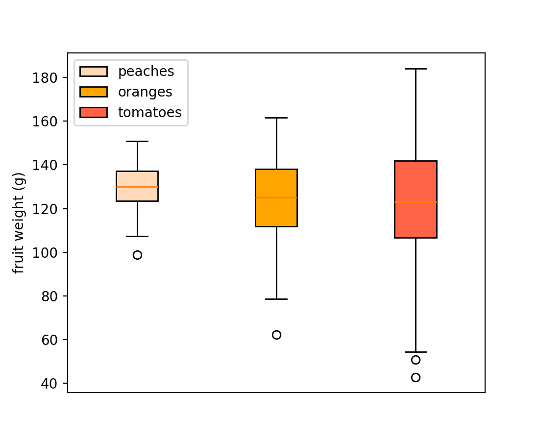
箱型圖的圖例支援#
箱型圖現在支援 *label* 參數以建立圖例項目。圖例標籤可以作為字串列表傳遞,以標記單個 Axes.boxplot 呼叫中的多個方塊
np.random.seed(19680801)
fruit_weights = [
    np.random.normal(130, 10, size=100),
    np.random.normal(125, 20, size=100),
    np.random.normal(120, 30, size=100),
]
labels = ['peaches', 'oranges', 'tomatoes']
colors = ['peachpuff', 'orange', 'tomato']

fig, ax = plt.subplots()
ax.set_ylabel('fruit weight (g)')

bplot = ax.boxplot(fruit_weights,
                   patch_artist=True,  # fill with color
                   label=labels)

# fill with colors
for patch, color in zip(bplot['boxes'], colors):
    patch.set_facecolor(color)

ax.set_xticks([])
ax.legend()
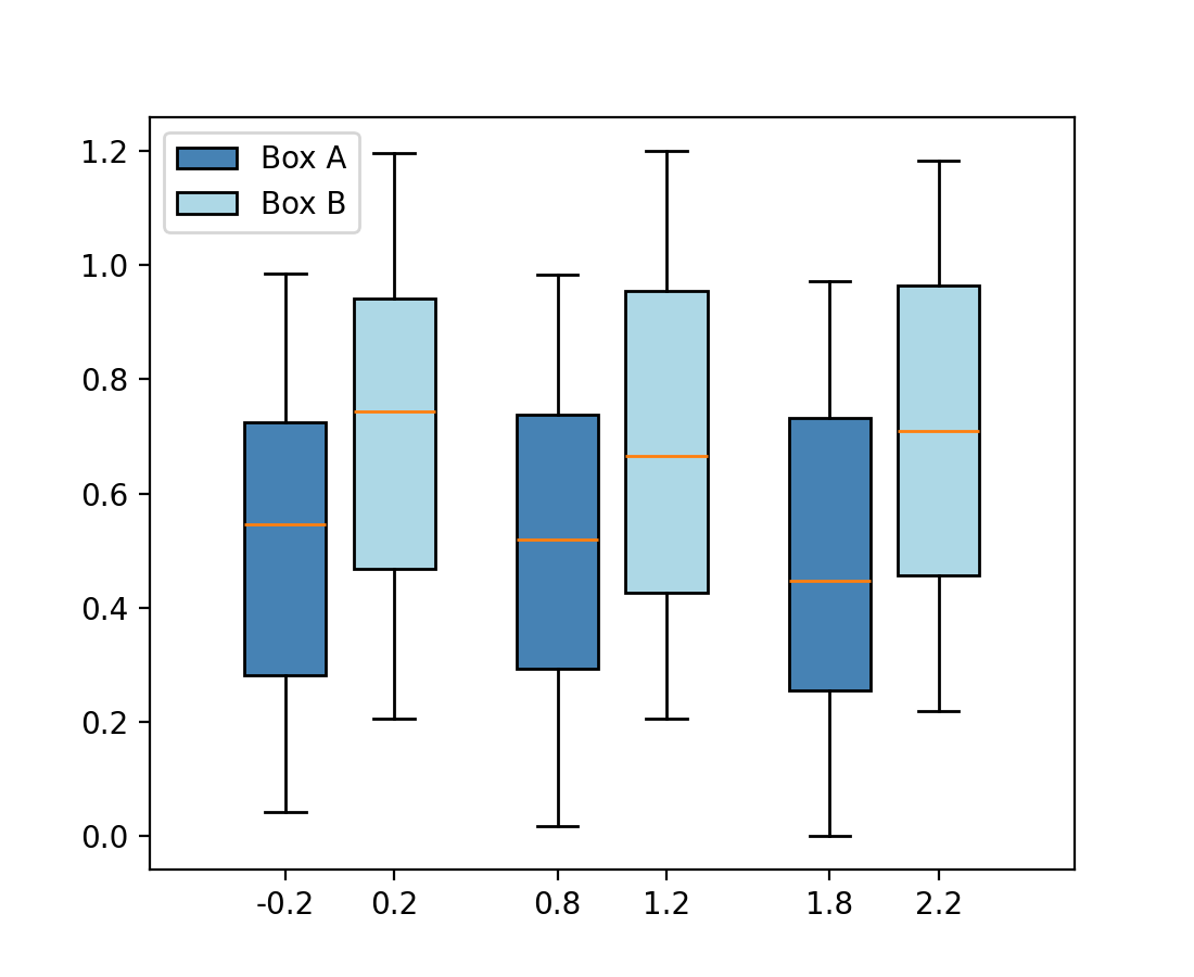
或作為單個字串傳遞至每個個別的 Axes.boxplot
fig, ax = plt.subplots()

data_A = np.random.random((100, 3))
data_B = np.random.random((100, 3)) + 0.2
pos = np.arange(3)

ax.boxplot(data_A, positions=pos - 0.2, patch_artist=True, label='Box A',
           boxprops={'facecolor': 'steelblue'})
ax.boxplot(data_B, positions=pos + 0.2, patch_artist=True, label='Box B',
           boxprops={'facecolor': 'lightblue'})

ax.legend()
使用 usetex=True 時,圓餅圖標籤中的百分號會自動跳脫#
在使用 Axes.pie 時,通常會指定包含百分比符號 ( % ) 的標籤,這在 LaTeX 中表示註解。當使用 rcParams["text.usetex"] (預設值:False) 啟用 LaTeX,或傳遞 textprops={"usetex": True} 時,這曾導致百分比符號消失。
現在,百分比符號會自動跳脫 (透過加入前導反斜線),使其無論 usetex 設定為何都會顯示。如果您已預先跳脫百分比符號,系統會偵測到,並保持原樣。
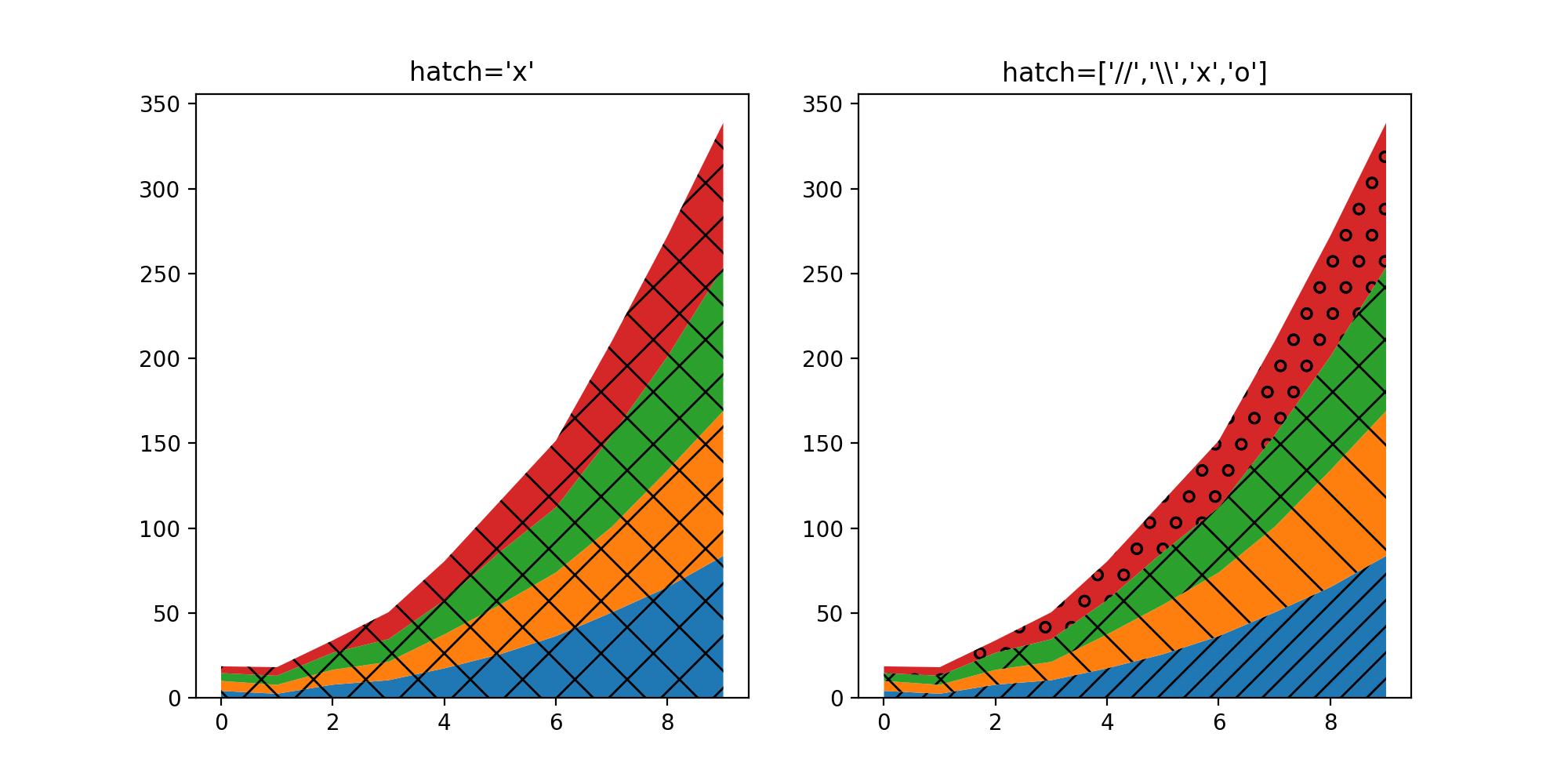
hatch 堆疊圖參數#
stackplot 的 hatch 參數現在接受描述陰影樣式的字串列表,這些樣式將依序套用到堆疊中的圖層
fig, (ax1, ax2) = plt.subplots(ncols=2, figsize=(10,5))

cols = 10
rows = 4
data = (
np.reshape(np.arange(0, cols, 1), (1, -1)) ** 2
+ np.reshape(np.arange(0, rows), (-1, 1))
+ np.random.random((rows, cols))*5
)
x = range(data.shape[1])
ax1.stackplot(x, data, hatch="x")
ax2.stackplot(x, data, hatch=["//","\\","x","o"])

ax1.set_title("hatch='x'")
ax2.set_title("hatch=['//','\\\\','x','o']")

plt.show()
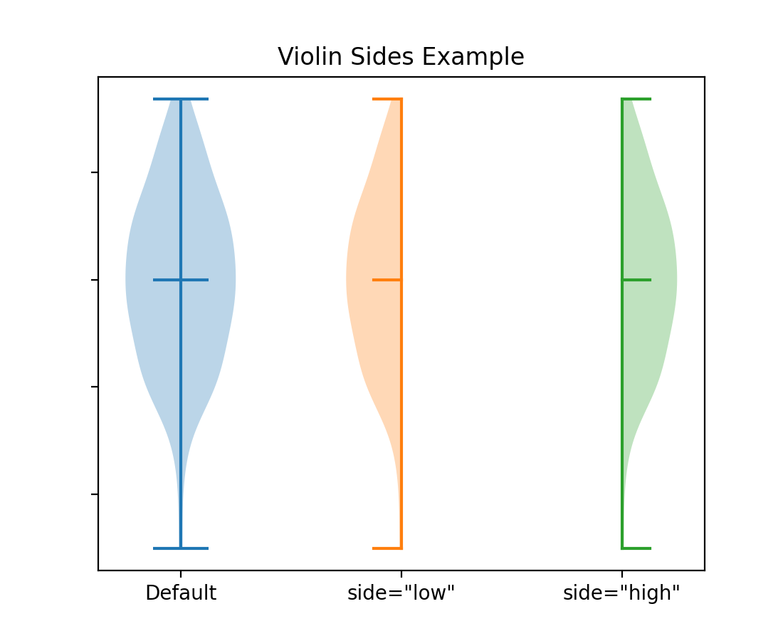
新增選項以僅繪製小提琴圖的一半#
將參數 side 設定為 'low' 或 'high' 允許僅繪製 Axes.violinplot 的一半。
# Fake data with reproducible random state.
np.random.seed(19680801)
data = np.random.normal(0, 8, size=100)

fig, ax = plt.subplots()

ax.violinplot(data, [0], showmeans=True, showextrema=True)
ax.violinplot(data, [1], showmeans=True, showextrema=True, side='low')
ax.violinplot(data, [2], showmeans=True, showextrema=True, side='high')

ax.set_title('Violin Sides Example')
ax.set_xticks([0, 1, 2], ['Default', 'side="low"', 'side="high"'])
ax.set_yticklabels([])
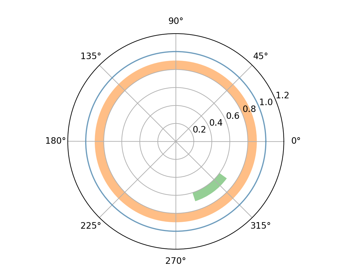
極座標軸上的 axhline 和 axhspan#
... 現在繪製圓形和圓弧 (axhline) 或環狀和楔形 (axhspan)。
fig = plt.figure()
ax = fig.add_subplot(projection="polar")
ax.set_rlim(0, 1.2)

ax.axhline(1, c="C0", alpha=.5)
ax.axhspan(.8, .9, fc="C1", alpha=.5)
ax.axhspan(.6, .7, .8, .9, fc="C2", alpha=.5)
子圖標題現在可以自動對齊#
如果刻度標籤或 x 軸標籤放置在一個子圖的頂部,則子圖軸標題可能會垂直錯位。 align_titles 方法會在 Figure 類別上垂直對齊標題。
fig, axs = plt.subplots(1, 2, layout='constrained')

axs[0].plot(np.arange(0, 1e6, 1000))
axs[0].set_title('Title 0')
axs[0].set_xlabel('XLabel 0')

axs[1].plot(np.arange(1, 0, -0.1) * 2000, np.arange(1, 0, -0.1))
axs[1].set_title('Title 1')
axs[1].set_xlabel('XLabel 1')
axs[1].xaxis.tick_top()
axs[1].tick_params(axis='x', rotation=55)
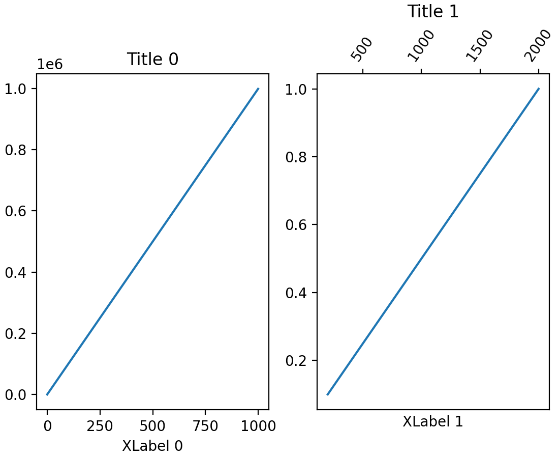

fig.align_labels()
fig.align_titles()

axisartist 現在可以與標準 Formatters 一起使用#
... 而不限於 axisartist 特定的格式器。
切換軸上的次要刻度#
可以使用 minorticks_on 和 minorticks_off 顯示或移除 Axis 上的次要刻度;例如,ax.xaxis.minorticks_on()。另請參閱 minorticks_on。
StrMethodFormatter 現在會尊重 axes.unicode_minus#
在格式化負值時,如果設定了 rcParams["axes.unicode_minus"] (預設值:True),則 StrMethodFormatter 現在將使用 unicode 負號。
>>> from matplotlib.ticker import StrMethodFormatter
>>> with plt.rc_context({'axes.unicode_minus': False}):
...     formatter = StrMethodFormatter('{x}')
...     print(formatter.format_data(-10))
-10
>>> with plt.rc_context({'axes.unicode_minus': True}):
...     formatter = StrMethodFormatter('{x}')
...     print(formatter.format_data(-10))
−10
圖形、軸和圖例佈局#
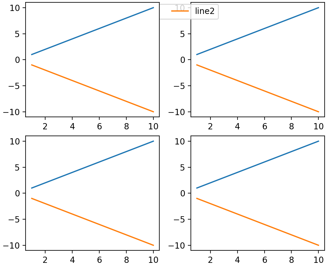
子圖形現在具有可控制的 z 順序#
先前,設定子圖形的 z 順序沒有效果,並且這些子圖形繪製在任何圖形層級的藝術家之上 (例如在圖形層級的圖例之上)。現在,子圖形的行為與任何其他藝術家一樣,並且可以控制它們的 z 順序,預設 z 順序為 0。
x = np.linspace(1, 10, 10)
y1, y2 = x, -x
fig = plt.figure(constrained_layout=True)
subfigs = fig.subfigures(nrows=1, ncols=2)
for subfig in subfigs:
    axarr = subfig.subplots(2, 1)
    for ax in axarr.flatten():
        (l1,) = ax.plot(x, y1, label="line1")
        (l2,) = ax.plot(x, y2, label="line2")
subfigs[0].set_zorder(6)
l = fig.legend(handles=[l1, l2], loc="upper center", ncol=2)
xmargin、ymargin 和 zmargin 的 Getter#
已新增 Axes.get_xmargin、Axes.get_ymargin 和 Axes3D.get_zmargin 方法,以傳回由 Axes.set_xmargin、Axes.set_ymargin 和 Axes3D.set_zmargin 設定的邊界值。
Mathtext 增強功能#
mathtext 文件改進#
文件已更新為直接從剖析器取得資訊。這表示 (幾乎) 所有支援的符號、運算子等都會顯示在 撰寫數學表達式 中。
mathtext 間距校正#
由於文件已更新,許多關係和運算符號上的間距已正確分類,因此將會適當地間隔。
小工具改進#
3D 繪圖改進#
設定 3D 軸的限制現在會精確地設定限制#
先前,設定 3D 軸的限制總會為限制添加一個小的邊距。現在預設會精確設定限制。新引入的 rcparam axes3d.automargin 可用於恢復舊的行為,即自動添加邊距。
fig, axs = plt.subplots(1, 2, subplot_kw={'projection': '3d'})

plt.rcParams['axes3d.automargin'] = True
axs[0].set(xlim=(0, 1), ylim=(0, 1), zlim=(0, 1), title='Old Behavior')

plt.rcParams['axes3d.automargin'] = False  # the default in 3.9.0
axs[1].set(xlim=(0, 1), ylim=(0, 1), zlim=(0, 1), title='New Behavior')

其他改進#
BackendRegistry#
新的 BackendRegistry 類別是可用後端的單一事實來源。單例實例為 matplotlib.backends.backend_registry。它在 Matplotlib 內部使用,也從 IPython 8.24.0 開始由 IPython(以及因此由 Jupyter)使用。
後端有三個來源:內建(原始碼位於 Matplotlib 儲存庫內)、明確的 module://some.backend 語法(透過載入模組取得後端),或透過進入點(外部套件中的自我註冊後端)。
要取得所有已註冊後端的列表,請使用
>>> from matplotlib.backends import backend_registry
>>> backend_registry.list_all()
新增 widths、heights 和 angles 設定器到 EllipseCollection#
現在可以在建立 EllipseCollection 後變更其 widths、heights 和 angles 值。
from matplotlib.collections import EllipseCollection

rng = np.random.default_rng(0)

widths = (2, )
heights = (3, )
angles = (45, )
offsets = rng.random((10, 2)) * 10

fig, ax = plt.subplots()

ec = EllipseCollection(
    widths=widths,
    heights=heights,
    angles=angles,
    offsets=offsets,
    units='x',
    offset_transform=ax.transData,
    )

ax.add_collection(ec)
ax.set_xlim(-2, 12)
ax.set_ylim(-2, 12)

new_widths = rng.random((10, 2)) * 2
new_heights = rng.random((10, 2)) * 3
new_angles = rng.random((10, 2)) * 180

ec.set(widths=new_widths, heights=new_heights, angles=new_angles)
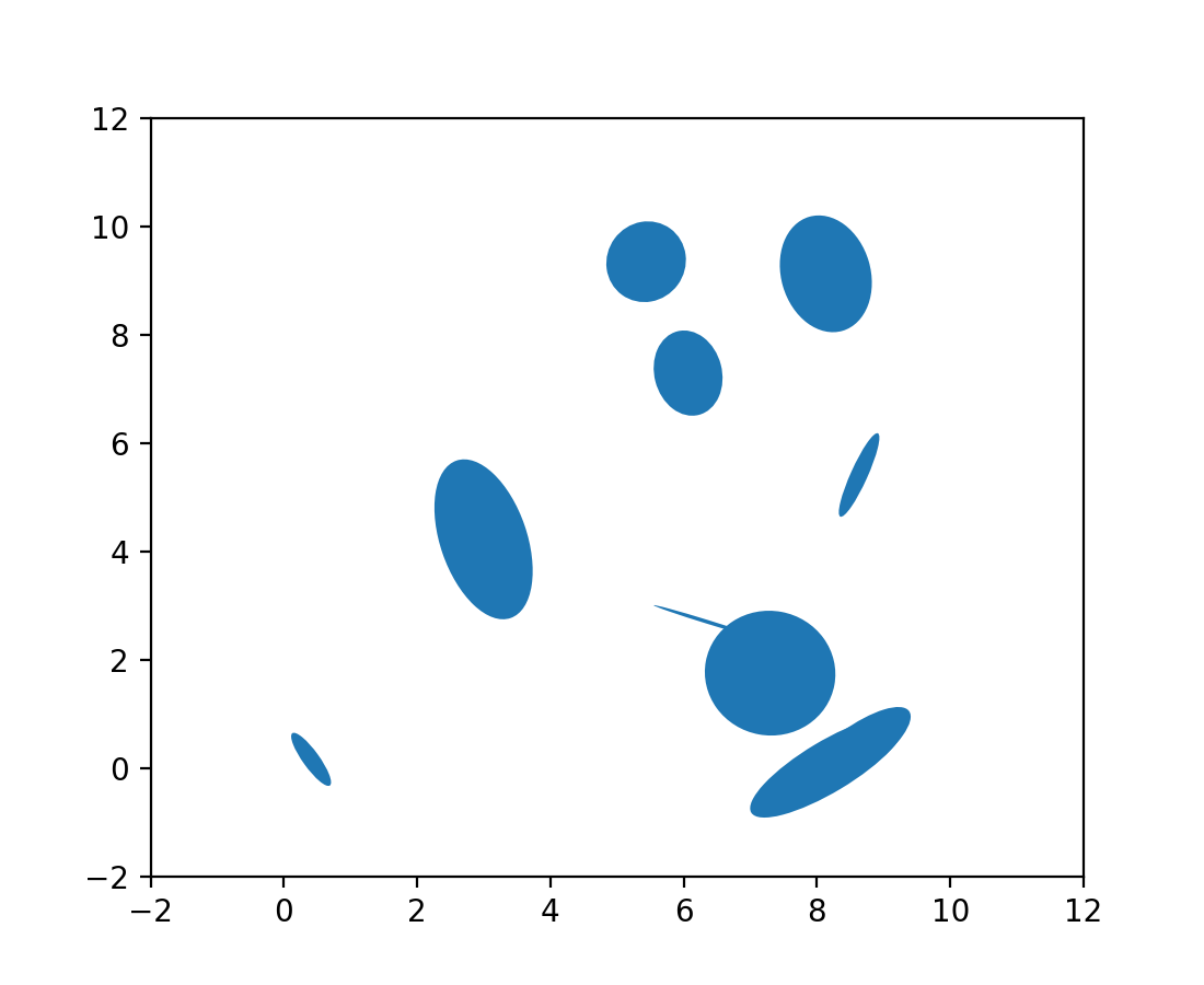
image.interpolation_stage rcParam#
這個新的 rcParam 控制影像內插是在「資料」空間還是「rgba」空間中發生。
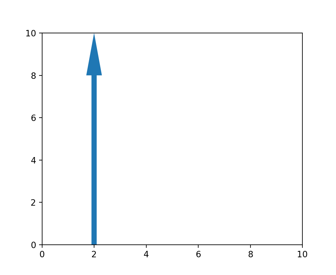
現在可修改箭頭補丁位置#
已新增 setter 方法,允許更新 patches.Arrow 物件的位置,而無需完全重新繪製。
from matplotlib import animation
from matplotlib.patches import Arrow

fig, ax = plt.subplots()
ax.set_xlim(0, 10)
ax.set_ylim(0, 10)

a = Arrow(2, 0, 0, 10)
ax.add_patch(a)


# code for modifying the arrow
def update(i):
    a.set_data(x=.5, dx=i, dy=6, width=2)


ani = animation.FuncAnimation(fig, update, frames=15, interval=90, blit=False)

plt.show()
NonUniformImage 現在具有滑鼠懸停支援#
當滑鼠懸停在 NonUniformImage 上時,現在會顯示資料值。