開始使用 mpl-probscale
安裝
mpl-probscale 是在 Python 3.6 上開發的。它也在 Python 3.4、3.5 甚至 2.7(暫時)上進行測試。
從 conda 安裝
mpl-probscale 的官方發行版本可以在 conda-forge 上找到
conda install --channel=conda-forge mpl-probscale
我個人頻道上提供相當新的開發版本
conda install --channel=conda-forge mpl-probscale
從 PyPI 安裝
官方原始碼發行版本也可以在 PyPI 上找到 pip install probscale
從原始碼安裝
mpl-probscale 是一個純 Python 套件。它應該可以在任何平台上從原始碼輕鬆安裝。要做到這一點,請從 github 下載或複製,如有必要,解壓縮封存檔,然後執行
cd mpl-probscale # or wherever the setup.py got placed
pip install .
我建議使用 pip install . 而不是 python setup.py install,原因 我不太理解。
%matplotlib inline
import warnings
warnings.simplefilter('ignore')

import numpy
from matplotlib import pyplot
from scipy import stats
import seaborn

clear_bkgd = {'axes.facecolor':'none', 'figure.facecolor':'none'}
seaborn.set(style='ticks', context='talk', color_codes=True, rc=clear_bkgd)
背景
內建的 matplotlib 尺度
對於一般使用者,您可以將 matplotlib 尺度設定為「linear」(線性)或「log」(對數)。還有其他選項(例如 logit、symlog),但我不太常看到它們被使用。
線性尺度是預設值
fig, ax = pyplot.subplots()
seaborn.despine(fig=fig)
當您的資料涵蓋幾個數量級,並且不必以 10 為底時,對數尺度可以很好地運作。
fig, (ax1, ax2) = pyplot.subplots(nrows=2, figsize=(8,3))
ax1.set_xscale('log')
ax1.set_xlim(left=1e-3, right=1e3)
ax1.set_xlabel("Base 10")
ax1.set_yticks([])

ax2.set_xscale('log', basex=2)
ax2.set_xlim(left=2**-3, right=2**3)
ax2.set_xlabel("Base 2")
ax2.set_yticks([])

seaborn.despine(fig=fig, left=True)

機率尺度
mpl-probscale 可讓您使用機率尺度。您只需匯入它即可。
在匯入之前,matplotlib 中沒有可用的機率尺度
try:
    fig, ax = pyplot.subplots()
    ax.set_xscale('prob')
except ValueError as e:
    pyplot.close(fig)
    print(e)
Unknown scale type 'prob'
若要存取機率尺度,只需匯入 probscale 模組。
import probscale
fig, ax = pyplot.subplots(figsize=(8, 3))
ax.set_xscale('prob')
ax.set_xlim(left=0.5, right=99.5)
ax.set_xlabel('Normal probability scale (%)')
seaborn.despine(fig=fig)
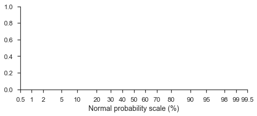
機率尺度預設為標準常態分佈(請注意,格式是基於百分比的機率)
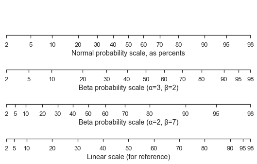
您甚至可以使用不同的機率分佈,儘管可能會有些棘手。您必須將 scipy.stats 或 paramnormal 的凍結分佈傳遞到 ax.set_[x|y]scale 中的 dist kwarg。
這是一個標準常態尺度,其中包含兩個不同的 beta 尺度和一個用於比較的線性尺度。
fig, (ax1, ax2, ax3, ax4) = pyplot.subplots(figsize=(9, 5), nrows=4)

for ax in [ax1, ax2, ax3, ax4]:
    ax.set_xlim(left=2, right=98)
    ax.set_yticks([])

ax1.set_xscale('prob')
ax1.set_xlabel('Normal probability scale, as percents')

beta1 = stats.beta(a=3, b=2)
ax2.set_xscale('prob', dist=beta1)
ax2.set_xlabel('Beta probability scale (α=3, β=2)')

beta2 = stats.beta(a=2, b=7)
ax3.set_xscale('prob', dist=beta2)
ax3.set_xlabel('Beta probability scale (α=2, β=7)')

ax4.set_xticks(ax1.get_xticks()[12:-12])
ax4.set_xlabel('Linear scale (for reference)')

seaborn.despine(fig=fig, left=True)
現成的機率圖
mpl-probscale 附帶一個小的 viz 模組,可以幫助您製作樣本的機率圖。
僅使用樣本資料,probscale.probplot 將建立圖形、計算繪圖位置和不超過機率,並繪製所有內容
numpy.random.seed(0)
sample = numpy.random.normal(loc=4, scale=2, size=37)
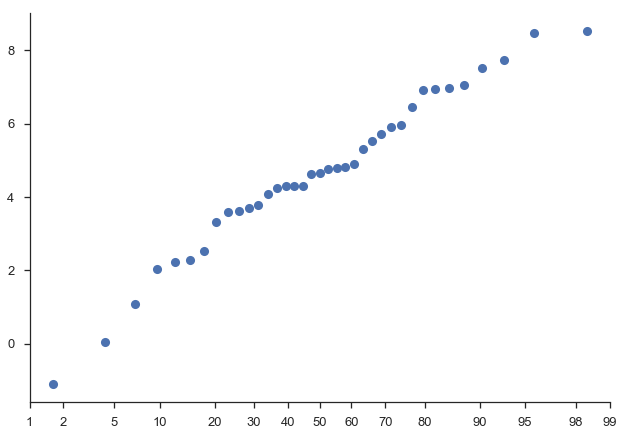
fig = probscale.probplot(sample)
seaborn.despine(fig=fig)
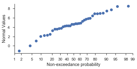
如果您想直接使用 matplotlib 命令自訂圖形,則應指定圖形應發生的 matplotlib 軸
fig, ax = pyplot.subplots(figsize=(7, 3))

probscale.probplot(sample, ax=ax)

ax.set_ylabel('Normal Values')
ax.set_xlabel('Non-exceedance probability')
ax.set_xlim(left=1, right=99)
seaborn.despine(fig=fig)
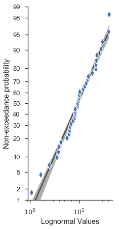
許多其他選項可以直接從 probplot 函數簽名存取。
fig, ax = pyplot.subplots(figsize=(3, 7))

numpy.random.seed(0)
new_sample = numpy.random.lognormal(mean=2.0, sigma=0.75, size=37)

probscale.probplot(
    new_sample,
    ax=ax,
    probax='y', # flip the plot
    datascale='log', # scale of the non-probability axis
    bestfit=True, # draw a best-fit line
    estimate_ci=True,
    datalabel='Lognormal Values',  # labels and markers...
    problabel='Non-exceedance probability',
    scatter_kws=dict(marker='d', zorder=2, mew=1.25, mec='w', markersize=10),
    line_kws=dict(color='0.17', linewidth=2.5, zorder=0, alpha=0.75),
)

ax.set_ylim(bottom=1, top=99)
seaborn.despine(fig=fig)
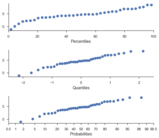
百分位數和分位數圖
為了方便起見,您可以使用相同的函數製作百分位數和分位數圖。
注意
百分位數和機率軸是針對相同的值繪製的。唯一的區別在於「百分位數」繪製在線性尺度上。
fig, (ax1, ax2, ax3) = pyplot.subplots(nrows=3, figsize=(8, 7))

probscale.probplot(sample, ax=ax1, plottype='pp', problabel='Percentiles')
probscale.probplot(sample, ax=ax2, plottype='qq', problabel='Quantiles')
probscale.probplot(sample, ax=ax3, plottype='prob', problabel='Probabilities')

ax2.set_xlim(left=-2.5, right=2.5)
ax3.set_xlim(left=0.5, right=99.5)
fig.tight_layout()
seaborn.despine(fig=fig)
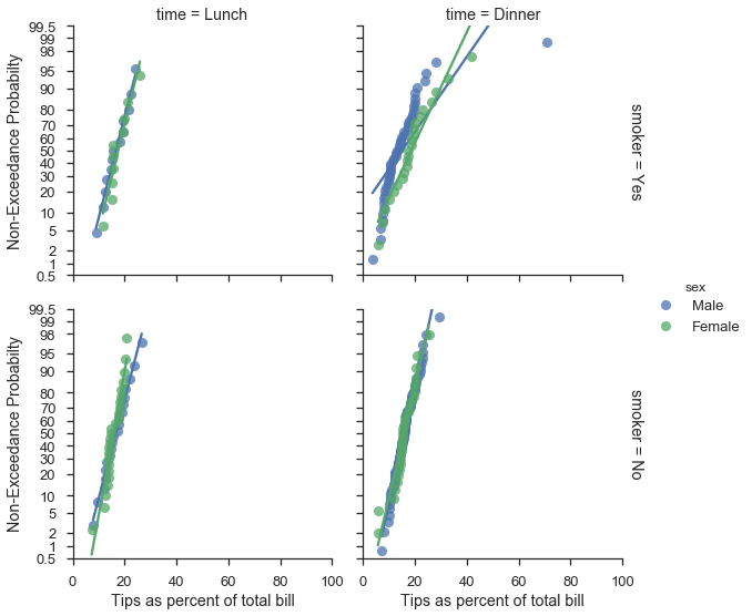
使用 seaborn FacetGrids
好消息,各位。probplot 函數通常可以如預期般與 FacetGrids 一起使用。
plot = (
    seaborn.load_dataset("tips")
        .assign(pct=lambda df: 100 * df['tip'] / df['total_bill'])
        .pipe(seaborn.FacetGrid, hue='sex', col='time', row='smoker', margin_titles=True, aspect=1., size=4)
        .map(probscale.probplot, 'pct', bestfit=True, scatter_kws=dict(alpha=0.75), probax='y')
        .add_legend()
        .set_ylabels('Non-Exceedance Probabilty')
        .set_xlabels('Tips as percent of total bill')
        .set(ylim=(0.5, 99.5), xlim=(0, 100))
)