使用不同的繪圖位置公式
計算繪圖位置
當繪製百分位數、分位數或機率圖時,必須計算已排序資料的繪圖位置。
對於一個大小為 \(n\) 的樣本 \(X\),第 \(j^\mathrm{th}\) 個元素的繪圖位置定義為
\[\frac{x_{j} - \alpha}{n + 1 - \alpha - \beta }\]
在這個方程式中,α 和 β 可以取幾個值。常見的值描述如下
- 「type 4」(α=0,β=1)
- 經驗累積分配函數的線性插值。
- 「type 5」或「hazen」(α=0.5,β=0.5)
- 分段線性插值。
- 「type 6」或「weibull」(α=0,β=0)
- 韋伯繪圖位置。所有分佈的無偏超越機率。建議用於水文應用。
- 「type 7」(α=1,β=1)
- R 中的預設值。不建議使用機率刻度,因為最小和最大資料點分別獲得 0 和 1 的繪圖位置,因此無法顯示。
- 「type 8」(α=1/3,β=1/3)
- 近似中位數無偏。
- 「type 9」或「blom」(α=0.375,β=0.375)
- 如果資料呈常態分佈,則為近似無偏位置。
- 「median」(α=0.3175,β=0.3175)
- 所有分佈的中位數超越機率(用於
scipy.stats.probplot中)。- 「apl」或「pwm」(α=0.35,β=0.35)
- 與機率加權動量一起使用。
- 「cunnane」(α=0.4,β=0.4)
- 對於常態分佈資料,幾乎是無偏分位數。這是預設值。
- 「gringorten」(α=0.44,β=0.44)
- 用於甘布分佈。
本教學的目的是展示所選的 α 和 β 如何改變機率圖的形狀。
首先,讓我們完成一些分析設定...
%matplotlib inline
import warnings
warnings.simplefilter('ignore')

import numpy
from matplotlib import pyplot
from scipy import stats
import seaborn

clear_bkgd = {'axes.facecolor':'none', 'figure.facecolor':'none'}
seaborn.set(style='ticks', context='talk', color_codes=True, rc=clear_bkgd)

import probscale


def format_axes(ax1, ax2):
    """ Sets axes labels and grids """
    for ax in (ax1, ax2):
        if ax is not None:
            ax.set_ylim(bottom=1, top=99)
            ax.set_xlabel('Values of Data')
            seaborn.despine(ax=ax)
            ax.yaxis.grid(True)

    ax1.legend(loc='upper left', numpoints=1, frameon=False)
    ax1.set_ylabel('Normal Probability Scale')
    if ax2 is not None:
        ax2.set_ylabel('Weibull Probability Scale')
常態 vs 韋伯刻度以及 Cunnane vs 韋伯繪圖位置
在這裡,我們將產生一些虛假的常態分佈資料,並定義一個 scipy 中的韋伯分佈以用於機率刻度。
numpy.random.seed(0)  # reproducible
data = numpy.random.normal(loc=5, scale=1.25, size=37)

# simple weibull distribution
weibull = stats.weibull_min(2)
現在,讓我們在韋伯和常態機率刻度上建立機率圖。此外,我們將為每個圖計算兩種不同但常見方式的繪圖位置。
首先,在藍色圓圈中,我們將顯示具有韋伯 (α=0, β=0) 繪圖位置的資料。韋伯繪圖位置通常用於水文學和水資源工程等領域。
在綠色方塊中,我們將使用 Cunnane (α=0.4, β=0.4) 繪圖位置。Cunnane 繪圖位置適用於常態分佈資料,並且是預設值。
w_opts = {'label': 'Weibull (α=0, β=0)',     'marker': 'o', 'markeredgecolor': 'b'}
c_opts = {'label': 'Cunnane (α=0.4, β=0.4)', 'marker': 's', 'markeredgecolor': 'g'}

common_opts = {
    'markerfacecolor': 'none',
    'markeredgewidth': 1.25,
    'linestyle': 'none'
}

fig, (ax1, ax2) = pyplot.subplots(figsize=(10, 8), ncols=2, sharex=True, sharey=False)

for dist, ax in zip([None, weibull], [ax1, ax2]):
    for opts, postype in zip([w_opts, c_opts,], ['weibull', 'cunnane']):
        probscale.probplot(data, ax=ax, dist=dist, probax='y',
                           scatter_kws={**opts, **common_opts},
                           pp_kws={'postype': postype})

format_axes(ax1, ax2)
fig.tight_layout()
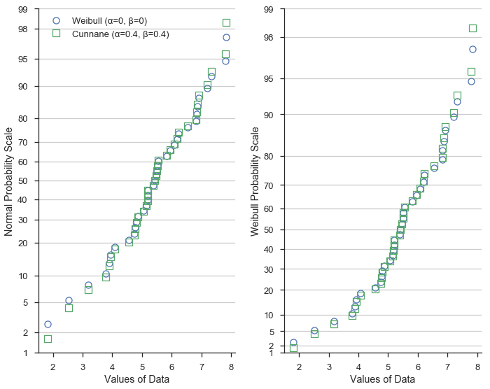
這證明繪圖位置的不同公式在資料集的極值處變化最大。
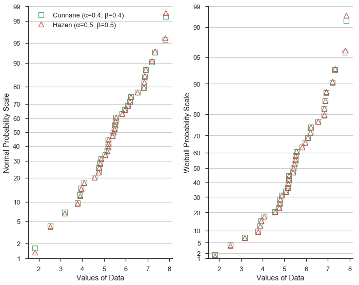
Hazen 繪圖位置
接下來,讓我們將 Hazen/Type 5 (α=0.5, β=0.5) 公式與 Cunnane 進行比較。Hazen 繪圖位置(顯示為紅色三角形)表示資料集經驗累積分配函數的分段線性插值。
鑑於 α 和 β=0.5 的值與 Cunnane 值僅略有不同,繪圖位置可預測地相似。
h_opts = {'label': 'Hazen (α=0.5, β=0.5)', 'marker': '^', 'markeredgecolor': 'r'}
fig, (ax1, ax2) = pyplot.subplots(figsize=(10, 8), ncols=2, sharex=True, sharey=False)

for dist, ax in zip([None, weibull], [ax1, ax2]):
    for opts, postype in zip([c_opts, h_opts,], ['cunnane', 'Hazen']):
        probscale.probplot(data, ax=ax, dist=dist, probax='y',
                           scatter_kws={**opts, **common_opts},
                           pp_kws={'postype': postype})

format_axes(ax1, ax2)
fig.tight_layout()
總結
冒著顯示一個非常混亂且難以閱讀的圖形的風險,讓我們將所有三個都放在同一個常態機率刻度上
fig, ax1 = pyplot.subplots(figsize=(6, 8))

for opts, postype in zip([w_opts, c_opts, h_opts,], ['weibull', 'cunnane', 'hazen']):
    probscale.probplot(data, ax=ax1, dist=None, probax='y',
                       scatter_kws={**opts, **common_opts},
                       pp_kws={'postype': postype})

format_axes(ax1, None)
fig.tight_layout()
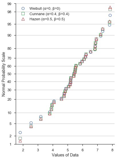
再次強調,α 和 β 的不同值不會顯著改變機率圖在 - 例如 - 下四分位數和上四分位數之間附近的形狀。然而,在四分位數之外,差異更加明顯。
下面的單元格使用我們研究過的三組 α 和 β 值計算繪圖位置,並列印前十個值以便輕鬆比較。
# weibull plotting positions and sorted data
w_probs, _ = probscale.plot_pos(data, postype='weibull')

# normal plotting positions, returned "data" is identical to above
c_probs, _ = probscale.plot_pos(data, postype='cunnane')

# type 4 plot positions
h_probs, _ = probscale.plot_pos(data, postype='hazen')

# convert to percentages
w_probs *= 100
c_probs *= 100
h_probs *= 100

print('Weibull: ', numpy.round(w_probs[:10], 2))
print('Cunnane: ', numpy.round(c_probs[:10], 2))
print('Hazen:   ', numpy.round(h_probs[:10], 2))
Weibull:  [  2.63   5.26   7.89  10.53  13.16  15.79  18.42  21.05  23.68  26.32]
Cunnane:  [  1.61   4.3    6.99   9.68  12.37  15.05  17.74  20.43  23.12  25.81]
Hazen:    [  1.35   4.05   6.76   9.46  12.16  14.86  17.57  20.27  22.97  25.68]